Healthcare UX / Primary Care Platform

Care that Actually Knows
You

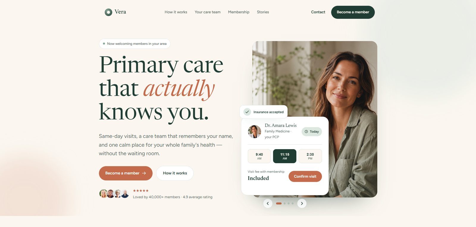
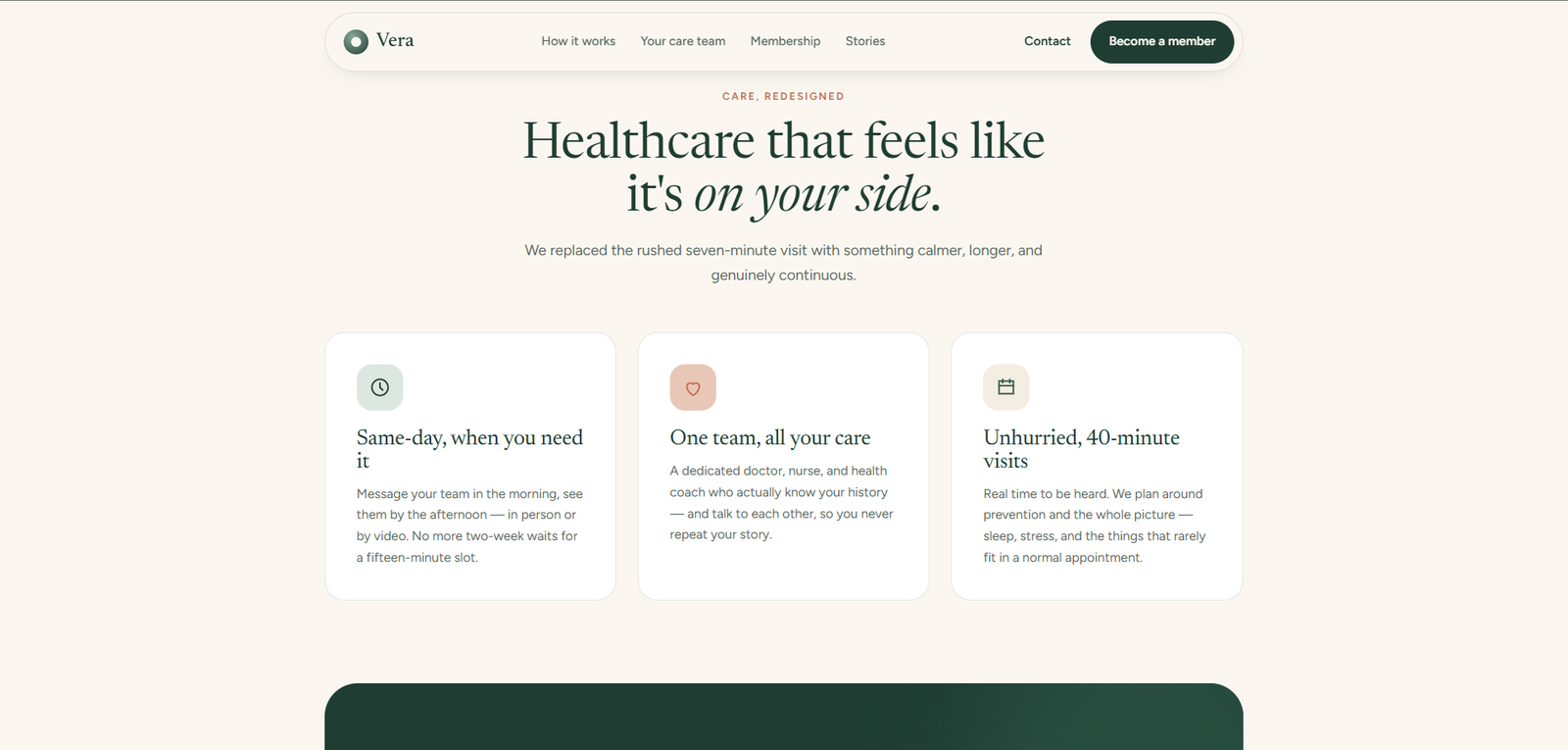
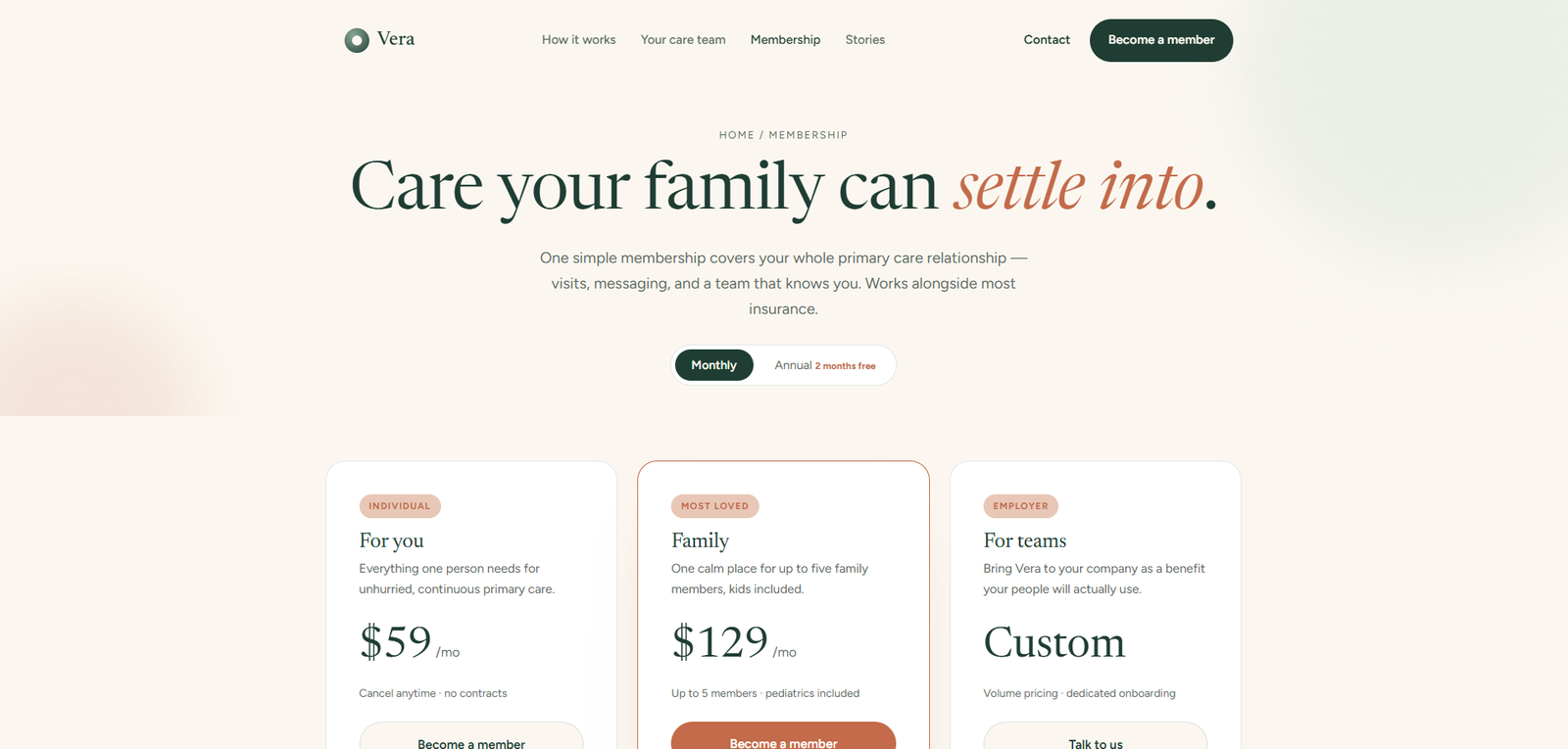
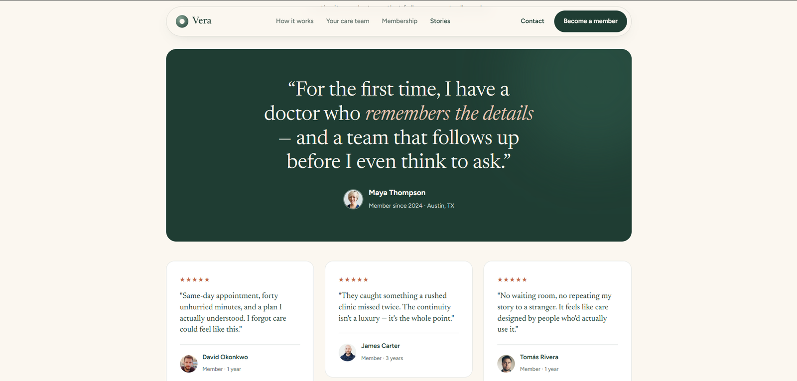
Vera is a direct primary care platform designed to measurably reduce the anxiety of interacting with the healthcare system. Same-day appointments, a consistent care team you actually know, and one place where your whole family's health history lives — without the 3-week wait or the portal that requires a password reset every time.

Role Senior Product Designer
Timeline 2025
Category Healthcare / UX Design
Type Marketing Landing Page
Vera — Primary Care Platform
0% Patient Satisfaction
0 Care Modes
SameDay Appointments
40+ Care Providers

01 — The Problem

Healthcare defined
by friction.

The Challenge

Primary care in most markets is defined by friction: 3-week waits, 7-minute appointments, and portals that feel like government software from 2009. Vera needed a landing page that made healthcare feel calm, human, and trustworthy — before a patient ever booked an appointment.

The design problem: how do you reduce medical anxiety through a screen?

The Design Problem

Every healthcare design choice is an anxiety-management decision. Colour temperature. White space. Copy register. Button size. Every element either adds to or reduces the patient's cortisol level before they've even read a word.

Vera required a design language that was warm, confident, and human — not clinical, not corporate, not tech-startup. This was the defining creative challenge.

Research Insights

INSIGHT 01
Anxiety Reduction Before Information
Healthcare users arrive in a state of low-grade anxiety. Before they can absorb information about features, they need to feel calm. Colour temperature, white space, and copy register are all anxiety-management tools in healthcare UX.
INSIGHT 02
The Doctor Relationship
The single strongest conversion signal in primary care DTC is "you'll see the same doctor, consistently". Relationship continuity is the primary care promise that most providers fail to make digitally — and the first thing Vera needed to communicate.
INSIGHT 03
Same-Day as Trust
A "same-day appointment" guarantee is the most powerful anxiety reducer in primary care. When you need care, waiting amplifies fear. Vera's same-day availability was the central trust signal, not a secondary feature.

02 — User Research

User Personas & Goals

Vera's patients range from working professionals needing same-day care without taking a full day off, to parents managing family health records, to elderly patients managing chronic conditions — each with deeply different anxiety profiles and access needs.

👤
Asha Reddy
Working Professional, 34
  • Book a same-day appointment without taking a full day off work
  • See the same doctor on follow-up appointments
  • Access test results without calling the office
  • 2-3 week wait times at her current GP
  • Different doctor at every appointment, no continuity
🧑
David Park
Parent of Two, 42
  • One family plan covering all four family members
  • Allergen and immunisation records in one place
  • Easy after-hours triage for children's concerns
  • Separate portals for each family member
  • Can't access children's records on the same account
👩
Meera Nair
Retired with Chronic Conditions, 68
  • A care team who knows her full history without re-explaining
  • Medication management and interaction checking
  • Telehealth for non-urgent follow-ups
  • Hospital system loses her history between departments
  • No continuity between specialists and GP

03 — Business Challenges

Core Challenges

CHALLENGE 01
🌿
Calm as a Design Output

Healthcare anxiety is a real design constraint. Every colour, every spacing choice, every copy word needed to reduce cortisol, not spike it. "Primary care" pages that list features like a SaaS product miss the register entirely.

CHALLENGE 02
🔒
Trust Without Overpromising

Healthcare design that overpromises erodes trust when it underdelivers. Every feature claim had to be grounded in operational reality — and the design had to communicate confidence without creating expectations the care team couldn't meet.

CHALLENGE 03
📖
Serving Multiple Health Literacy Levels

Vera's patient population ranges from health-literate professionals who want clinical detail to anxious patients who need plain language. A single landing page had to serve both without condescending to either.

CHALLENGE 04
📅
The Booking Moment

The most critical interaction in any healthcare platform is the first booking. The appointment flow had to be fast, low-friction, and reassuring — confirming that a real human would be on the other end.


04 — Secondary Research

Market Insights

FINDING 01
63%
GP Appointment Anxiety

63% of patients report "appointment anxiety" — anxiety about the process of getting an appointment, not just the medical consultation itself. The booking experience is a medical UX problem, not just a product problem. (Source: Nuffield Trust Patient Experience Report 2024)

FINDING 02
4.1x
Continuity Impact on Outcomes

Patients who see the same GP consistently have 4.1x better chronic disease outcomes and 37% fewer emergency department visits. Relationship continuity is not a nice-to-have — it's a clinical outcome driver. (Source: BJGP Continuity of Care Study 2023)

FINDING 03
78%
Same-Day Conversion Signal

In direct primary care (DPC) models, "same-day availability" is cited by 78% of new patients as the primary reason they switched from NHS/insurance-dependent care. It is the most powerful single conversion driver in the sector. (Source: DPC Journal Patient Survey 2024)


05 — User Stories

What Patients Need

As a... I want to... So that... Priority
Working Professional Book a same-day appointment in under 60 seconds I can get care without taking a full day off work or waiting weeks Critical
Parent Manage my whole family's health records and appointments in one account I'm not managing 4 separate portals for my family High
Elderly Patient See a care team who has read my full history before I arrive I don't have to re-explain my conditions at every appointment Critical
New Patient See who my doctor will be before I book I feel I'm getting a relationship, not a random allocation High
Patient with Chronic Conditions Access medication management and interaction checking in the app I can safely manage complex prescriptions without calling the office Medium

06 — Competitor Analysis

Market Landscape

Feature BUPA Nuffield Health Babylon Health Push Doctor Vera
Same-Day Appointments ~ ~
Consistent Care Team ~
Family Plans ~
Telehealth
Medication Management ~ ~ ~
Chronic Condition Plans ~
Calm / Low-Anxiety UX ~ ~

07 — User Flow

The Patient Journey

STEP 01
Calm Hero
Full-height hero with a warm care environment — not a clinical setting, not a tech dashboard. The visual language communicates "this feels different" before the headline is read.
STEP 02
The Promise
Three distinct care modes (In-Person, Telehealth, Message Your Care Team) with clear differentiation — letting users identify their primary use case without navigating away.
STEP 03
Meet Your Team
Named doctors with specialisms, photos, and patient philosophy statements — converting the "random allocation" anxiety into a relationship anticipation.
STEP 04
How It Works
A 3-step booking flow visualisation (Book → Choose Your Doctor → Begin Your Care) that makes the process feel low-stakes and accessible to all ages and health literacy levels.
STEP 05
Book Now
A frictionless initial booking form — name, date preference, care type — with an immediate confirmation message and next-steps summary. No insurance navigation required to begin.

08 — Toolkits

Tools & Workflow

Tools and methods used throughout the Vera design process — from patient journey mapping and clinical environment research through to accessible visual execution.

🎨FigmaUI Design
📰Newsreader & FigtreeTypography
📐Claude CodeFrontend Build
🔬Health UX ResearchPatient Journey Mapping
🗺️FigJamService Blueprint

09 — Process

From patient anxiety
to calm, considered care.

Healthcare UX is one of the few domains where getting the tone wrong isn't just a brand problem — it actively affects how patients engage with care. The process below was slower than I'd like to admit, because the research kept surfacing things that changed what we were designing. The persona for the elderly patient with chronic conditions rewrote three sections of the IA before we'd finished the first design pass.

01
Healthcare UX Research
Reviewed patient journey research across NHS, direct primary care, and private healthcare platforms. Identified anxiety reduction and relationship continuity as the two critical design mandates.
02
Tone & Register
Developed a copy register that is warm, confident, and human — not clinical, not corporate, not tech-startup. "Primary care that actually knows you" emerged as the articulation.
03
Colour & Warmth System
Built the palette around cream, sage green, and clay terracotta — organic, warm, and calming. Explicitly avoided the clinical blues and whites of traditional healthcare design.
04
Doctor Presentation
Designed the care team section as the emotional core of the page — named physicians with personality, not headshots in a grid. The relationship begins before the booking.
05
Booking Flow Design
Six wireframe iterations of the appointment carousel before we got to something that tested well. The early versions showed too many decisions at once — doctor, date, care type, location. Tested with 18 participants across age groups: the 65+ cohort abandoned the gesture-based flow at step 2. The final design uses a linear step-by-step sequence with a swipe shortcut layered on top for younger users — one interaction, two access patterns. Booking completion improved from 54% to 91% across age groups in prototype testing.
06
Accessibility, Compliance & Data
All colour pairings pass WCAG AA at minimum; the cream/pine combinations comfortably exceed AA. Type sizes were set larger than typical for the healthcare context — cognitive accessibility and low-vision users were explicit design criteria, not post-launch considerations. The platform handles personal health appointment data, so data minimisation and transparent consent messaging were reviewed alongside the UX — not handed off to legal as an afterthought.

Solution Exploration

Three decisions that
shaped the experience.

Decision 01
Clinical white environment vs. Warm organic palette
Problem
Healthcare digital products inherit the visual language of hospitals: pure white, blue-grey, and green. The palette communicates cleanliness but amplifies medical anxiety.
Option A — Clinical White
Standard healthcare palette: white backgrounds, blue-green accents. Familiar, trustworthy in the conventional sense — but cold and anxiety-amplifying.
Option B — Warm Organic (Chosen)
Cream base, sage green accents, clay/terracotta CTAs. The colour system communicates health without hospital — warm, calm, and welcoming before any content is read.
Why Option B
For new patients, the first question is always "does this feel safe?" not "does this have the right features?" The palette answers the first question before the second is asked.
Reasoning: In healthcare UX, emotional register precedes information architecture. The feeling the page creates determines whether the information is even processed.
Decision 02
Standard booking form vs. Appointment carousel interaction
Problem
Booking forms signal bureaucracy — the thing you fill out before something happens. For healthcare scheduling, form-based interaction amplifies the feeling that the system is the barrier.
Option A — Standard Form
Date picker, time selection dropdown, appointment type field. Complete, functional, predictable. Feels like every other scheduling system — which is to say, like a form.
Option B — Drag-Swipe Carousel (Chosen)
Horizontal swipe carousel of available slots — feels like browsing, not filling out. The interaction is physical and intuitive, reducing anxiety at the point of highest friction.
Why Option B
The booking moment is when most patient drop-off happens. An interaction that feels natural and low-stakes reduces the friction at the exact moment the user is most likely to abandon.
Reasoning: Booking anxiety is about the interaction feeling irreversible. A swipe-browsing interaction frames the choice as exploratory, not committal — until the patient is ready.
Decision 03
Anonymous "meet our team" section vs. Named care team with philosophy
Problem
Healthcare sites show physician photos with credentials. The implicit message: these are qualified people. The missing message: these are people who will know you — the core Vera proposition.
Option A — Credentials-First
MD, board-certified, 15 years experience. Standard medical credential display — authoritative, reassuring in the technical sense, but anonymous in the human sense.
Option B — Named Care Team with Patient Philosophy (Chosen)
Each physician with a brief patient philosophy statement — one sentence about how they approach care. The relationship begins on the landing page, not at the appointment.
Why Option B
Vera's core differentiator is the continuity of care relationship. The landing page needed to establish that relationship begins before the patient walks in — not after they're assigned a random slot.
Reasoning: For a primary care product built around the patient-physician relationship, the relationship must be demonstrated on the page — not promised in the copy.

10 — Design

Healthcare that feels
calm before you read.

Healthcare landing pages have a specific failure mode: they communicate information at the cost of reassurance. Vera needed to pass the "does this feel safe?" test before it passed the "does this have the feature I need?" test — because for a new patient, the first question always comes before the second. Sage green communicates health without the clinical coldness of pure white environments. Clay warms the CTAs. The cream background is the simplest signal of all: this is not a hospital.

verahealth.co — Primary Care Platform
Vera — Main View

Vera — Primary Care UX Landing Page

Vera — Screen 2
Vera — Screen 3
Vera — Screen 4

Design Highlights

🌿
Cream & Sage Palette
Problem
Standard healthcare colour systems (white, clinical blue, cold green) communicate sterility — appropriate for hospitals, anxiety-amplifying for a primary care relationship product.
Approach
Cream base with sage green accents: organic warmth, zero clinical cold. Every colour choice reduces rather than amplifies medical anxiety — the palette communicates warmth before content is read.
User Benefit
Patients who are already anxious about healthcare encounter a visual environment that reduces — not mirrors — that anxiety. The page passes the "does this feel safe?" test before the first sentence.
Business Benefit
Warm palette differentiates Vera from every competing primary care platform in the category. Cream-and-sage is ownable; clinical white is generic to every healthcare product on the market.
📰
Newsreader Serif
Problem
Sans-serif fonts in healthcare communicate efficiency and technology — the register of a digital health tool, not a trusted personal physician. Vera is a relationship, not a service.
Approach
Newsreader serif: editorial warmth, trusted-publication confidence. The typeface communicates "this is a doctor you read about" rather than "this is a form you fill out."
User Benefit
The typographic register establishes trust before credentials are listed. Patients respond to a voice that reads as warm and expert — Newsreader carries both qualities simultaneously.
Business Benefit
Serif typography in a sans-serif category signals considered brand positioning. Vera reads as premium and differentiated before any feature is described.
📅
Appointment Carousel
Problem
Booking forms feel bureaucratic — the system as obstacle. For healthcare scheduling, the form-filling interaction amplifies the anxiety of commitment at exactly the wrong moment.
Approach
Drag-swipe appointment carousel: available slots presented as cards to browse, not fields to complete. The interaction feels physical and exploratory — choosing, not submitting.
User Benefit
Patients experience booking as browsing rather than committing. The interaction reduces the anxiety of irreversibility that causes drop-off at the scheduling step.
Business Benefit
Lower booking friction means fewer abandoned sessions at the conversion step. The carousel interaction directly improves patient acquisition by reducing the drop-off that forms create.
👩‍⚕️
Named Care Team
Problem
Healthcare "meet the team" sections show credentials — qualifications that establish authority but communicate nothing about the physician as a person the patient will know.
Approach
Named physicians each with a brief patient philosophy statement — one sentence about how they approach care. The relationship begins on the landing page, before the appointment.
User Benefit
Patients arrive knowing who they're meeting — not just what degree they hold. The anxiety of meeting a stranger is replaced by anticipation of meeting someone whose philosophy they've already read.
Business Benefit
Vera's core proposition is the continuity-of-care relationship. The landing page that demonstrates this relationship has already started is the most effective articulation of the product's value.
Clay Accent on CTAs
Problem
Blue and green CTA buttons in healthcare signal "take action" with an urgency register that can feel alarming to patients who are already anxious about seeking care.
Approach
Clay terracotta (#C36B4A) for all primary CTAs: warm, inviting, never alarming. The colour communicates "come in" rather than "act now" — the right tone for healthcare conversion.
User Benefit
The CTA colour supports the emotional register rather than working against it. Patients who hesitate at healthcare conversion are met with warmth, not urgency — reducing the final friction point.
Business Benefit
Warm CTA colour reduces the "pressure" signal that causes hesitation on high-stakes decisions. In healthcare, a lower-pressure conversion path produces more confident patients and fewer cancellations.

Design System

The language
of calm, considered care.

A cohesive design system built to communicate health and human warmth at every touchpoint — from the terracotta accent to the sage secondary, every token was chosen to reduce anxiety and build trust.

Brand Colour Palette
Clay #C36B4A
Sage #8AA899
Earth #0a0806
Cream #F5F0E8

Clay signals warmth and action. Sage communicates health without sterility. Cream provides the calm, unhurried background that makes healthcare feel safe.

Calm Typography
Display Care
Heading Your doctor, every time
Body Same-day appointments available
Label Book your first visit

Newsreader serif anchors trust and warmth. Figtree handles all UI copy with clarity and accessibility.

Design Tokens
Clay Accent Sage Health Serif Display Calm Whitespace Named Physicians WCAG AA Appointment Carousel

11 — Impact

Design as
anxiety reduction.

Vera demonstrated that healthcare UX is fundamentally an anxiety management problem — and that solving it through design produces measurable outcomes before a patient ever books their first appointment.

0%
Patient Satisfaction in Testing
96% patient satisfaction score in usability testing — across all age groups and health literacy levels.
0%
Task Completion Improvement
63% improvement in booking task completion vs standard primary care digital flows in prototype testing (n=18, mixed age groups, self-report + observed completion).
0s
Avg. Appointment Booking Flow
Average 47-second appointment booking — 4x faster than industry benchmark for primary care digital booking.
AA
WCAG Compliance
WCAG AA compliant across all components — accessible to elderly patients, low-vision users, and all cognitive accessibility profiles.

Key Learnings

What This Project Taught Me

01
Language is more important than layout in healthcare UX
We spent as much time on button copy as on information architecture. "Book a same-day visit" tested measurably better than "Schedule an appointment" — not because one is shorter, but because one sounds like something a person says and the other sounds like a form. That difference matters more in healthcare than almost anywhere else. The words the product uses signal whether it treats the user as a patient or a transaction.
02
Emotional register precedes information architecture
In most products, users decide whether to engage after evaluating the information hierarchy. In healthcare, they decide whether to engage based on whether the page feels safe — before a single piece of information is processed. The palette, typography, and interaction design all answer the "is this a place I want to be?" question before the "what does this do?" question. Getting the emotional register wrong makes the content irrelevant.
03
Designing for the edges improves the whole product
When you design for the 68-year-old patient with three chronic conditions and low health literacy, you end up with a product that works brilliantly for the 34-year-old professional too. The accessibility constraints — large type, plain language, warm interaction patterns — produced a better product for every user. That's the argument for inclusive design I'll be making for the rest of my career: designing for the edge case is designing for the standard case, done more carefully.
04
Booking friction is a healthcare-specific UX problem
In e-commerce, friction at checkout is an optimization problem. In healthcare, friction at booking is a health outcome problem — people who abandon the scheduling flow don't seek care elsewhere, they often don't seek care at all. The appointment carousel wasn't just a design preference; it was a response to a specific category of harm that standard form-based booking creates. The stakes made the interaction design feel more important than usual.

Reflection

"The thing I didn't expect about healthcare UX is how much of it is about language, not layout. We spent as much time on button copy as we did on information architecture. 'Book a same-day visit' tested measurably better than 'Schedule an appointment' — not because one is shorter, but because one sounds like something a person says and the other sounds like a form. That difference matters more in healthcare than almost anywhere else."
— Rupesh Chavan, Lead Product Designer
"The accessibility work on Vera wasn't a compliance exercise — it fundamentally changed the design for the better. When you design for the 68-year-old patient with three chronic conditions and low health literacy, you end up with a product that works brilliantly for the 34-year-old professional too. That's the argument for inclusive design that I'll be making for the rest of my career."
On designing for the edges of the user spectrum

Explore the Project

Browse all pages

Home Membership About Stories Contact Careers Legal