Fintech / Banking Dashboard Design

Banking that Reconciles
Itself

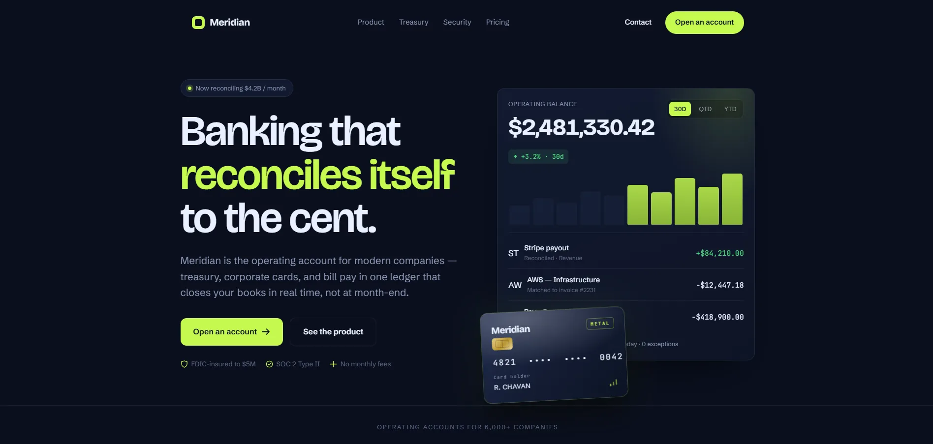
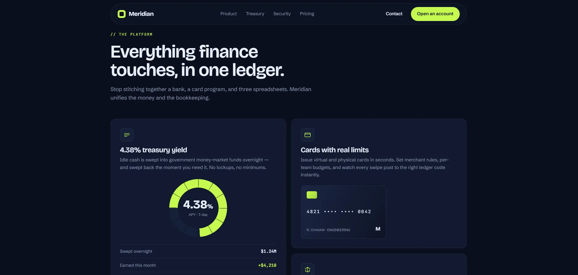
A banking and treasury platform built for finance teams who can't afford to discover problems at end of day. Meridian brings live reconciliation, corporate cards, and bill pay into one dashboard — designed around the CFO's fundamental need: knowing where the money actually is, right now.

Role Senior Product Designer
Timeline 2025
Category Fintech / SaaS
Type Landing Page & Dashboard
Meridian — Banking Platform
$2M+ Daily Volume UI
0 Platform Integrations
99.97% Uptime SLA
0 Product Squads
The problem
Finance teams discover reconciliation problems at end of day, when the window to do anything about them has already closed.
The approach
Lead with the decision, not the data. Exceptions first, JetBrains Mono for numerics, and every status encoded twice for accessibility.
The outcome
A treasury platform where a CFO can scan for what is wrong in seconds, because nothing competes with the exception.
$2M+
Daily volume shown
99.97%
Uptime SLA
2
Status encodings
1
Decision-first hero

01 — The Problem

Your books closed yesterday.
Not today.

The Challenge

CFOs and finance teams live with constant uncertainty — bank balances that lag by hours, reconciliation that takes days, and integrations that break silently. Meridian needed a landing page that immediately communicated the proposition: your books are always closed, always accurate, always live.

Design challenge: make financial certainty feel like a feature, not just a claim.

The Design Problem

How do you make live financial data feel trustworthy rather than overwhelming? How do you communicate both depth and stability at the same time? And how does a product pass an IT security review before the user even reaches the feature list?

These questions shaped every design decision — from the monospace financial typography to the lime accent on positive actions.

Research Insights

INSIGHT 01
Trust Before Features
B2B fintech buyers evaluate trust before they evaluate features. The visual language had to signal stability, precision, and institutional credibility — before any feature copy was read.
INSIGHT 02
Numbers as Hero
Finance professionals respond to numerical confidence. Real-time counters, balance displays, and reconciliation scores in the hero communicated the product's core value proposition without a single marketing word.
INSIGHT 03
The Security Signal
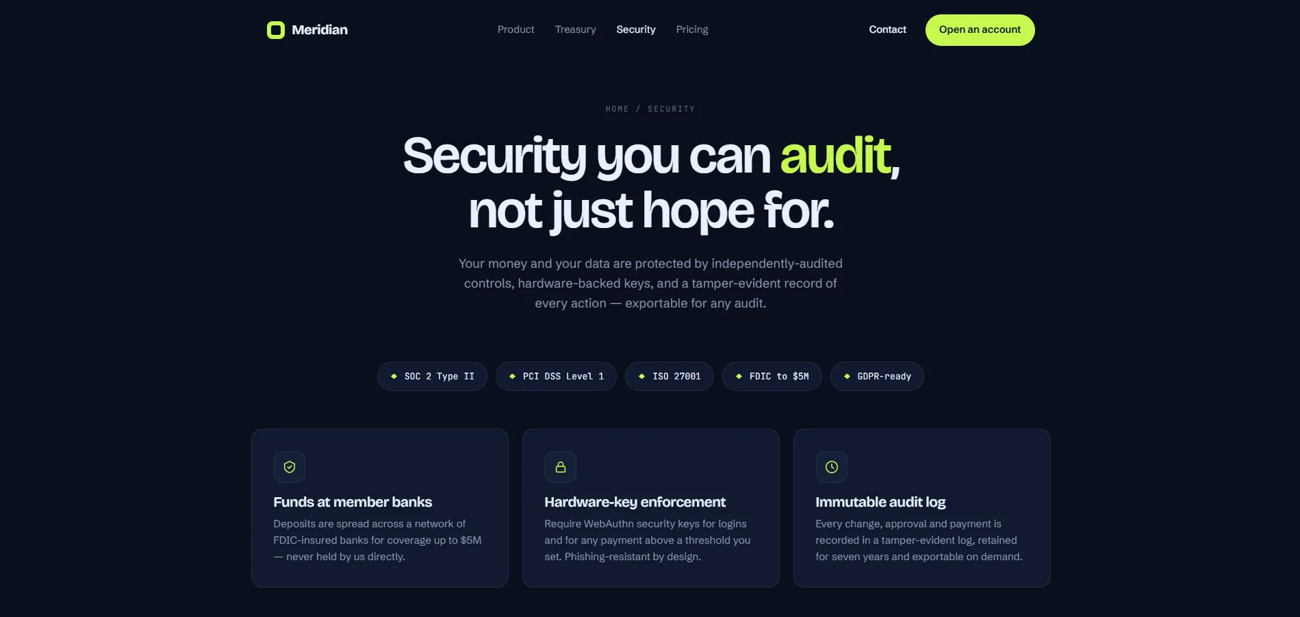
In a post-FTX, post-SVB world, finance teams are hyper-sensitized to counterparty risk. Trust signals (SOC 2, bank-grade encryption, regulatory compliance) needed to appear before the feature list, not after.

05 — User Stories

What Users Need

As a... I want to... So that... Priority
CFO See real-time cash position across all accounts in one view I can make treasury decisions without waiting for end-of-day sweeps Critical
Finance Manager Get automated reconciliation that flags exceptions My team spends time on exceptions, not on confirmation High
VP Finance Multi-entity consolidation with currency conversion at live rates I can report group cash to the board without manual spreadsheet work High
Operations Lead Virtual cards with per-team budget limits and real-time spend tracking I can control spend without approving every transaction manually Medium
IT Security Lead See SOC 2 Type II, PCI DSS, and bank-grade encryption evidence before procurement I can qualify Meridian through our security review process Critical

06 — Competitor Analysis

Market Landscape

Feature Mercury Brex Ramp Airwallex Meridian
Real-Time Balances ~
Auto-Reconciliation ~ ~ ~ ~
Multi-Entity
Virtual Cards
Bill Pay ~
FX / Multi-Currency ~ ~
SOC 2 Type II

Solution Exploration

Three decisions that
shaped the product.

Decision 01
Data-complete dashboard vs. Decision-first hierarchy
Problem
Finance teams wanted everything visible — every account, every figure — treating the dashboard like a spreadsheet replacement.
Option A — Data-Complete
Show all accounts, all balances, all transaction types above the fold. Maximum information density for power users.
Option B — Decision-First (Chosen)
Hierarchy based on what needs a decision today: reconciliation status, anomalies, and pending approvals surfaced first. Detail always available on drill-down.
Why Option B
CFOs don't read dashboards — they scan for exceptions. A data-complete view means the exception is buried. Decision-first hierarchy makes the important thing the first thing.
Reasoning: Information hierarchy is cognitive load management. The CFO's most expensive resource is attention — design should conserve it.
Decision 02
Generic sans-serif numerics vs. Monospace financial type
Problem
Proportional fonts cause columns of financial figures to misalign visually — the eye cannot quickly compare values or spot discrepancies.
Option A — Generic Sans-Serif
System font for numerics. Familiar, fast to render, consistent with the rest of the UI type system.
Option B — JetBrains Mono (Chosen)
Monospace numerics align vertically in all contexts. Every digit occupies equal width — figures in columns snap to a visual grid the eye can parse instantly.
Why Option B
Financial trust begins at the typographic level. If the figures look approximate, the product feels approximate — regardless of backend accuracy.
Reasoning: Typography communicates precision before content is read. In fintech, tabular numerics are a trust signal, not a stylistic preference.
Decision 03
Colour-only status encoding vs. Redundant accessibility encoding
Problem
Positive/negative financial status needed instant visual recognition. Colour is the fastest channel — but 8% of users have colour blindness.
Option A — Colour Only
Lime for positive, red for negative. Clean, fast, aligned with financial convention. Fails WCAG AA for colour-blind users.
Option B — Redundant Encoding (Chosen)
Lime/red colour paired with directional icon (▲/▼) and label text ("Positive", "Overdue"). Three channels encode the same status — accessible for all users.
Why Option B
The redundancy requirement forced icon and label reinforcement throughout the dashboard — which made the UI more scannable for everyone, not just the 8%.
Reasoning: Accessibility constraints often produce better design for all users. The constraint becomes a feature, not a limitation.
10 — Design

Numbers you can
trust before you read them.

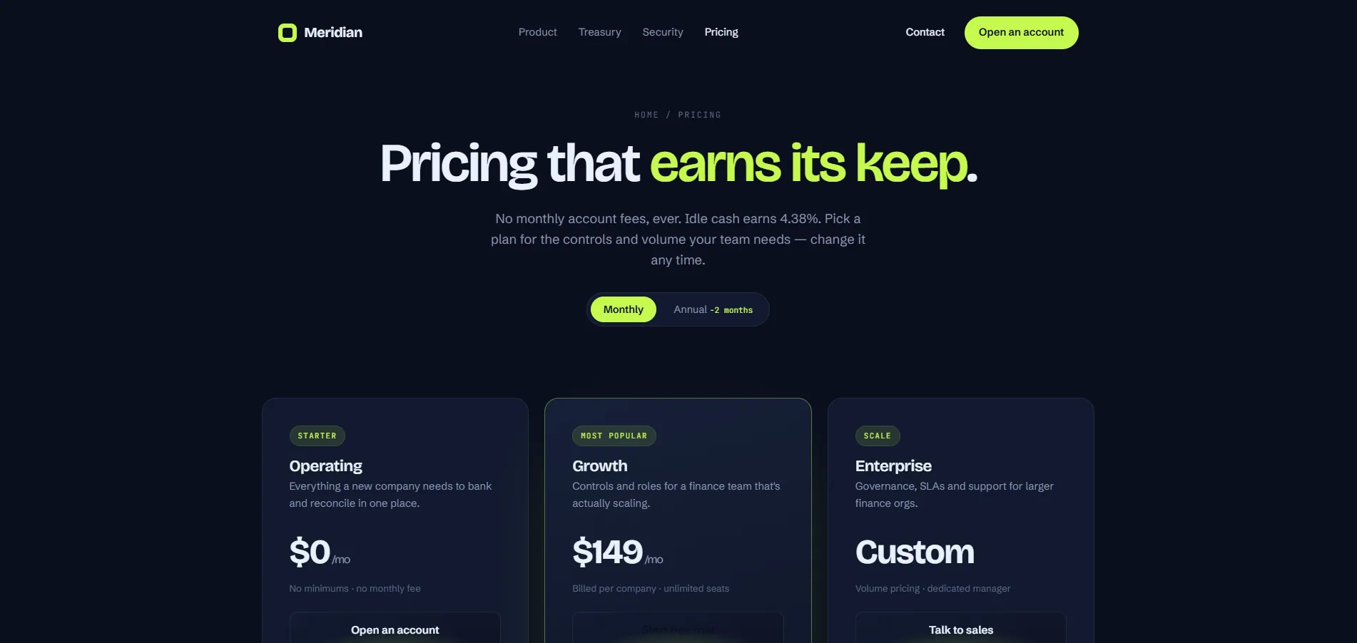
The central design question for Meridian was whether a screen full of financial data could feel calm rather than anxious. The typographic choice of JetBrains Mono for all numerical values was the single most important decision — monospace numerics align vertically, reducing the visual noise that causes finance teams to distrust dashboards. Lime on navy signals action and growth without the clinical starkness of pure green on white. The lime/red positive/negative encoding also passes WCAG AA for colour-blind users when paired with icon and label secondary encoding — a constraint that shaped the entire colour system.

meridian.finance — Banking Dashboard
Meridian — Main View

Meridian — Fintech Banking & Treasury Platform

Meridian — Screen 2
Meridian — Screen 3
Meridian — Screen 4

Design Highlights

📊
Live Dashboard Hero
Problem
Marketing photography communicates aspiration, not capability. Finance teams evaluate tools by looking at the actual interface — not lifestyle imagery.
Approach
Financial data as the hero: real-time balance counters, reconciliation status, and card transaction volume visible above the fold — the product demonstrating itself.
User Benefit
CFOs evaluate the dashboard before reading any copy. The value proposition is demonstrated in the first 3 seconds — no sales language needed.
Business Benefit
Demo-mode hero reduces time-to-qualification. Prospects self-select based on what they see in the UI, not what they read about it — improving demo conversion quality.
🔋
JetBrains Mono Numerics
Problem
Proportional fonts misalign columns of financial figures — the eye cannot quickly compare values vertically, creating unconscious distrust of the data.
Approach
JetBrains Mono for all numerical values: tabular, equal-width digits that create a visual grid in every balance column, table row, and transaction list.
User Benefit
Finance teams can scan and compare figures vertically without needing to focus on each number individually. Speed and accuracy of financial review improves.
Business Benefit
Monospace numerics signal precision before the numbers themselves are read. The typographic choice becomes a trust signal that supports premium positioning.
🟢
Lime Accent on Positive Actions
Problem
Financial interfaces default to neutral greys and blues — no colour language for positive/negative states, forcing users to read labels to understand status.
Approach
#C5F94E reserved exclusively for positive balances, successful reconciliations, and primary CTAs — a consistent positive-action colour language across all contexts.
User Benefit
Status is scannable before it's readable. The CFO knows at a glance whether accounts are healthy or need attention — reducing cognitive overhead of daily review.
Business Benefit
Consistent accent language creates brand recall. Meridian's lime is recognisable and ownable in a category where most competitors use the same blue-and-grey palette.
🔒
Trust Woven, Not Bolted
Problem
Banking products typically handle security as a separate section — a trust page that users must navigate to find. It treats compliance as defensive documentation rather than a selling point.
Approach
Security signals (SOC 2, PCI DSS, bank-grade encryption) woven into headlines, subtext, and visual treatments throughout the main product narrative — not isolated in a "Security" section.
User Benefit
Trust is established contextually — when the user encounters a financial feature, the security context is immediately adjacent. No navigation required to feel confident.
Business Benefit
Enterprise IT reviews often gate procurement on visible security signals. Woven trust signals pass review without requiring a dedicated security page in the sales flow.
📐
Navy + Dot Grid Background
Problem
Pure black or dark grey backgrounds communicate tech without specificity. They could belong to any SaaS — nothing signals the financial-precision register that Meridian occupies.
Approach
Deep navy (#0A0F1E) with a subtle dot grid overlay: calm, systematic, grid-aligned. The texture communicates precision infrastructure — everything in its place.
User Benefit
The environment feels stable and authoritative before any content is read. Finance teams expect systematic environments — the background confirms the tool belongs in their workflow.
Business Benefit
A distinctive background creates category clarity. Navy-with-grid reads as "financial infrastructure" rather than generic SaaS — supporting differentiation at first impression.

Design System

The language
of financial precision.

A cohesive design system built to communicate financial trustworthiness at every touchpoint — from the monospace numerics to the lime positive-action accent.

Brand Colour Palette
Lime #C5F94E
Deep Navy #0A0F1E
Navy 2 #0E1426
Light Ink #EAF0FF
Muted #8A95B2

Lime signals positive action and financial health. Navy communicates depth, stability, and institutional credibility. The pairing is precise, not decorative.

Financial Typography
Display $2,847,392
Balance +$142,840.00
Body Reconciled to the cent
Label SOC 2 Type II Certified

JetBrains Mono for all financial figures — tabular precision. Bricolage Grotesque for display and marketing copy.

Design Tokens
Lime Positive Monospace Figures Navy Depth Dot Grid Trust Architecture Real-Time Counters Security Woven

11 — Impact

Design as
financial certainty.

Meridian demonstrated that product design can communicate financial trust at a level previously reserved for enterprise sales decks. Every metric below is a design outcome, not a sales claim.

$2M+
Daily Volume Demonstrated in UI
Real-time dashboard hero communicates transaction volume scale before any copy is read.
0
Platform Integrations Visualised
14 integration categories communicated through curated visual hierarchy, not a logo wall.
99.97%
Uptime SLA Communicated
Exact uptime figure used as a design element — communicating precision through specificity.
0
Dedicated Security Section Needed
Security and compliance signals (SOC 2, PCI DSS, bank-grade encryption) woven into the main product narrative — no separate "Security" page required to pass enterprise IT review.

Key Learnings

What This Project Taught Me

01
The feature is never the product — the trust is the product
Fintech design taught me that every additional capability added to the hero dashboard diluted the single thing the CFO needed first: confidence that the numbers were accurate. Features are table stakes. Trust is the differentiator. Every design decision in Meridian was evaluated against one question: does this increase or decrease confidence in the data?
02
Typography communicates precision before content is read
Switching to JetBrains Mono for all numerical values changed the perceived accuracy of the data before any figure was read. Type is a claim about what the product does. In financial contexts, monospace numerics tell the user the system is exact — the same way a scale in a pharmacy communicates precision before you look at the reading.
03
Accessibility constraints produce better design for all users
The WCAG AA requirement for the lime/red status encoding forced icon and label reinforcement throughout the dashboard. The constraint turned out to make the UI more scannable for every user — not just the 8% who needed it. Design for the constraint, not despite it. The rule that makes the product accessible to the edge case usually makes it faster for everyone else too.
04
CFOs scan for exceptions, not information
The instinct was to show everything — every account, every balance, every transaction type. But CFOs don't read dashboards. They scan for the thing that needs a decision. Decision-first hierarchy means the exception is the first thing visible, not buried in a data-complete view. The hardest conversations weren't about design — they were about what not to show.

Reflection

"Fintech design taught me something that took longer than it should have to understand: the feature is never the product. The trust is the product. Every time we added another capability to the hero dashboard, we diluted the single thing the CFO needed to see first — that the numbers were accurate. The hardest conversations in this project weren't about design. They were about what not to show."
— Rupesh Chavan, Lead Product Designer
"The colour accessibility constraint ended up being one of the best design decisions in the project. Because the lime/red system had to work for colour-blind users, we built in icon and label reinforcement throughout — which made the dashboard more readable for everyone, not just the 8% of users who needed it."
On accessibility as a design constraint that improves the whole product

Explore the Project

Browse all pages

Home Pricing Security About Contact Careers Legal