Native Android App / Membership Primary Care

Not a patient portal.
A care surface.

Vera is the member companion app for a membership-based primary care service — the daily-use surface of the membership. Members book same-day visits, message a four-person care team, and read results explained like a human wrote them. The design brief was unusually specific: it had to feel handcrafted and calm, and never once like hospital software.

Role Product Design & Build
Timeline 2026
Category Healthcare / Mobile App
Type Native Android · Kotlin & Compose
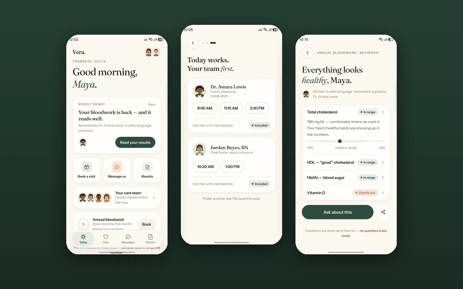
Vera — Today, booking and results screens
0 Screens Designed & Built
0 Care Team Roles
0% Jetpack Compose
AA WCAG 2.2 Target
The problem
Patient portals are built for the clinic’s records, not the member’s day — so people only open them when something has already gone wrong.
The approach
Treat the care team as the product. Names, faces and plain language first; the clinical value second, never the other way round.
The outcome
A native Android member app where booking a visit takes a sentence, not a history quiz, and the record reads like a person wrote it.
24
Screens built
4
Care team members
AA
WCAG 2.2 target
100%
State survives death

01 — The Problem

Patient apps surface records.
They rarely surface care.

The Challenge

A membership primary care service sells a relationship — same-day access, unhurried 40-minute appointments, and a named team who know your history. But the app that members actually open every week is usually a patient portal: a records database with a login screen bolted to the front.

If the app feels like hospital software, it quietly contradicts the thing the membership is selling. The product had to carry the promise, not just store the data.

The Design Problem

Design a native Android app that feels handcrafted and premium while handling genuinely anxious moments — a result landing, a child's fever at 9pm, a bill you weren't expecting.

Two things had to be true at once: the app needed to look like nothing else in healthcare, and it needed to behave with total predictability when someone is worried. Craft could never come at the cost of calm.

Research Insights

INSIGHT 01
A Portal Is a Filing Cabinet With a Login
Most patient apps organise around the provider's data model — Documents, Encounters, Claims. Members do not think in those categories. They think in questions: when can I be seen, what did my result mean, who do I ask. The information architecture had to follow the question, not the database table.
INSIGHT 02
Unattributed Care Reads as No Care
"Your care team will respond within 24 hours" is a queue. "Jordan Reyes, RN usually replies within the hour" is a person. Attribution — a name, a role, a face — is the mechanism that converts a service into a relationship, and it has to appear everywhere care is referenced, not once on an About screen.
INSIGHT 03
Families Are the Real Account
The person holding the phone is frequently not the patient. Parents manage children, adults manage ageing parents. Apps that treat the account holder as the only patient force constant logout-and-switch friction at exactly the moments that matter most — a sick child at night.

08 — Solution Exploration

Three decisions that
shaped the app.

Decision 01
Feature-grid dashboard vs. One derived hero card
Problem
The home screen has to serve a member with nothing happening, one with a visit in two hours, and one with an unread result. Showing all three at once means none of them lead.
Option A — Feature Grid
A tile per capability: Book, Messages, Record, Care Plan, Billing. Complete, predictable, and effectively a menu — it hands the member a directory and asks them to self-triage.
Option B — Derived Hero (Chosen)
A single contextual card computed from live state, in strict priority order: next appointment, then unread result, then a warm default. Quick actions sit below it, not beside it.
Why Option B
A member opening the app almost always has one live concern. Deriving it removes the triage step entirely — reading a result moves the card on to whatever is next.
Reasoning: A dashboard asks "what do you want to do?" A derived hero answers "here is the thing that matters right now." In care, the second question is the useful one.
Decision 02
Confirmation screen vs. Shared-element morph
Problem
Booking ends in a moment of uncertainty — did that work? A new screen pushing in from the right is a navigation event, not an acknowledgement. It reads as "form submitted."
Option A — Push Confirmation
Standard forward navigation to a success screen with a checkmark. Conventional, cheap to build, and emotionally inert at the highest-anxiety point of the flow.
Option B — Chip Morph (Chosen)
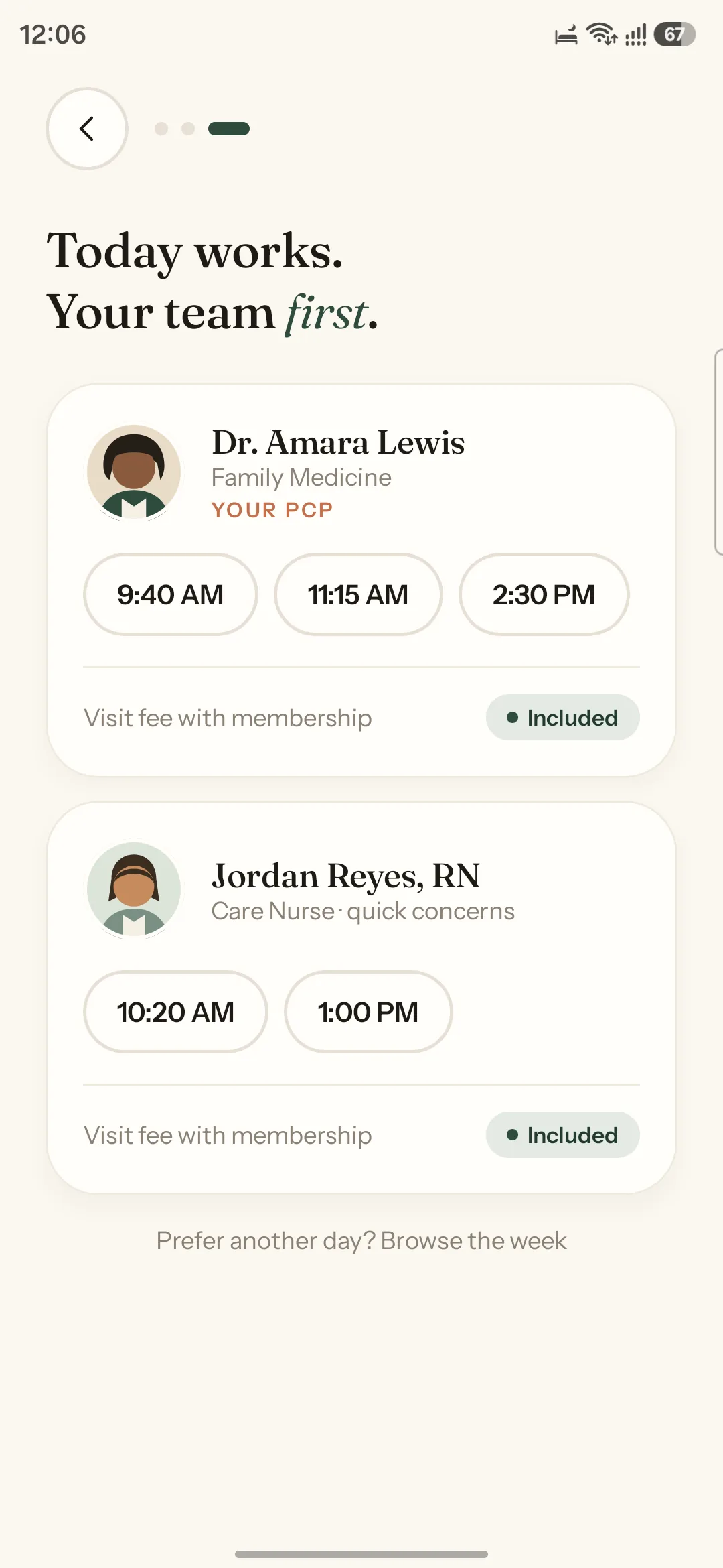
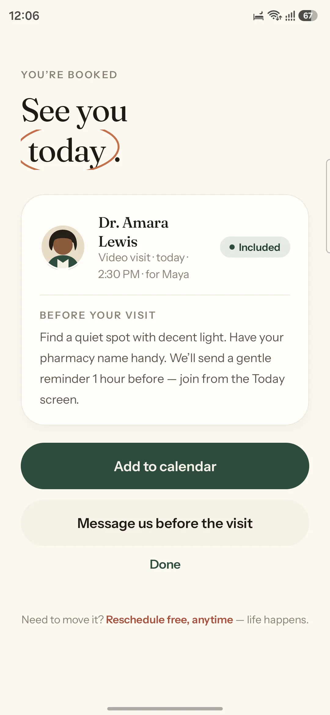
The tapped time chip physically morphs into the confirmation card via SharedTransitionLayout, with a hand-drawn terracotta circle drawing itself around "today."
Why Option B
Continuity of object proves causality. The thing you touched became the thing you now have — no mental work is required to connect the tap to the outcome.
Reasoning: Motion is the cheapest reassurance in an anxious flow — but only when it is doing semantic work. A morph explains; a slide merely transitions.
Decision 03
Clinical values first vs. Plain language first
Problem
Lab results are the single highest-anxiety surface in any health app. Opening on a table of values and reference ranges sends people to a search engine, frightened, within seconds.
Option A — Values First
The clinical convention: analyte, value, unit, reference range. Complete and precise, and completely unreadable to the person whose body it describes.
Option B — Sentence First (Chosen)
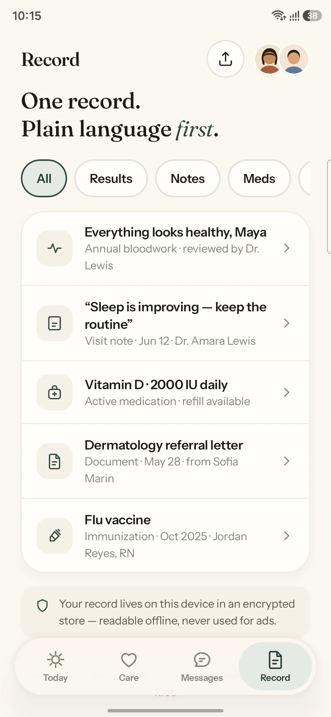
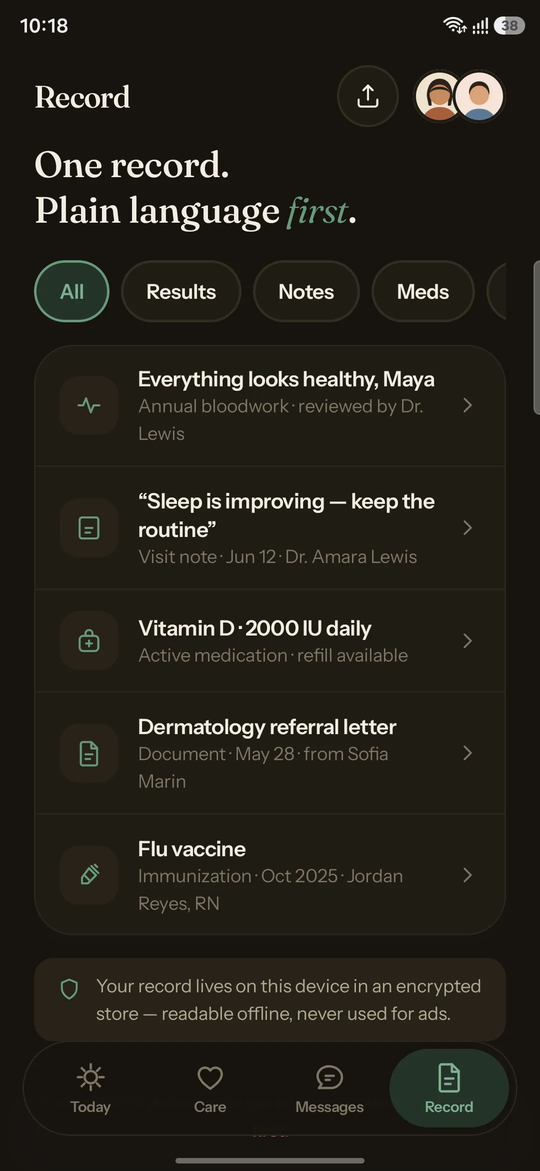
A human headline opens the screen — "Everything looks healthy, Maya" — attributed to the reviewing physician by name and face. Warm gauges and values sit below, expandable.
Why Option B
The member's actual question is "am I okay?" Answering it in the first line, signed by a named clinician, resolves the anxiety before the detail is offered rather than after.
Reasoning: Data without interpretation transfers the clinician's work to the patient. An "Ask about this" button on every result keeps the loop closed with a human.

09 — Final Solution

Editorial warmth,
engineered restraint.

The finished app reads as a considered object rather than a utility. A warm cream canvas, deep botanical green, and terracotta used sparingly. Fraunces sets every headline with real optical-size and weight axes; Instrument Sans carries the interface. Motion is present everywhere and loud nowhere — and it all collapses to calm fades the moment reduce-motion is switched on.

Vera — Today, booking and result screens

Vera — Today, same-day booking, and a plain-language result

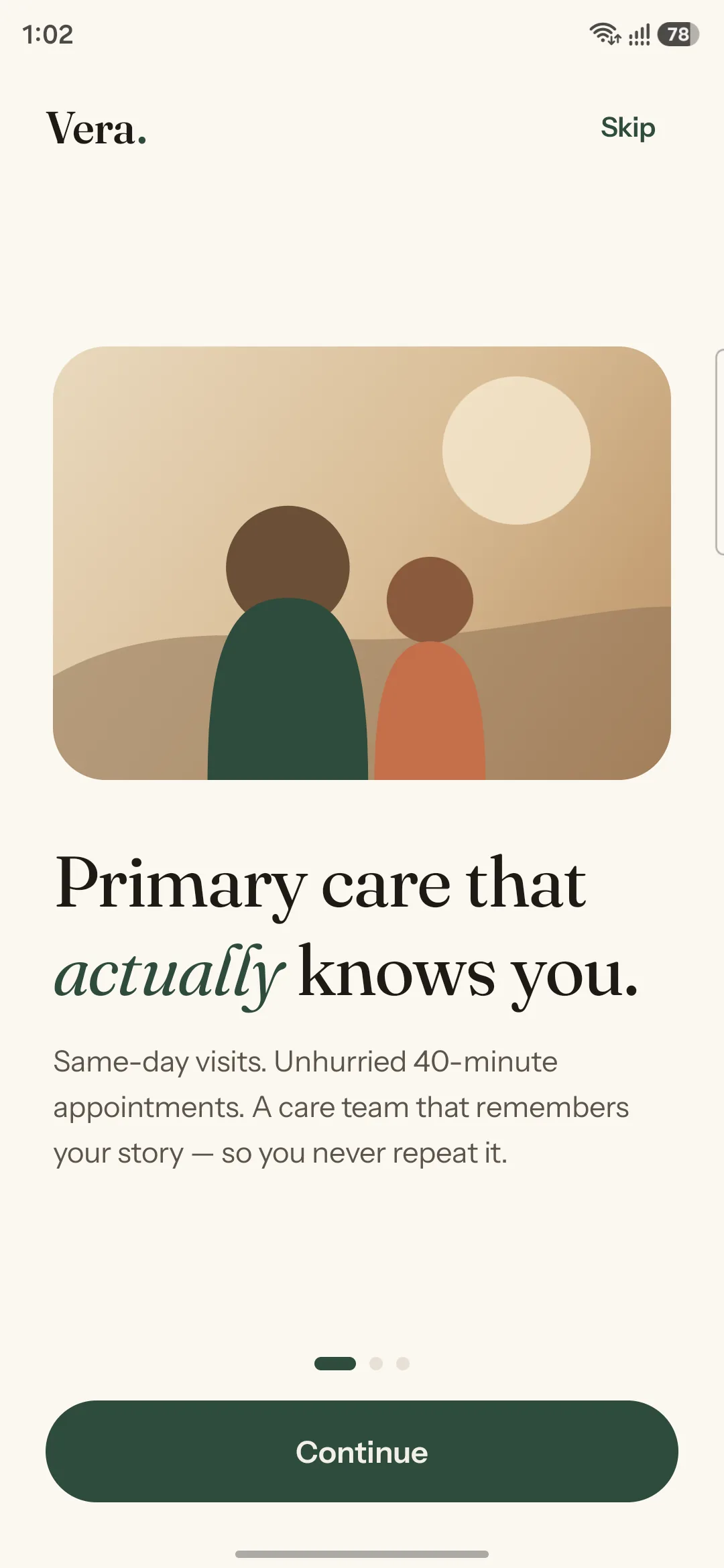
Editorial onboarding
Onboarding — editorial brand moment
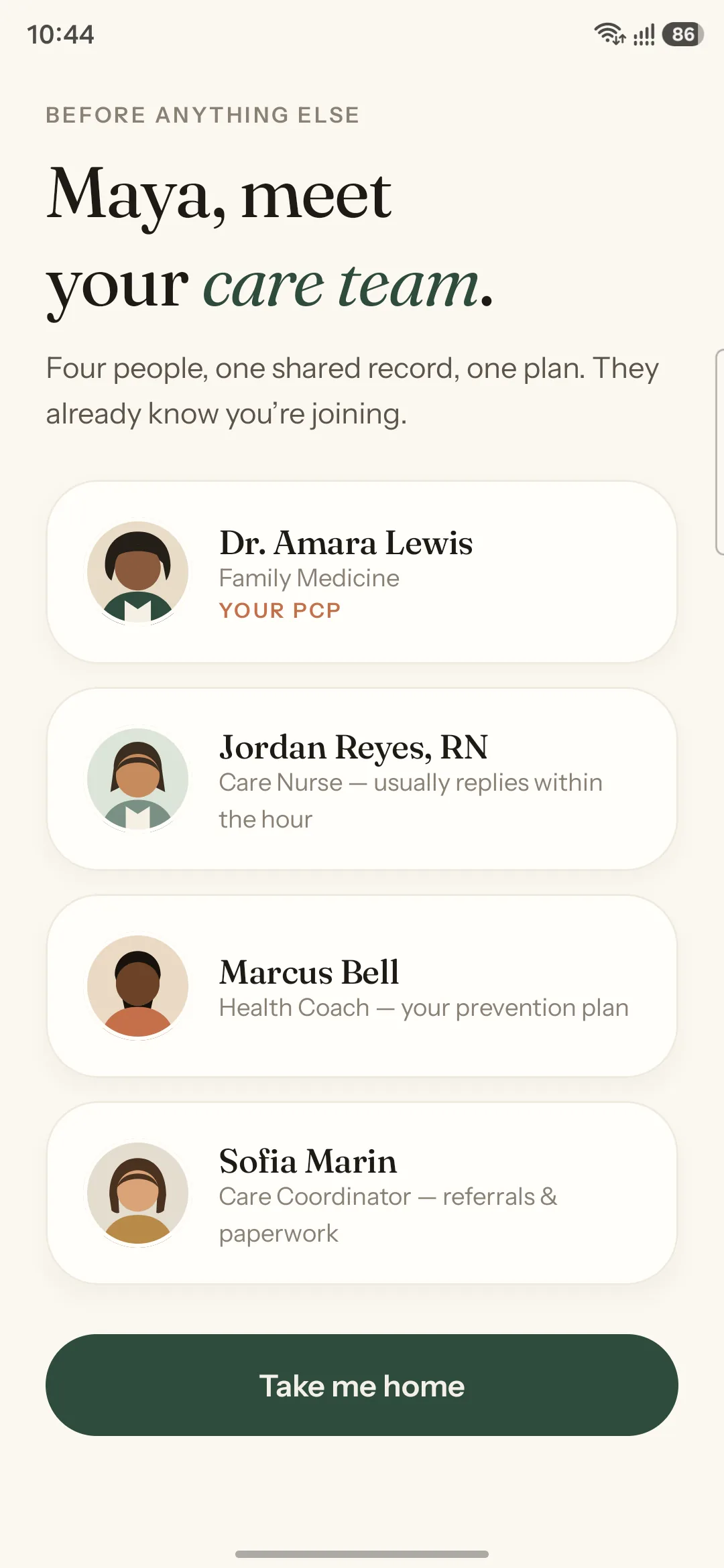
Meet your care team
Meet your care team — first run
Same-day slots
Same-day slots — your team first
Booking confirmed
Confirmed — the chip becomes the card
Team message thread
Messages — one thread, whole team
Health record
Record — plain language first
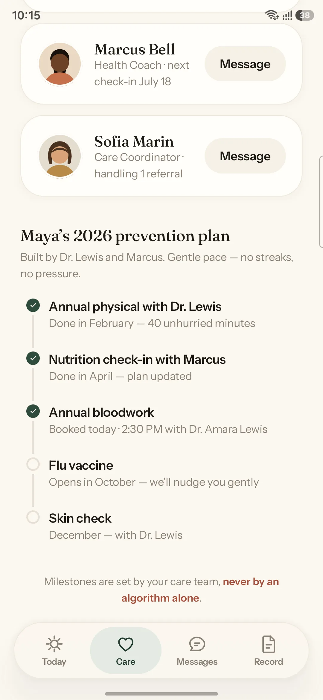
Prevention plan
Prevention plan — milestones complete themselves
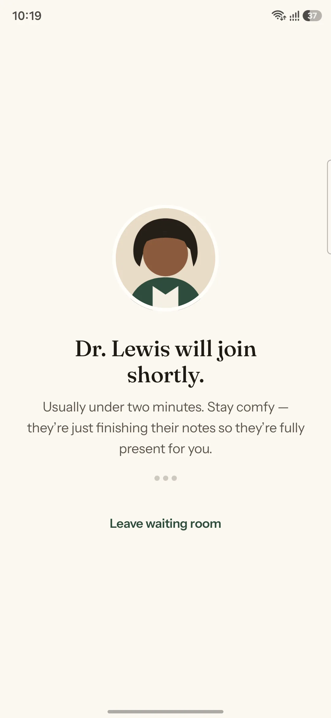
Video visit waiting room
Waiting room — a breathing portrait
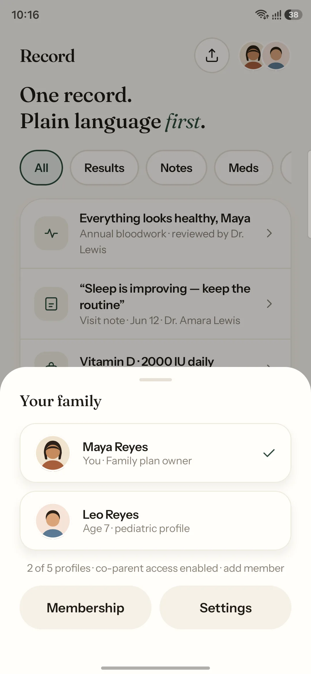
Family profile switcher
Family — one tap to a child's profile
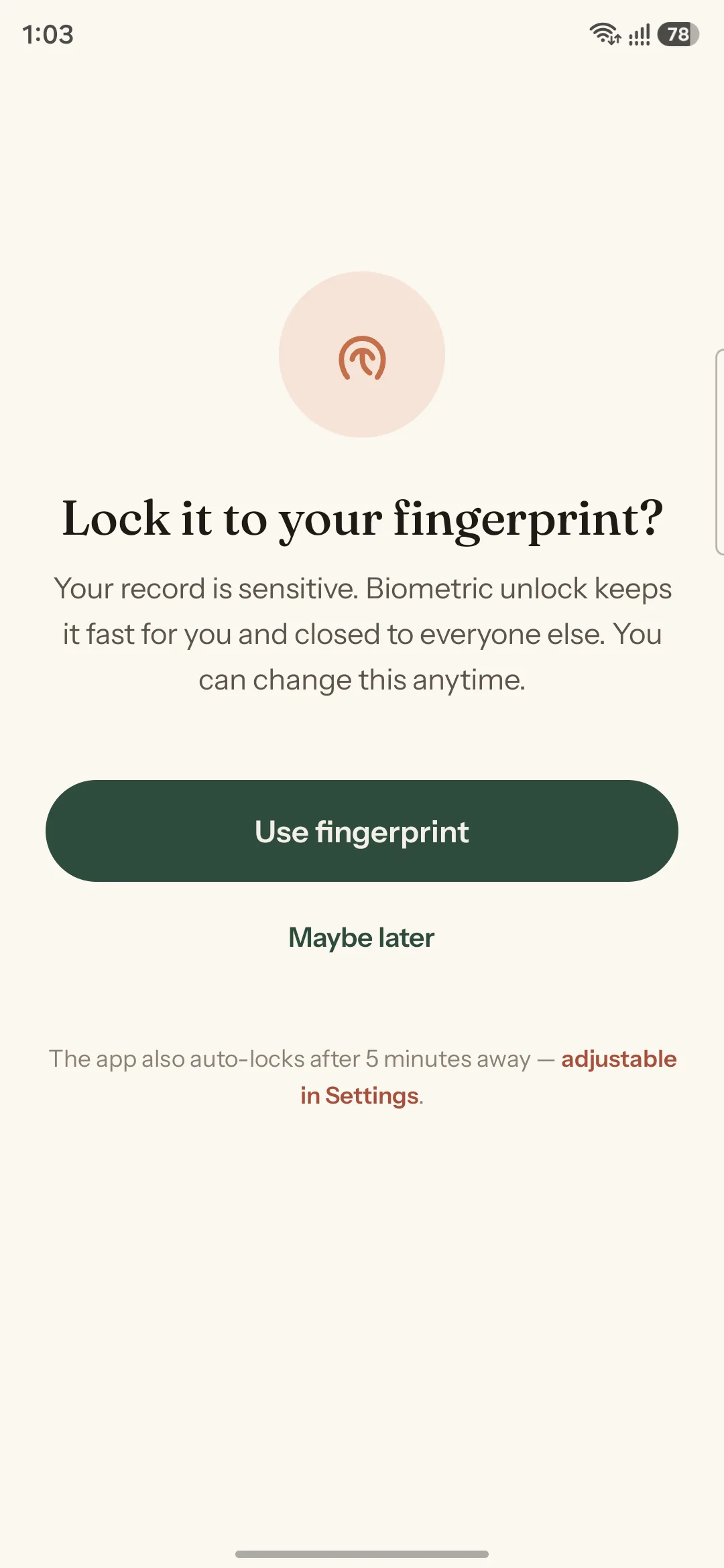
Biometric opt-in
Biometric app lock — opt-in, explained
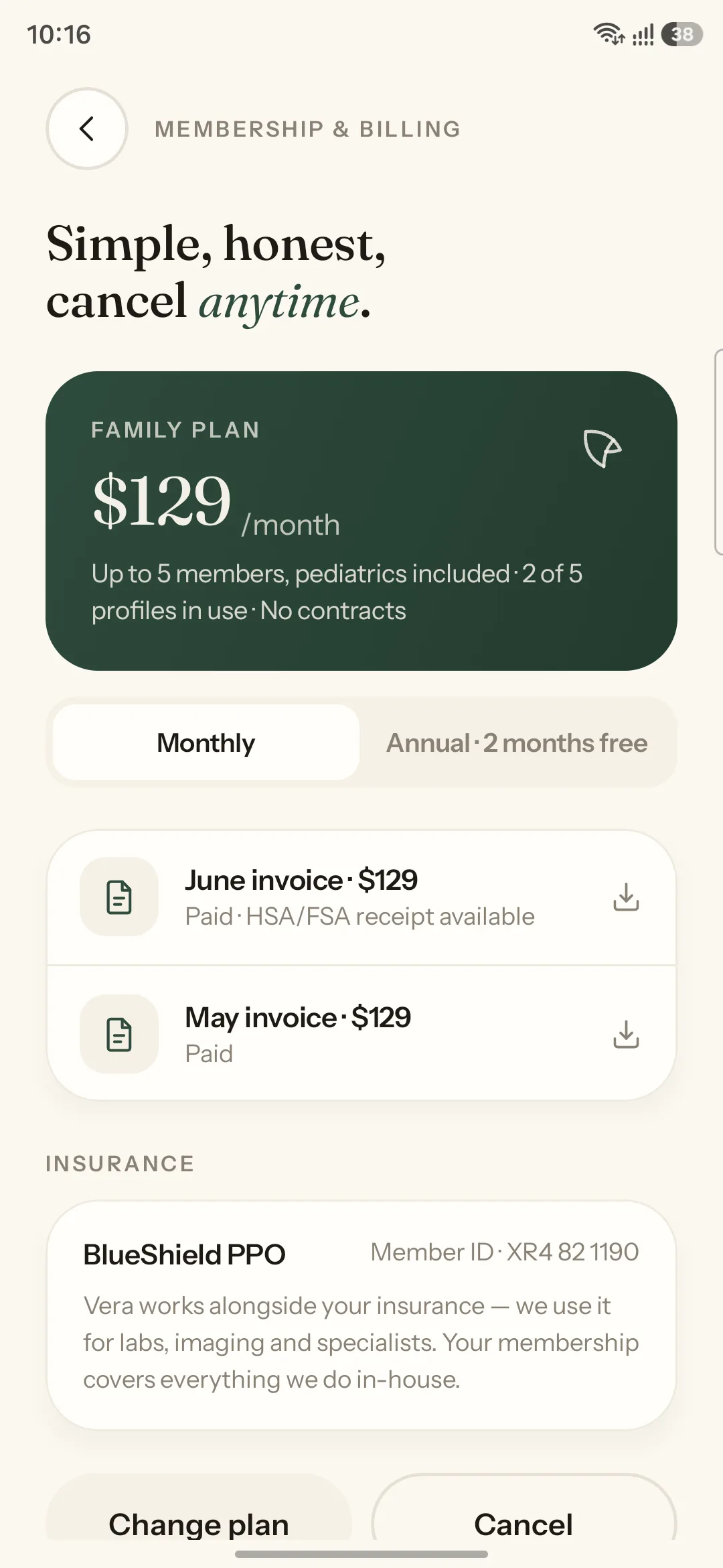
Membership billing
Membership — honest billing, cancel anytime
Candlelit dark mode
Candlelit dark mode — warm charcoal, never slate

Design Highlights

🧠
The Today Hero, Derived
Problem
A static dashboard shows every capability with equal weight, forcing the member to self-triage at the exact moment they came in with one specific concern.
Approach
A single hero card computed from live Room state in strict priority order — next appointment, then unread result, then a warm default prompt. Acting on it recomputes it.
User Benefit
The app opens on the thing that actually matters. Reading a result moves the card on; booking a visit turns it into the appointment. Nothing has to be hunted for.
Business Benefit
Members reach their intent in one tap instead of three, which is what makes a membership app feel worth its monthly fee rather than like an obligation.
📰
Fraunces Editorial Headlines
Problem
Health apps default to neutral geometric sans-serifs, which read as system software. The type communicates infrastructure rather than a relationship with a clinician.
Approach
Fraunces variable serif on both optical-size and weight axes for every headline, with Instrument Sans carrying body and UI. Headlines rise line-by-line on entry.
User Benefit
Screens read like something written for the member rather than generated for them — the difference between a letter and a receipt, achieved before a word is parsed.
Business Benefit
Editorial typography in a category of geometric sans is instantly ownable. The app is recognisable from a screenshot, which matters for a referral-driven membership.
👩‍⚕️
Care Attributed to a Named Human
Problem
"Your care team will respond" describes a queue. Unattributed care reads as institutional, which is precisely what a membership model is sold as an escape from.
Approach
Four named people with illustrated avatars and roles, introduced at first run and present everywhere care appears — booking slots, message replies, result sign-offs.
User Benefit
Members know who they are talking to and who reviewed their result. Continuity is visible rather than promised, which is the entire premise of the membership.
Business Benefit
Relationship continuity is the retention mechanism in membership primary care. Making the team visible in-app converts an abstract benefit into a daily, felt one.
✍️
The Booking Morph
Problem
Confirmation screens that push in from the side read as navigation, not acknowledgement. At the highest-uncertainty point in the flow, that is a wasted moment.
Approach
SharedTransitionLayout morphs the tapped time chip directly into the confirmation card, while a hand-drawn terracotta circle draws itself around the word "today."
User Benefit
Causality is shown rather than stated — the thing you touched became the thing you have. The "did that work?" question never gets a chance to form.
Business Benefit
Booking is the core repeat action of the membership. A confirmation that feels satisfying rather than transactional makes the primary loop something members return to.
🔒
Trust Built In, Not Bolted On
Problem
Health security measures — locks, secure screens, emergency disclaimers — are friction by nature. Placed badly they make a calm product feel bureaucratic and defensive.
Approach
Real BiometricPrompt app lock as an explained opt-in, FLAG_SECURE on record and result screens in release builds, and a quiet permanent line: not for medical emergencies.
User Benefit
Protection is present without being performed. Typing emergency keywords into Messages raises a calm interstitial that routes to emergency services rather than a red alert.
Business Benefit
Health data handling is a licence-to-operate requirement. Designing the safeguards into the flow rather than around it avoids the retrofit that usually breaks the experience.

10 — Design System & Scalability

A system built
for warmth at scale.

Every token was chosen against a single test: does this feel like a considered object, or like software? The dark theme is the clearest example — a warm charcoal described in the brand lock as "candlelit," explicitly never a cold slate, because a health app opened at 2am should still feel like somewhere safe.

Brand Colour Palette
Canvas #FBF7F0
Botanical #2E4B3C
Terracotta #C4704B
Ink #1E1B16
Candlelit #17140F
Typography
Fraunces
Display · variable opsz + wght axes · every headline
Instrument Sans
Body & UI · variable · dynamic type honoured
Motion Language

Soft springs at roughly 0.75 damping and 300–400 stiffness, 200–450ms, every animation interruptible. Provider cards cascade in, headlines rise line-by-line, the waiting-room portrait breathes.

Reduce-motion is a first-class state, not a fallback: every spring and reveal collapses to a 150ms fade with no layout change.

Accessibility Rules

Colour is never the only signal — every status is colour plus icon plus words. Touch targets at or above 48dp. Body contrast checked against the warm palette to WCAG 2.2 AA.

An in-app larger-text toggle scales everything without breaking a layout, and plain-language-first content design applies to every clinical item in the record.
11 — Outcomes & Impact

A product, not
a prototype.

Vera was designed and built end-to-end as a working native Android application with a real local-first data layer — not a clickable mockup. The outcomes below describe what actually ships and runs, which is the honest measure for a self-directed product build.

0
Screens Designed & Built
24 distinct screens across onboarding, booking, video visits, messaging, record, family and billing — all shipping in the Compose codebase.
0
Stock Material Components
Zero default Material templates. The tab bar, icon set, avatars, cards, chips, gauges and switches were all built custom on Canvas and Compose.
0%
State Survives Process Death
Every booking, message, record item and milestone persists in Room and DataStore — kill the app, relaunch, and nothing is lost.
AA
WCAG 2.2 Target
Dynamic type, an in-app larger-text toggle, reduce-motion support, 48dp targets, and status never encoded by colour alone.

12 — Key Learnings

What This Project Taught Me

01
A care app is not a records app with better styling
The temptation throughout was to organise around the data model, because the data model is knowable and the member's mental model is not. Every time I followed the data — Documents, Encounters, Results — the screen got worse. The information architecture only started working when it followed the member's questions instead: when can I be seen, what did that mean, who do I ask. That reordering is the whole difference between a portal and a product.
02
Attribution is the cheapest trust mechanism available
Adding a name and a face to every place care is referenced cost almost nothing in engineering terms and changed the emotional register of the entire app. "Your care team will reply" and "Jordan Reyes, RN usually replies within the hour" carry identical information and completely different meaning. I now treat unattributed system copy as a design smell — if the product can name who is doing something, it should.
03
Motion earns its place by explaining, not decorating
The booking morph took far longer than a push transition would have, and it is the single most valuable interaction in the app. The distinction I kept returning to: does this animation carry information, or does it just fill time? A morph proves that the thing you touched became the thing you have. A slide proves nothing. Building reduce-motion in from the start also forced that discipline — if an animation could not be removed safely, it was doing structural work it should not have been.
04
Local-first is an emotional decision before a technical one
Building on Room and DataStore rather than waiting on a backend was originally a pragmatic choice. It turned out to be a design one. An app where a booking survives a force-quit feels solid in a way that is difficult to articulate and immediately obvious to use. Health software is used in bad network conditions during stressful moments, and an interface that loses your input at that moment does real harm to trust. Offline capability is a feature of the emotional experience, not just the architecture.

Reflection

"The brief said it should feel like a $10k handcrafted product and never like hospital software. What I did not expect is how often those two goals pointed in the same direction. Almost everything that made the app feel expensive — naming the clinician, opening a result with a sentence instead of a table, a confirmation that grows out of the thing you tapped — also made it calmer. Craft and care turned out to be the same discipline applied at different scales."
— Rupesh Chavan, Lead Product Designer
"Designing and building it myself changed what I was willing to argue for. When you know the morph is forty lines of SharedTransitionLayout rather than a sprint, you stop trading away the details that carry the whole feeling of a product. The gap between a design that is approved and a design that survives implementation is where most of the craft quietly disappears."
On designing and shipping the same product

Explore the Project

Try the real thing

The native Android app runs from source in Android Studio. Every screen below is captured from the running build on device — step through the full set with the arrow keys, or click any screen to open it full size.

All 24 Screens All Projects Vera Website Case Study