Native Android App / Senior-First Health Monitoring

Designed for Margaret, 74.
Which means everyone.

A remote blood-pressure app built around a single job: take a reading and log it, guided gently, for someone using a health app for the first time. The brief was never “add bigger fonts” — it was to design so well for a 74-year-old that everyone else gets the better product too.
Role Product Design & Build
Timeline 2026
Category Healthcare / Accessibility
Type Native Android · Kotlin & Compose
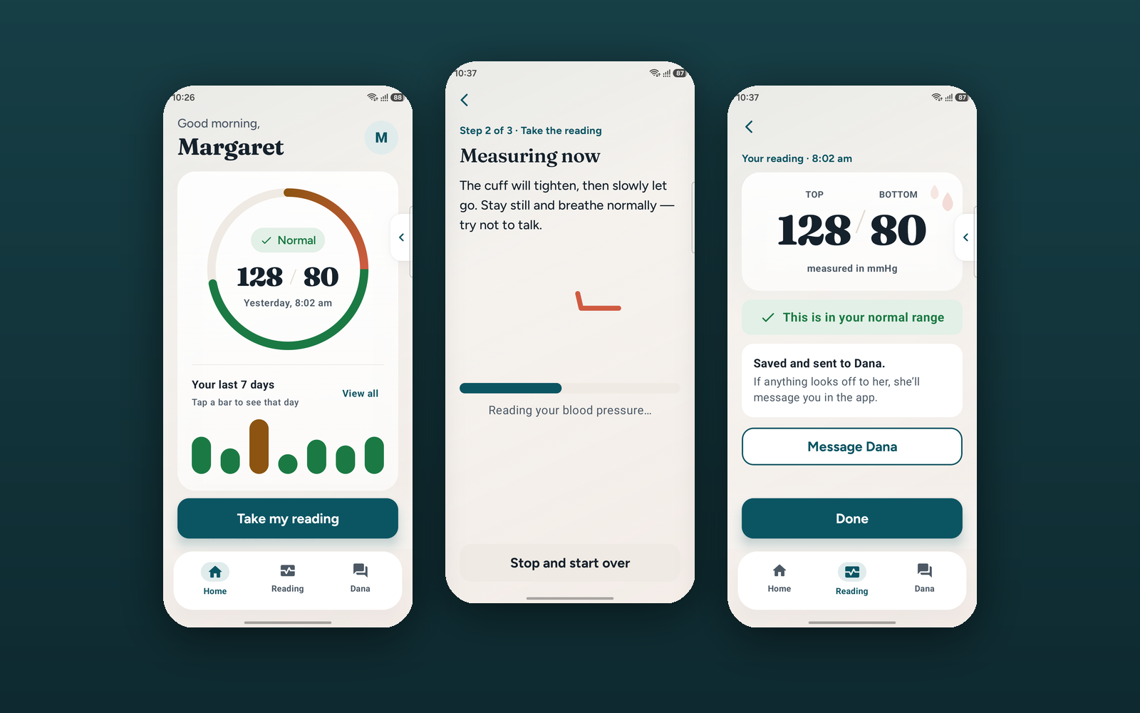
Vantage Care — home, measuring and result screens
The problem
“Accessible” usually means a normal app with bigger fonts — which reads to the user as the dumbed-down version.
The approach
Design it so well for Margaret, 74, that it becomes the better product for everyone — then hand her the controls instead of deciding for her.
The outcome
A shipping Android app with eight independent accessibility controls, where every screen survives all of them switched on at once.
8
Independent controls
7:1
Contrast · WCAG AAA
3
Steps to a reading
10
Screens shipped

01 — The Problem

"Accessible" usually means
a normal app with bigger fonts.

The Challenge

Margaret is 74. She was recently diagnosed with hypertension and told to take her blood pressure at home. She has never used a health app. Her vision is reduced, her hands are less steady than they were, and when an app does something she did not expect, she stops — because she assumes she broke it.

Most health apps treat her as an edge case to accommodate after launch. This one had to treat her as the primary user from the first screen.

The Design Problem

The reading depends on a Bluetooth cuff — hardware that fails, disconnects and runs out of battery. Most apps hide that dependency until it breaks, then present a technical error.

The real problem was honesty under failure: how do you tell a nervous first-time user that a device is not connected, without her concluding that she has done something wrong? Every error state had to be blameless and recoverable.

Research Insights

INSIGHT 01
Older Users Blame Themselves First
When something unexpected happens, less-confident users attribute the fault to themselves rather than the software, and often abandon the task entirely. Error copy that is merely neutral is not enough — it has to actively transfer blame away from the user and state the recovery step.
INSIGHT 02
Accessibility Preferences Are Personal, Not Categorical
"Designing for seniors" as a category produces a patronising average: everything huge, everything plain. Real needs are specific and combinatorial — someone may need a clearer typeface but not larger text, or haptic confirmation but not reduced motion. The user has to be able to choose.
INSIGHT 03
A Number Without Meaning Creates Anxiety
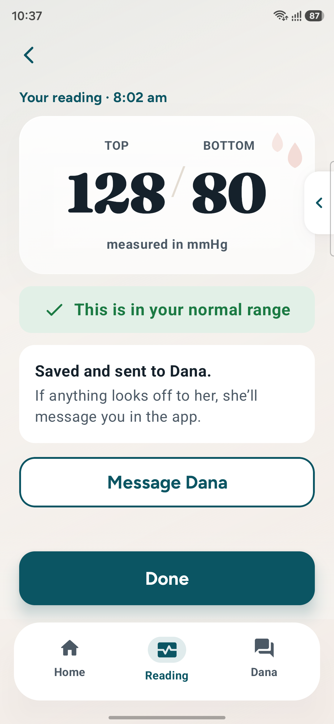
128/80 means nothing to someone newly diagnosed. Presented alone it invites a worried search online. The reading needs an immediate plain-language verdict — and a named human who has also seen it — before the user has a chance to interpret it alone.

08 — Solution Exploration

Three decisions that
shaped the app.

Decision 01
Designer-set accessibility vs. A user-controlled panel
Problem
"Senior-first" applied as a global style produces a patronising average — everything oversized and plain — that serves nobody precisely and signals "the simple version."
Option A — Fixed Senior Styling
Ship one large, high-contrast, low-motion theme for all users. Simple to build, visually consistent, and quietly condescending to the person it is aimed at.
Option B — Eight Controls (Chosen)
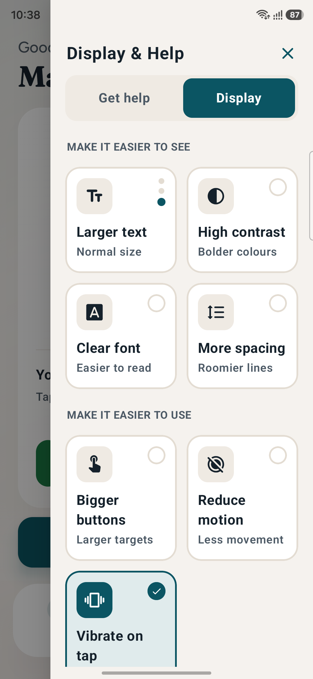
A Display panel with independent toggles: text size in three levels, high contrast, clear font, spacing, bigger buttons, reduce motion, haptic tap and read-aloud.
Why Option B
Real needs are combinatorial. Someone may need a clearer typeface but not larger text. Only the user knows their combination — the design's job is to make every combination work.
Reasoning: Accessibility applied as a preset is a guess about a person. Accessibility offered as controls is a conversation with them — and it stops the default from feeling like a downgrade.
Decision 02
One-tap measure vs. Three explicit guided steps
Problem
Fewer taps is usually better. But a blood-pressure reading depends on hardware pairing and correct posture — compressing that hides both the dependency and the technique.
Option A — Single Action
One "Measure" button that handles connection silently and reads the cuff. Fastest when everything works; opaque and frightening the moment anything does not.
Option B — Connect · Measure · Result (Chosen)
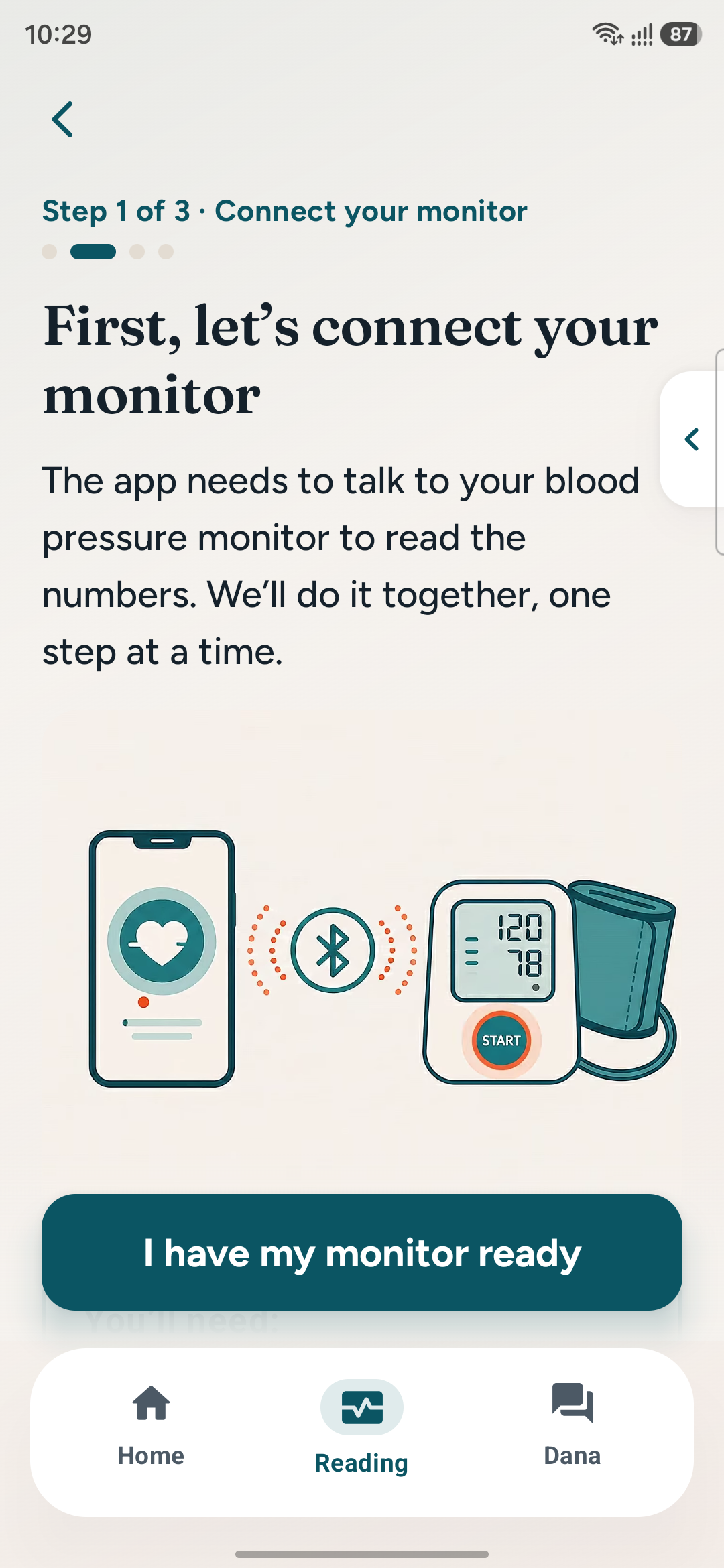
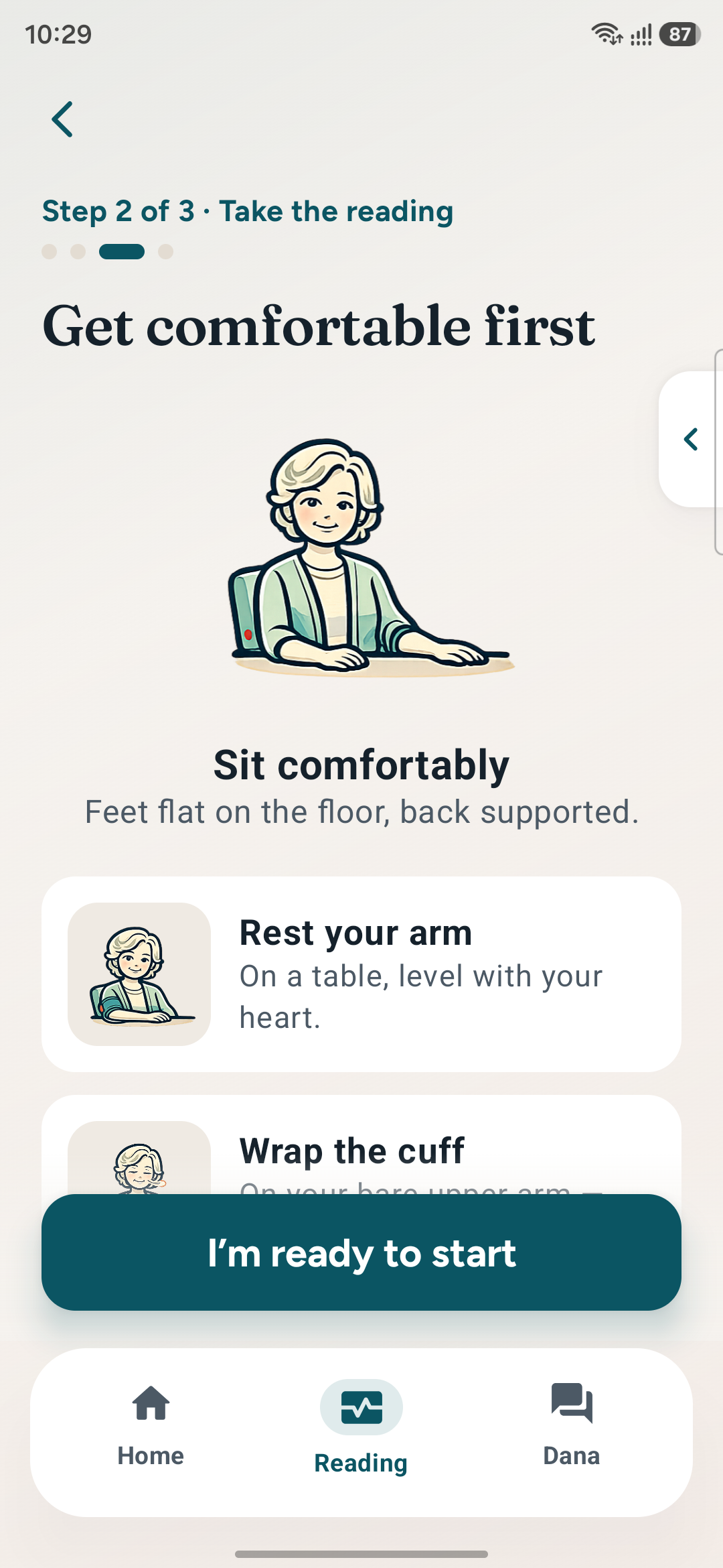
Three labelled steps with visible progress. The Bluetooth dependency is stated in step one, posture coaching happens in step two, meaning arrives in step three.
Why Option B
Each step is a place a failure can be explained locally and recovered from, rather than one opaque action that either works or produces an error.
Reasoning: Minimising taps optimises for the success path. Naming the steps optimises for the failure path — which is the one that decides whether a nervous user continues.
Decision 03
Standard notification vs. Alarm tone with screen wake
Problem
Home monitoring fails on adherence. A silent notification in a crowded tray is effectively invisible to the user least likely to be checking for it.
Option A — Push Notification
Conventional, polite and easy to implement — and reliably ignored, buried or dismissed without ever being read by the person who needed the prompt.
Option B — Exact Alarm (Chosen)
A real AlarmManager alarm that rings a tone at the set time and wakes the screen directly into the app via full-screen intent, and survives a device reboot.
Why Option B
The reminder is the mechanism the clinical value depends on. A prompt that can be missed is not a reminder — it is a log entry that happens to be visible.
Reasoning: Choosing the heavier platform primitive was a clinical decision, not a technical one. Adherence is the outcome; anything quieter would not have moved it.

09 — Final Solution

Calm concierge,
not clinical software.

The finished app reads as a warm, premium health companion rather than a medical device readout. Warm linen canvas, petrol-teal and coral, frosted glass cards and soft depth. Type is large by default and scalable by choice. Every status carries colour, an icon and a word, so nothing depends on seeing a hue correctly — and Dana is one tap away from every screen.

Vantage Care — home, measuring and result

Vantage Care — home gauge, the measure state, and a plain-language result

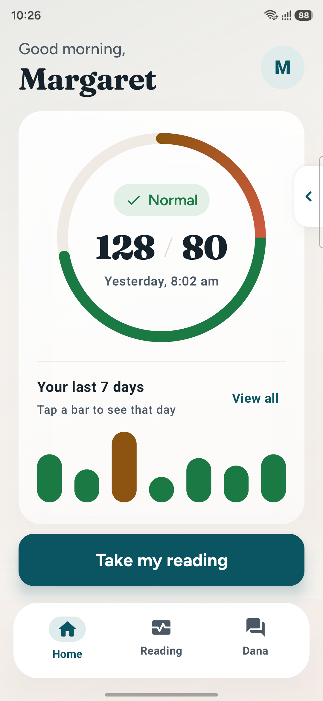
Home with gauge and trend
Home — gradient gauge + tappable trend
Connect your monitor
Connect — the dependency, stated openly
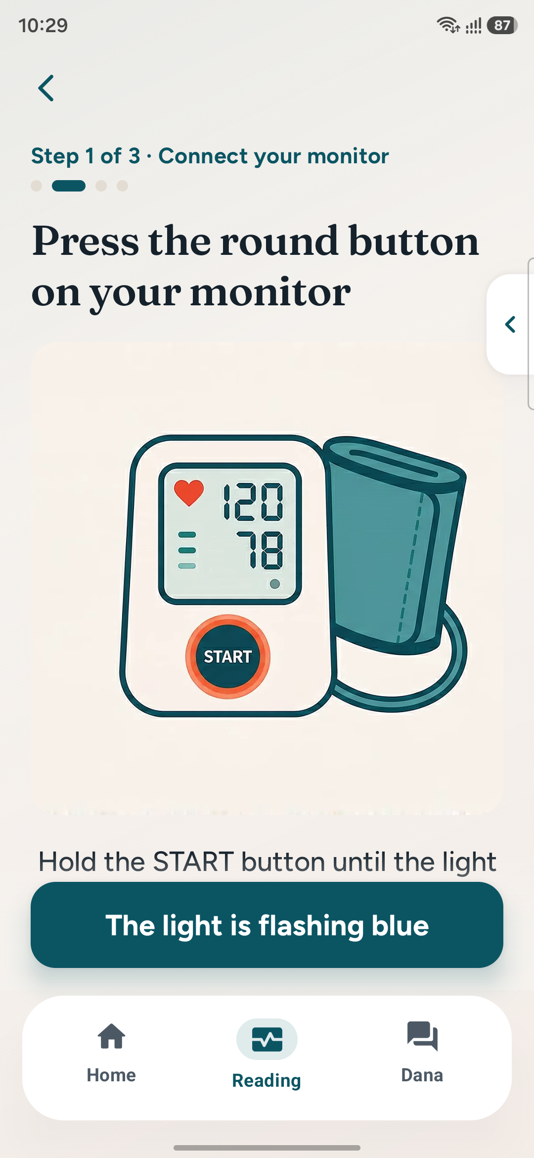
Press start on the cuff
Press START — one instruction only
Get comfortable posture coaching
Get comfortable — protecting the reading
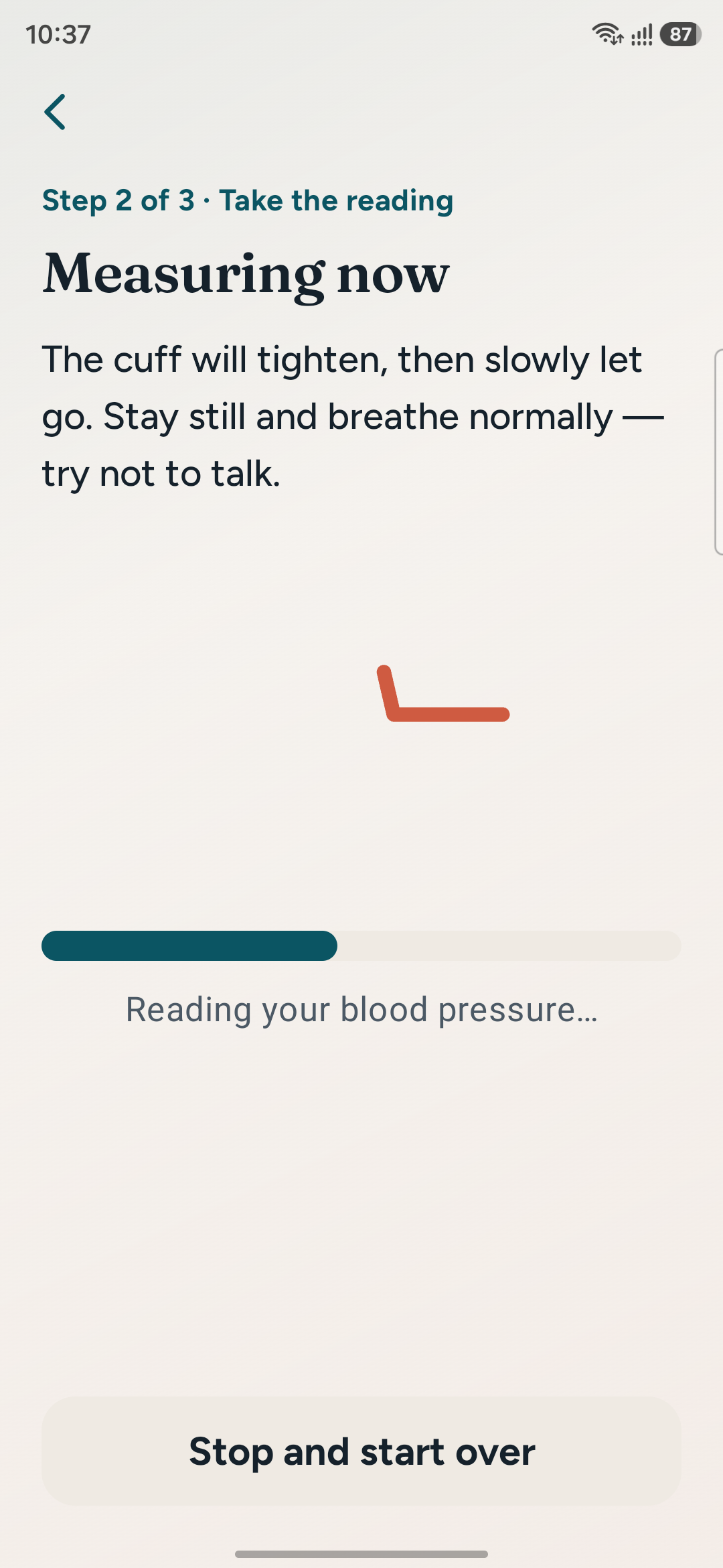
Measuring state
Measuring — an honest wait state
Result screen
Result — number, then meaning, then Dana
Dana care coach
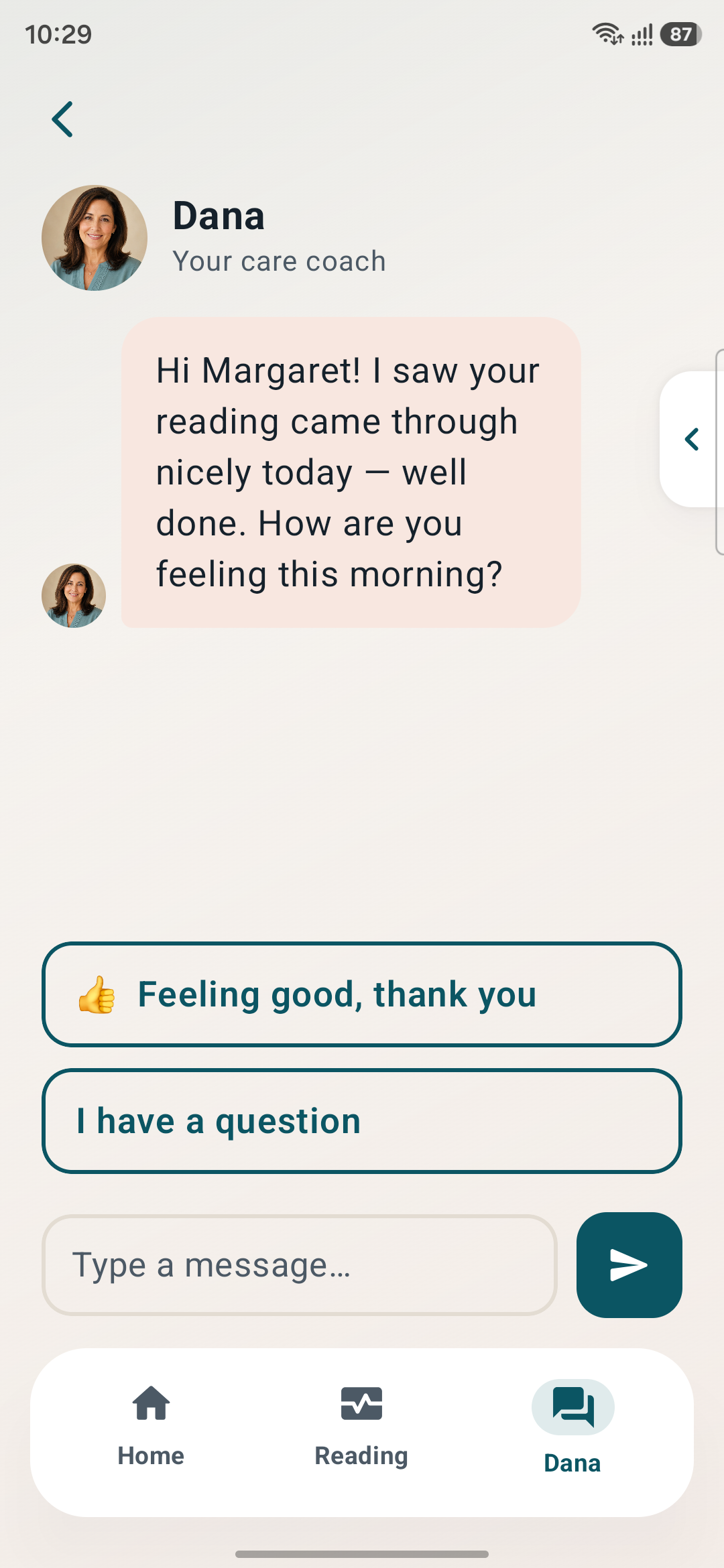
Dana — a named human, one tap away
Reading history
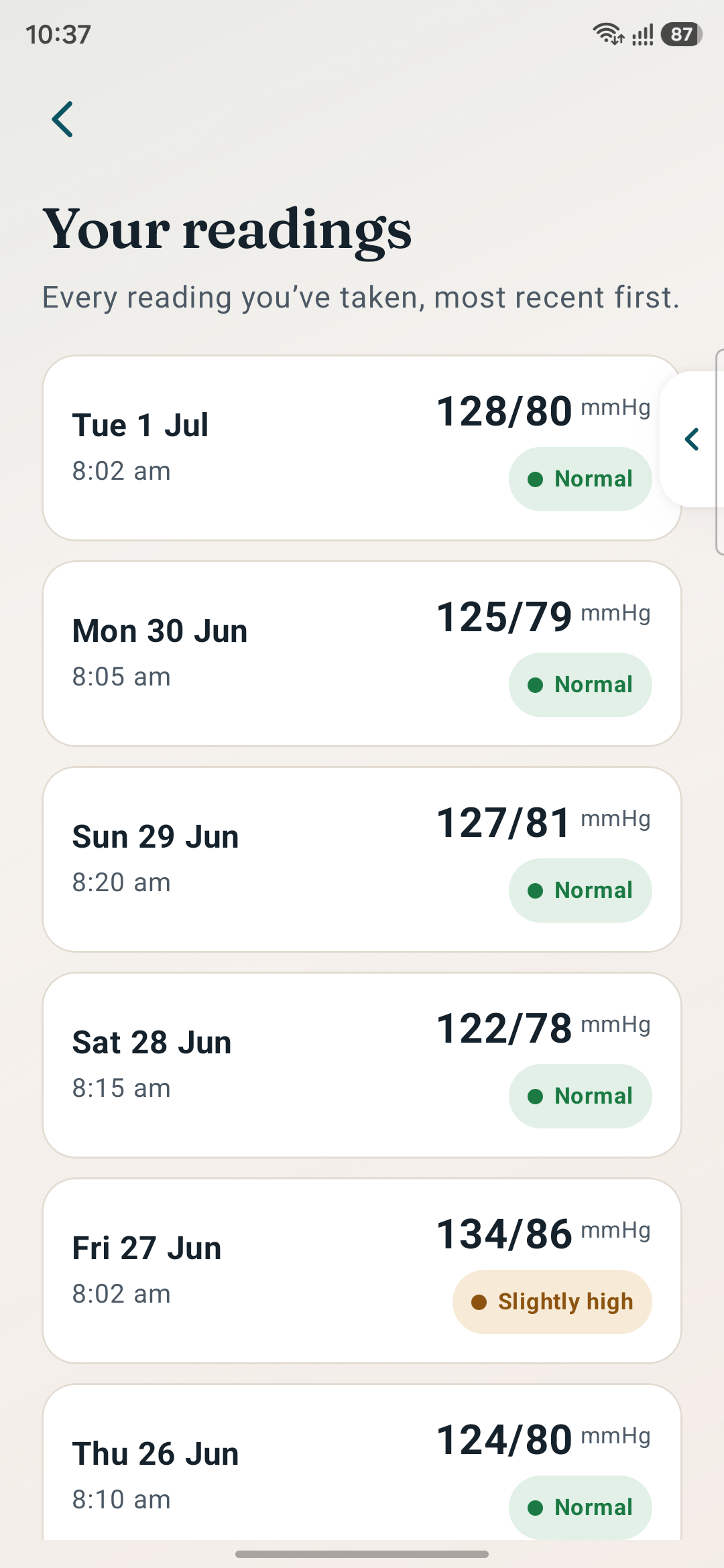
History — the full record behind "View all"
Health profile
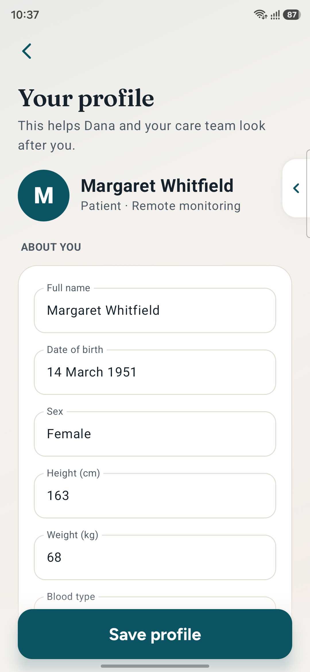
Health profile — conditions, targets, meds
Display and accessibility panel
Display — eight controls, user's choice

Design Highlights

🎛️
The Accessibility Panel
Problem
Designing "for seniors" as a category produces one oversized, low-motion theme that serves nobody precisely and reads to the user as the dumbed-down version.
Approach
Eight independent in-app controls — three text sizes, high contrast, Atkinson Hyperlegible, roomier spacing, 72dp targets, reduce motion, haptic tap and read-aloud.
User Benefit
Margaret builds the combination she actually needs instead of accepting a designer's guess, and the default experience never has to be compromised to accommodate her.
Business Benefit
One product serves the full age range without a separate "accessible mode," removing an entire parallel design and maintenance burden.
🩺
Three Honest Steps
Problem
Hiding the Bluetooth cuff dependency behind a single Measure button produces an opaque technical failure at the exact moment a first-time user is least equipped to handle it.
Approach
A labelled Connect → Measure → Result sequence with visible progress, where the hardware dependency is named in step one and posture is coached in step two.
User Benefit
Every failure has a local, explainable recovery instead of one opaque action that either works or does not. The user always knows which part went wrong.
Business Benefit
Posture coaching directly protects the clinical validity of the data, which is the only thing that makes the remote-monitoring programme worth running.
💬
Meaning Before Numbers
Problem
A raw 128/80 means nothing to someone newly diagnosed, and a number presented alone invites a frightened search online within seconds of appearing.
Approach
The result screen states the number, then immediately "This is in your normal range," then confirms Dana has received it — with a direct message button beneath.
User Benefit
The anxiety is resolved in the same glance that creates it. A high reading routes to what-to-do guidance rather than a red alert that amplifies panic.
Business Benefit
Members who understand their readings keep taking them. Interpretation is the feedback loop that converts a one-off measurement into a monitoring habit.
Reminders That Ring
Problem
Home-monitoring adherence collapses over months, and a silent notification in a crowded tray is invisible to precisely the user who most needs the prompt.
Approach
Exact AlarmManager alarms that ring a real tone at the set time and wake the screen straight into the app via full-screen intent — and survive a reboot.
User Benefit
The prompt arrives as an event rather than a badge, and lands the user directly on the action rather than on a home screen they then have to navigate.
Business Benefit
Adherence is the single metric a remote monitoring programme lives or dies on. Choosing the heavier platform primitive was a clinical decision, not a technical one.
🫧
Blameless Recovery
Problem
Less-confident users assume unexpected behaviour is their own fault and abandon the task. Neutral error copy is insufficient — it leaves the attribution unresolved.
Approach
Every failure state rewritten so the software takes the blame and names one recovery step. "Connection lost" is a calm screen with a way forward, never a code.
User Benefit
Margaret can fail and continue, rather than fail and stop. The app never implies she has broken something, which is the reason most first-time users quit.
Business Benefit
Recoverable errors keep users inside the programme instead of routing them to a support call to an adult child who lives two hours away.

11 — Outcomes & Impact

Accessibility as
the product, not the patch.

Vantage Care was designed and built as a working native Android application with real scheduled alarms, persisted profile data and a full accessibility layer. The measures below describe what the product actually does — the honest metric set for a self-directed build.

0
Independent A11y Controls
Eight combinable settings — text size, contrast, typeface, spacing, target size, motion, haptics and read-aloud — all verified in combination.
0:1
Body Text Contrast Floor
7:1 minimum — WCAG AAA rather than AA — designed into the palette from the start rather than corrected afterwards.
0
Steps to a Logged Reading
Connect, measure, result — each one a place where a failure can be explained locally and recovered from without leaving the flow.
0
Blaming Error States
Every failure message rewritten so the software takes responsibility and names the recovery step — no codes, no implied user error.

12 — Key Learnings

What This Project Taught Me

01
Designing for one named person beats designing for a segment
"Older users" is a category that invites averages, and averages produce the patronising version of everything. Margaret is specific: reduced vision, less-steady hands, stops when surprised. Every trade-off had an obvious answer once I asked what she would do rather than what the segment prefers. The specificity is what made the decisions fast — and it is also what kept the result from feeling like a simplified product.
02
Accessibility is a control surface, not a style
I began by applying senior-first styling globally and it felt condescending immediately — visibly the easy-mode version. Moving those decisions into eight user-facing controls changed the relationship entirely: the app stops guessing and starts asking. The engineering cost of that shift was mostly in verifying combinations, which is a testing problem rather than a design one. I would make this trade again on any product with a wide ability range.
03
Optimise the failure path, not the success path
Reducing taps optimises for the case where everything works — which was never the case that decided whether Margaret continued. Naming the three steps made the flow longer and made it survivable, because each step is somewhere a failure can be explained and recovered locally. For an anxious first-time user in a hardware-dependent flow, the failure path is the actual product; the happy path is the easy part.
04
Sometimes the right answer is the heavier platform primitive
A push notification would have been the polite, conventional choice, and it would have quietly failed the one metric that matters — adherence. Choosing an exact alarm with a full-screen intent felt disproportionate until I framed it as a clinical decision rather than a technical one. Designers often default to the lightest available mechanism out of good manners. When the outcome is a health outcome, restraint in the wrong place is its own kind of failure.

Reflection

"The brief said: design it so well for Margaret that it works for everyone. I assumed that meant accepting compromises for her sake. It did not. Larger type forced me to cut the copy to what actually mattered. Bigger targets forced fewer actions per screen. Blameless errors made the writing better everywhere. Almost nothing I did for Margaret made the product worse for anyone else — the constraint kept producing the better design rather than the accommodating one."
— Rupesh Chavan, Lead Product Designer
"The moment the project turned was when I stopped styling for seniors and started handing over the controls. Applied globally, senior-first design is a judgement about someone. Offered as eight switches, it is a question. That change cost very little to build and it is the difference between an app that accommodates Margaret and one that respects her."
On the difference between accommodation and respect

Explore the Project

Walk the whole flow

Every screen below is captured from the running build on device — step through the full set with the arrow keys, or click any screen to open it full size.

All 10 Screens All Projects Vera Mobile App