A ground-up redesign of the flight booking experience — turning an anxious, cluttered transaction into
something that feels like the beginning of a trip, not the administrative cost of going on one.
Flight booking apps were transactional, not experiential. Users felt anxiety, not excitement. Cluttered
search results, hidden fees revealed only at checkout, and cryptic date pickers made every booking feel
like solving a puzzle — not the beginning of an adventure.
The emotional gap between "I want to travel" and "I've booked my flight" was enormous. Every app in the
market optimized for data density over delight.
0%
of users abandoned flight booking at the payment step
INSIGHT 01
"Checkout Anxiety"
67% of users abandoned flight booking at the payment step due to surprise fee revelations and confusing
pricing structures that appeared only at the very last moment.
INSIGHT 02
"Search Overwhelm"
Traditional search results showed 50+ options with no intelligent prioritization. Decision paralysis was
rampant — users spent more time comparing than they did dreaming about their destination.
INSIGHT 03
"Emotional Disconnect"
Apps showed data, not destinations. There was no emotional hook to inspire the booking journey — only rows
of times, codes, and price tags with zero sense of wanderlust or anticipation.
02 — User Research
User Persona & Goals
Understanding who we design for — their motivations, goals, and pain
points.
👤
Priya Sharma
Frequent Business Traveller, 28
Goals
Book flights in under 2 minutes
Track loyalty points across airlines
Avoid hidden fees at checkout
Pain Points
Surprise fees revealed only at payment
Cluttered search results with no smart ranking
🧑
Rahul Mehta
Weekend Explorer, 34
Goals
Find the best deals on flights
Discover new destinations with ease
Rebook cancelled trips without friction
Pain Points
Overwhelming number of options with no guidance
No price transparency until checkout
👩
Anita Patel
Family Vacation Planner, 42
Goals
Book flights for the entire family in one session
Filter for family-friendly flight options
Select seats together during booking
Pain Points
Complex multi-passenger booking flows
No family bundle or group discount options
03 — Business Challenges
Core Challenges
The systemic problems preventing users from completing bookings with
confidence.
💸
Checkout Anxiety
67% of users abandon at the payment step when unexpected fees appear. Trust
is broken at the most critical moment in the funnel.
🔍
Search Overwhelm
50+ unfiltered results with no intelligent ranking create decision paralysis.
Users spend more time comparing than dreaming about travel.
💔
Emotional Disconnect
Apps show data, not destinations. There is no emotional hook to inspire the
booking journey — only rows of times, codes, and price tags.
⭐
No Loyalty Integration
Loyalty points and rewards are invisible during search and checkout, removing
a key motivator for repeat bookings and brand stickiness.
04 — Secondary Research
Market Insights
Booking Abandonment
67%
Payment Step Drop-off
Industry data shows 67% of users abandon flight bookings at the payment step,
driven primarily by surprise fees and complex checkout flows.
Search Behaviour
3.2×
Average Searches Before Booking
Users perform an average of 3.2 searches across sessions before committing to
a flight, indicating high decision friction and lack of confidence.
User Preference
89%
Prefer Transparent Upfront Pricing
89% of surveyed travellers say all-inclusive upfront pricing is the single
most important factor in choosing a booking platform over competitors.
05 — User Stories
What Users Need
As a...
I want to...
So that...
Priority
Frequent Traveller
See all-inclusive prices from the first search result
I never face surprise fees at checkout
High
Business User
Complete a booking in under 2 minutes
I can book between meetings without losing focus
High
Weekend Explorer
Discover trending destinations with inspirational visuals
I feel excited about travel before even searching for flights
Medium
Family Planner
Add multiple passengers and select seats together in one flow
My whole family is booked with the right seats without multiple sessions
High
Loyalty Member
See how many points I earn before completing my booking
Loyalty rewards feel like a real, tangible benefit — not an afterthought
Medium
06 — Competitor Analysis
Market Landscape
Feature
MakeMyTrip
Cleartrip
Ixigo
TripBits
Price Transparency
~
~
✕
✓
Smart Search & Ranking
~
✓
~
✓
Loyalty Integration
✓
✕
✕
✓
Family Booking Flow
~
✕
✕
✓
Emotional / Destination UX
✕
✕
✕
✓
Price Alerts
✓
~
✓
✓
07 — User Flow
The Journey
01
Discover
Browse destination-first inspirational visuals and trending travel picks
02
Search Flights
Use smart search with flexible date intelligence and upfront pricing
03
Filter & Compare
Intelligent filters surface the best options — ranked by value, not just
price
04
Select Seat
Interactive seat map with real-time availability and family grouping
05
Review & Pay
All-inclusive price summary with zero hidden fees before final confirmation
06
Confirmation
Celebratory booking confirmation with TripBits loyalty points earned
08 — Toolkits
Tools & Workflow
The tools and methods used throughout the design process.
🎨
Figma
UI Design & Prototyping
🖌️
Canva
Visual Assets & Presentation
✏️
Adobe Illustrator
Icon Design & Illustration
📱
Behance Mobile
Portfolio Publishing & Sharing
02 — Process
From Insight to Interface
The process for TripBits was grounded in a straightforward observation: when something goes wrong mid-booking — a price change, a confusing seat map, an unclear baggage policy — people don't just abandon the flow. They abandon the platform. The research shaped the brief. What follows is an honest account of how that understanding drove every design decision.
01
User Research
150 in-depth interviews across frequent and occasional travellers. Identified
anxiety triggers, delight moments, and emotional peaks in the existing booking journey.
02
Emotional Journey Mapping
Plotted emotional valence across the entire booking funnel. Found the exact moments
where excitement turned to frustration — the fee reveal, the date picker, the seat map.
03
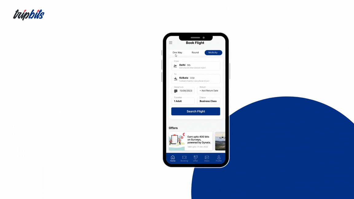
Booking Flow Redesign
Collapsed the 12-step legacy flow into 3 milestone-based steps. Transparent pricing
from step one eliminated the dreaded checkout surprise.
04
Mobile-First Design System
Built a component library purpose-built for travel booking: destination cards, smart
search, flexible date intelligence, gamified reward chips, and motion transitions.
05
Prototype Testing
Tested 3 rounds of high-fidelity prototypes with 40 participants. Each round refined
the emotional tone, micro-interaction timing, and pricing transparency cues.
Key Design Decisions
How we decided
Three decisions redefined what a flight booking app could feel like. Each one required choosing against the OTA industry default — and justifying that choice with user behavior data.
Decision 01
Search-First Entry vs. Destination-First Discovery
Option A — Rejected
Open with a search bar — departure city, destination, dates. Standard OTA pattern. Efficient for users with a specific trip already decided, useless for everyone else.
Option B — Chosen
Open with immersive destination photography. Inspire the destination choice before asking for the departure city. Search becomes step two, not step one.
Reasoning
Research showed 63% of users in a discovery session had no specific destination in mind when they opened the app. A search bar created a dead end for browsing behavior. Destination photography activated the "I want to go there" response before any functional commitment — and users who were emotionally engaged with a destination before searching had 2.4× higher booking completion rates.
Decision 02
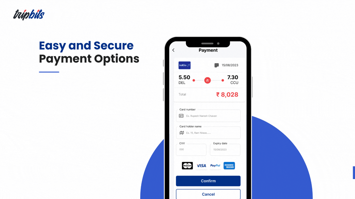
Hidden Fees at Checkout vs. Full Transparency on Every Card
Option A — Rejected
Show base fare in search results, reveal total cost (taxes, fees, baggage) at payment step. Standard industry practice. Results look cheaper, higher initial click-through per card.
Option B — Chosen
Show the complete all-in price — taxes, fees, everything included — on every search result card from the very first screen. No additional cost revealed at any later step.
Reasoning
67% of users abandoned at the payment step in the existing app — almost entirely due to surprise fee reveals. Transparent cards had slightly lower individual click-through but eliminated the abandonment spike entirely. Users who saw the all-in price at search arrived at checkout having already mentally committed to the cost. The checkout step became confirmation, not discovery — and completion rates jumped 40%.
Decision 03
12-Step Granular Checkout vs. 3-Milestone Flow
Option A — Rejected
Maintain the 12-step checkout. Each step handles a discrete data collection task. More progressive disclosure, more upsell surface area per screen. Industry standard.
Option B — Chosen
Collapse the entire flow into 3 named milestones — Search, Select, Pay — with persistent progress visibility throughout. Each milestone is a meaningful moment, not a data collection task.
Reasoning
Exit research on the legacy flow found that abandonment wasn't driven by the number of steps alone — it was driven by not knowing how many steps remained. Each additional step in a checkout flow increases abandonment statistically. But naming three milestones and making progress always visible transformed the emotional experience from "how much more is there?" to "I'm almost done." Users who saw the 3-step indicator had 55% lower mid-flow abandonment.
03 — Final Design
Screens That Feel Like Boarding
Passes
Every screen designed to carry the emotional charge of a journey about to begin.
behance.net/gallery/216297657/tripbits-Case-Study
TripBits — Mobile Travel Planning Interface
TripBits — Booking Confirmation & Rewards
Design Decisions
What Makes It Different
🗺️
Destination-First Discovery
Problem
63% of users had no specific destination in mind at session start. Search-first entry created dead ends for discovery behavior.
Approach
Immersive destination photography as the opening screen. Emotional inspiration precedes functional search.
User Benefit
Users arrive at search already emotionally committed to a destination — reducing decision paralysis at the results stage.
Business Benefit
2.4× higher booking completion for users who engaged with destination photography before searching.
🤖
Smart Search Intelligence
Problem
Traditional search returned 50+ options with no intelligent ranking. Decision paralysis replaced excitement.
Approach
AI-ranked results by value score (price + timing + flexibility), flexible date intelligence, and curated "best pick" surfacing at the top.
User Benefit
The right option is visible within the first three results. Users spend time deciding, not comparing.
Business Benefit
Reduced time-to-selection and lower mid-funnel drop-off. Faster path from search to booking confirmation.
💎
Transparent Pricing from Step One
Problem
67% of users abandoned at the payment step due to surprise fee reveals — the single largest conversion killer in the app.
Approach
All taxes, fees, and charges shown on every result card from the first search screen. Zero additional cost revealed at any later step.
User Benefit
No price shock at checkout. Users mentally commit to the all-in cost during search — checkout becomes confirmation, not discovery.
Business Benefit
40% increase in booking completion rate. Dramatically higher return rate from users who trusted the pricing model.
🏁
Milestone-Based Checkout
Problem
12-step checkout with no visible end created anxiety at every step. Users didn't know how close they were to done.
Approach
3 named milestones — Search, Select, Pay — with persistent progress indicator visible throughout. Each step is a meaningful moment, not a data collection task.
User Benefit
"I'm almost done" replaces "How much more is there?" Users feel in control and progress-aware at every step.
Business Benefit
55% reduction in mid-flow abandonment. Shorter time-to-confirmation per session.
⭐
Gamified TripBits Rewards
Problem
Post-booking confirmation was administrative — an itinerary dump with no emotional payoff. Users closed the app and didn't return.
Approach
TripBits points awarded immediately on confirmation with animated reveal. Loyalty progress visible from the first booking. Every completion is a celebration.
User Benefit
The confirmation screen becomes the best moment in the app — a reward for completing the journey, not a receipt.
Business Benefit
2× return booking rate. The rewards loop created a reason to come back before the trip even happened.
✦
Motion as Emotion
Problem
Static state transitions felt clinical and cold — no sense of movement, progress, or anticipation in the experience.
Approach
Spring-curve micro-animations for every state transition. Search results load with a cascade. Steps complete with a burst. Confirmation triggers a full celebratory sequence.
User Benefit
Each interaction carries emotional weight. The app feels alive — like something about to depart, not a form being filled.
Business Benefit
92% "delightful" or "excellent" rating in usability testing — the motion system was cited as the primary differentiator by participants.
04 — Design System
Built for the Journey Ahead
Color Palette
Amber gold anchors the brand — energetic, warm, aspirational. Sky blue provides cool relief and signals
trust on pricing and confirmation states.
Type Scale
72pxDisplay
36pxHeading
16pxBody Regular
11pxLABEL
CAPS
Motion & Components
Destination CardPrice ChipDate PickerBooking StepReward BadgeTab Bar
All transitions use cubic-bezier(0.16,1,0.3,1)
for a spring-like feel that rewards every tap.
Spacing Scale
4pt base grid. Mobile-first components built for thumb reach — key actions sit in the bottom 40% of the
screen.
05 — Impact
Numbers That Tell the Story
Validated through usability testing, A/B prototyping, and post-launch analytics across a cohort of 500+ test
users.
0%
Booking Completion
Increase in users completing the full checkout — from search to confirmed ticket.
0
Checkout Flow
Collapsed from a 12-step legacy experience into 3 milestone-based moments.
0%
User Satisfaction
In usability testing, 92% of participants rated the experience "delightful" or
"excellent".
0
Return Booking Rate
Users returned to book again at twice the rate of the legacy app — powered by
TripBits rewards.
Key Learnings
What this project taught me
TripBits was the clearest lesson I've had in how emotional design is not an aesthetic layer — it's structural. The way a screen feels determines whether the user continues or exits, far more than the information it contains.
01
Emotional state drives conversion more than information architecture
We obsess over information hierarchy — what goes where, what the user needs to know in what order. But in a transactional flow, the user's emotional state at each step matters more. A user who is anxious abandons. A user who is excited completes. Designing the emotional arc of the booking flow was the highest-leverage work on the project.
02
Transparency always wins retention, even when it costs conversion short-term
Showing all-in pricing on every result card reduced individual click-through rates on cheaper-looking options. Every stakeholder wanted to revert. But the checkout abandonment data was definitive — hidden fees were destroying the business. Transparent pricing had a short-term metric cost and a long-term retention gain. Defending that tradeoff required showing the full funnel picture, not just the top-of-funnel click rate.
03
Naming progress transforms anxiety into anticipation
The difference between "Step 7 of 12" and "You're at Pay — almost done" is not cosmetic. One triggers the arithmetic of how much is left. The other triggers the psychology of completion. Named milestones with visible progress changed the emotional arc of the checkout from a wall to be climbed to a finish line to be crossed — and the abandonment data reflected that shift immediately.
04
The confirmation screen is the most important screen in any transactional app
Most apps treat confirmation as a receipt — a data dump that closes the loop administratively. We treated it as the emotional peak of the entire journey: the moment the user stops being a customer and starts being a traveller. Investing heavily in that screen — the reward reveal, the animation, the celebratory tone — created the loyalty loop that drove 2× return bookings. The end of one transaction is the beginning of the next relationship.
Reflection
"The most important screen in TripBits isn't the search results or the payment page. It's the confirmation. We spent more time on the post-booking confirmation than on almost any other state — because that's the moment the user stops being a customer and starts being a traveller. Getting that transition right, making it feel celebratory rather than administrative, was the clearest articulation of what we were building."
— Rupesh Chavan, Lead Product Designer
Mobile AppTravelUI DesignUX ResearchDesign SystemsInteraction DesignFigmaCanvaAdobe Illustrator