Emplora
Mobile App / AI-native HRMS

Not a companion app.
The whole product.

Every US-first HR incumbent ships mobile as a reduced subset of the real thing. Emplora on Android is the same product — same fourteen modules, same Copilot, same permissions — wrapped in a shell that behaves like a native app rather than a web page in a frame.
Role Product Design & Build
Timeline 2026
Category Mobile App / HR Tech
Stack Capacitor 8 · Next.js 15 · Supabase
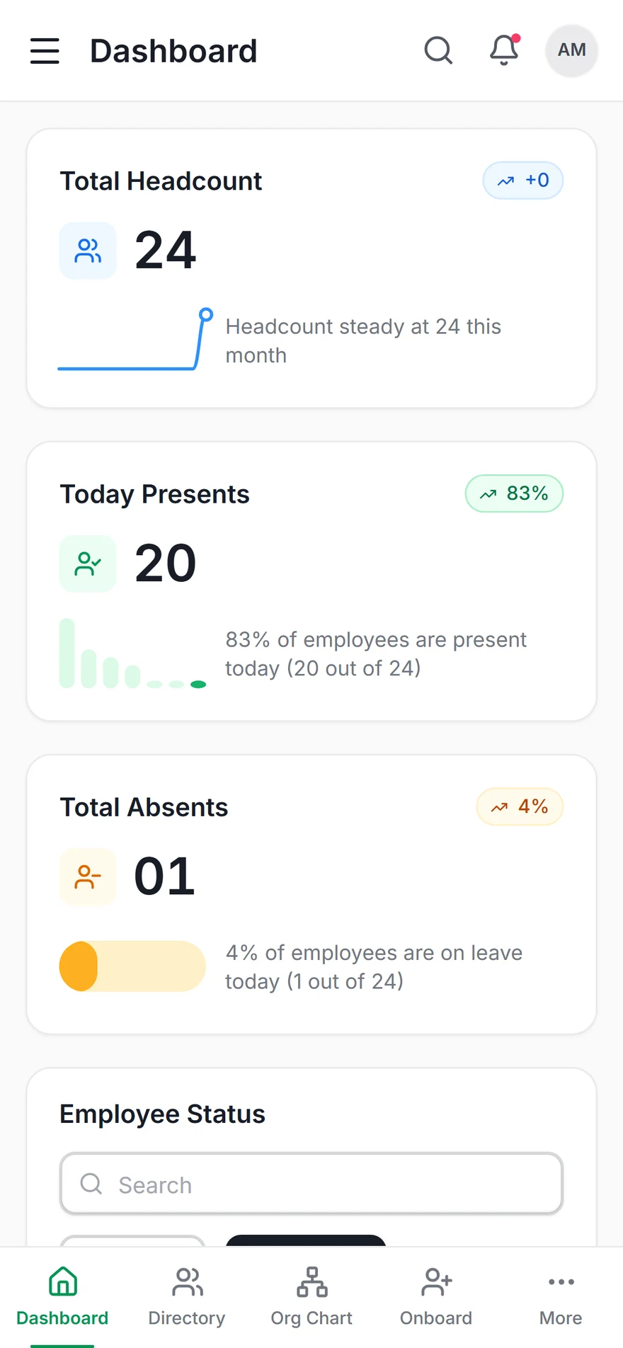
Emplora on Android — dashboard with the five-item bottom tab bar
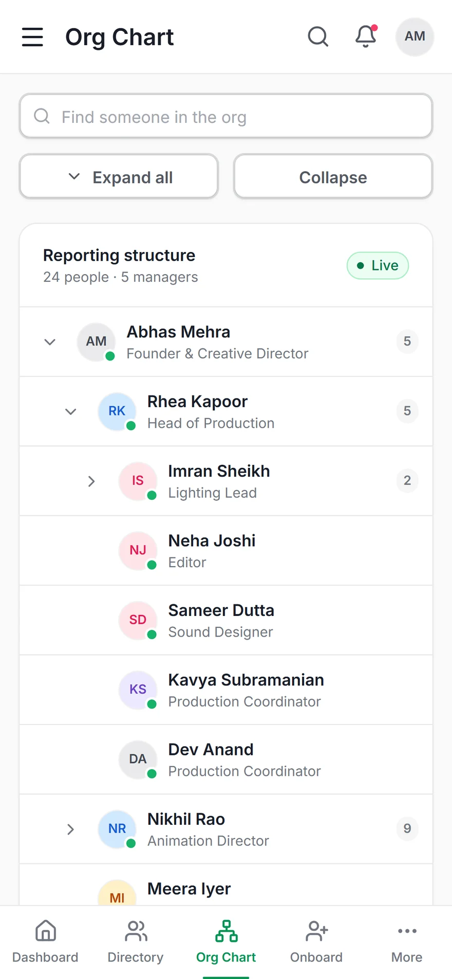
Org chart as an indented, expandable tree on the phone
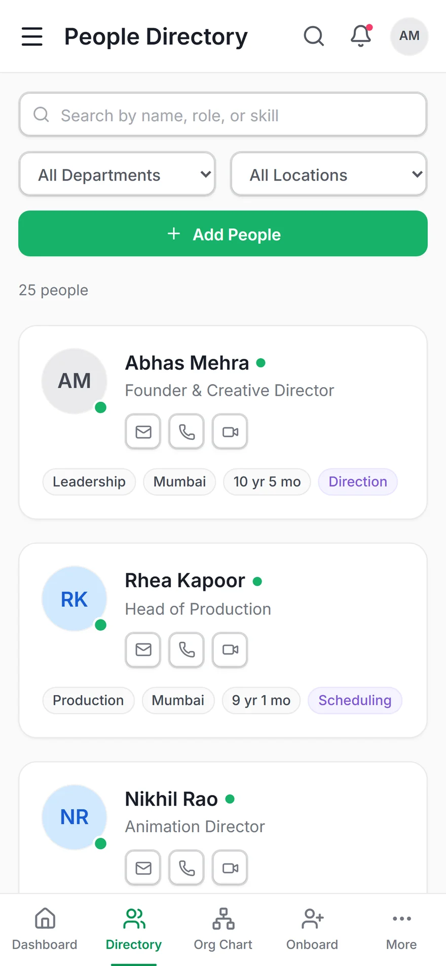
People directory as a card list rather than a scrolling table
0 Modules, same as web
0 Roles & permission scopes
0 Features cut for mobile
0 Approve from a notification

The problem
Mobile HR is where frontline and episodic users actually live, and it is where every US-first incumbent is weakest — a companion app with three of the features, treated as an accessory to the desktop product.
The approach
Ship the same product, not a subset. One Capacitor shell around the same Next.js build, then design away every tell that gives a WebView up — safe areas, back button, keyboard, haptics, overscroll.
The outcome
Full capability parity on Android, with phone-specific layouts rather than a reflowed desktop, and a Copilot that still answers when the network is gone.
14
Modules on phone
5
Tab bar destinations
7
Native behaviours restored
0
Capability removed
The Problem

Mobile treated as an accessory,
not as the product

Research across eight HR platforms found the same pattern: mobile ships as a reduced companion. You can check a balance and approve a request, then you hit a wall and are told to open a laptop. Darwinbox displaced SAP and Workday in Indian conglomerates largely because it did not do this — which is the clearest proof available that mobile parity wins deals.

The Opportunity

Two of the three user populations are phone-first. The line manager approves between meetings; the employee has no desktop at all. Both are the users the category serves worst — and 82% of HR-tech rollouts report adoption failure, concentrated exactly there.

So mobile parity became a strategic wedge rather than a delivery detail: identical capability on Android and web, from one codebase, with the phone getting its own layouts instead of a reflowed desktop.

Capability Parity Capacitor Shell Offline-Tolerant AI Edge-to-Edge Android
Research Insights
01 / 04

The queue moved, it didn't disappear

Self-service portals reduced HR email and increased HR Slack. The interaction cost was never removed, only relocated — and the people relocating it are the ones without a desk.

02 / 04

Managers are episodic users

They open an HRIS twice a year, under protest. Any interface that depends on recall between sessions fails them structurally. This is the mechanical cause of the 82% adoption number, not a training budget problem.

03 / 04

A WebView announces itself

Users cannot name what is wrong, but they feel it instantly: a dead back button, a rubber-band overscroll, text that selects when you tap a tab, a bar bar floating over the keyboard. Each one alone is small; together they read as "this is a website".

04 / 04

A reflowed table is a hidden table

A 720px data table behind a horizontal scrollbar hides the columns that matter, and nobody discovers the scroll. Responsive is not the same as designed — the phone needed its own layouts, not narrower versions of the desktop ones.


05 — User Stories

What Users Need

As a... I want to... So that... Priority
Line manager (Marcus) Approve a request from the notification without navigating anywhere I can clear it between meetings instead of saving it for a laptop I won't open High
Employee (Aisha) Ask "how much leave do I have left" in plain language and get an answer A thirty-second question doesn't become a portal, a form and a DM to HR High
Line manager (Marcus) Reach any screen by typing what I want, not by remembering where it lives Opening the app twice a year doesn't mean relearning the navigation each time High
HR manager (Priya) Open a full employee record on my phone — including risk and compensation I can answer a leadership question from a corridor, not promise to follow up High
Employee (Aisha) Have the directory and Copilot still work on a train with no signal The app is useful in the places I actually use my phone Medium
Any role Press the Android back button and have it do what I expect The app feels like an app instead of a website someone wrapped Medium

06 — Competitor Analysis

What mobile actually means

Everyone in the category ships an app. Almost nobody ships the product. Read this table as capability on a phone, not "is there an icon on the home screen".

On a phone, can you… BambooHR Rippling Darwinbox Emplora
Approve leave & view your own record
Open the full org chart and reach every node ~ ~
Run analytics and see comp-band outliers ~ ~
Read explainable attrition risk per person ~
Bulk-import a roster from a spreadsheet
Ask an AI assistant in plain language ~ ~
Get an answer with no network connection

Key Design Decisions

How we decided

Four decisions shaped the Android build. The first set the ambition; the rest are what that ambition costs once you leave the browser.

Decision 01
Companion app vs. capability parity
Option A — Rejected
A focused companion: dashboard, my record, approvals, notifications. The category standard, and genuinely easier to design — a small surface can be polished quickly and tested cheaply.
Option B — Chosen
All fourteen modules on the phone, including analytics, payroll, bulk import and the risk register. The tab bar carries the five highest-frequency destinations; "More" opens the complete lifecycle and administration tree.
Reasoning
A companion app is a promise that the real work happens elsewhere. For two of the three personas there is no elsewhere — Aisha is phone-first by circumstance, Marcus by preference. The moment a user hits a feature wall they learn the app is not to be trusted for anything important, and they stop opening it for the things it does handle. Parity is not a feature list; it is the precondition for the app being used at all. It also removes an entire class of product decision — nobody has to argue about what earns a place on mobile.
Decision 02
Native rewrite vs. one codebase in a Capacitor shell
Option A — Rejected
A separate Kotlin or React Native client. Best-in-class feel, real native components — and a second implementation of the permission matrix, the risk model and every screen.
Option B — Chosen
One Next.js build, statically exported and wrapped in Capacitor 8. The shell adds haptics, splash, status bar, keyboard and hardware-back handling; every plugin call is a no-op on the web so components never branch on platform.
Reasoning
Parity and a second codebase are in direct conflict. Two implementations means two permission matrices, and a permission matrix that exists twice is a permission matrix that will disagree — which is how a hidden button becomes an unguarded endpoint. The native feel that a rewrite buys is real, but it turns out to be a finite list of behaviours you can restore deliberately. The parity it costs is not recoverable at all.
Decision 03
Fight edge-to-edge vs. design for it
Option A — Rejected
Opt out of edge-to-edge and let Android letterbox the WebView between opaque system bars. Simple, and every existing layout keeps working unchanged.
Option B — Chosen
Transparent system bars, content drawing underneath, and layout utilities that add env(safe-area-inset-*) to element height rather than padding inside it.
Reasoning
targetSdk 36 forces edge-to-edge, so opting out was borrowed time. The detail that matters is the one everyone gets wrong: padding inside a fixed 64px app bar leaves the bar 64px tall with the status bar sitting on top of its contents. The inset has to grow the element, not inset its children. Getting this right is the difference between a phone app and a web page with a notch problem — and it is invisible when correct, which is why it is worth writing down.
Decision 04
Responsive reflow vs. phone-specific layouts
Option A — Rejected
Keep every desktop component and let it reflow. Tables scroll horizontally, the org chart canvas pans, stat tiles stack one per row. One layout to maintain.
Option B — Chosen
Below md, tables become card lists, the org chart becomes an indented tree, short stat tiles go 2-up, and rows with actions stack identity above buttons instead of sharing a wrapping flex line.
Reasoning
Each of these started as a bug report that was really a design failure. A horizontally scrolling table hides the columns that matter and nobody discovers the scroll. A centred org-chart canvas wider than the viewport renders the root off-screen behind empty space — fixed by centring scroll position with a ResizeObserver, but only after deciding the canvas belonged on tablets and up. And a flex-wrap row with a name and two buttons crushes the text column to one word per line. Responsive is a mechanism; the layouts still have to be designed.

Final Design

The same product,
at arm's length

Five destinations in the tab bar, the full tree behind More, and a dashboard that recomposes for your role rather than gating you out of it. Nothing here is a mobile-only screen — it is the web app, laid out for a thumb.

Emplora — Employee Management System
Emplora — employee management system, mobile app

Below: captured from the running build at 390×844. Every screen here also exists on desktop — none of them are mobile-only, and none of the desktop ones are missing.

Dashboard — stat cards stacked, tab bar fixed at the bottom
Dashboard
People directory rendered as a card list rather than a horizontally scrolling table
Table → card list
Org chart as an indented, expandable tree with per-node report counts
Canvas → indented tree
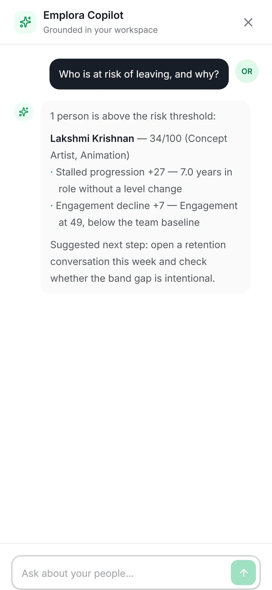
Copilot on the phone, with suggested questions grounded in the workspace
Copilot
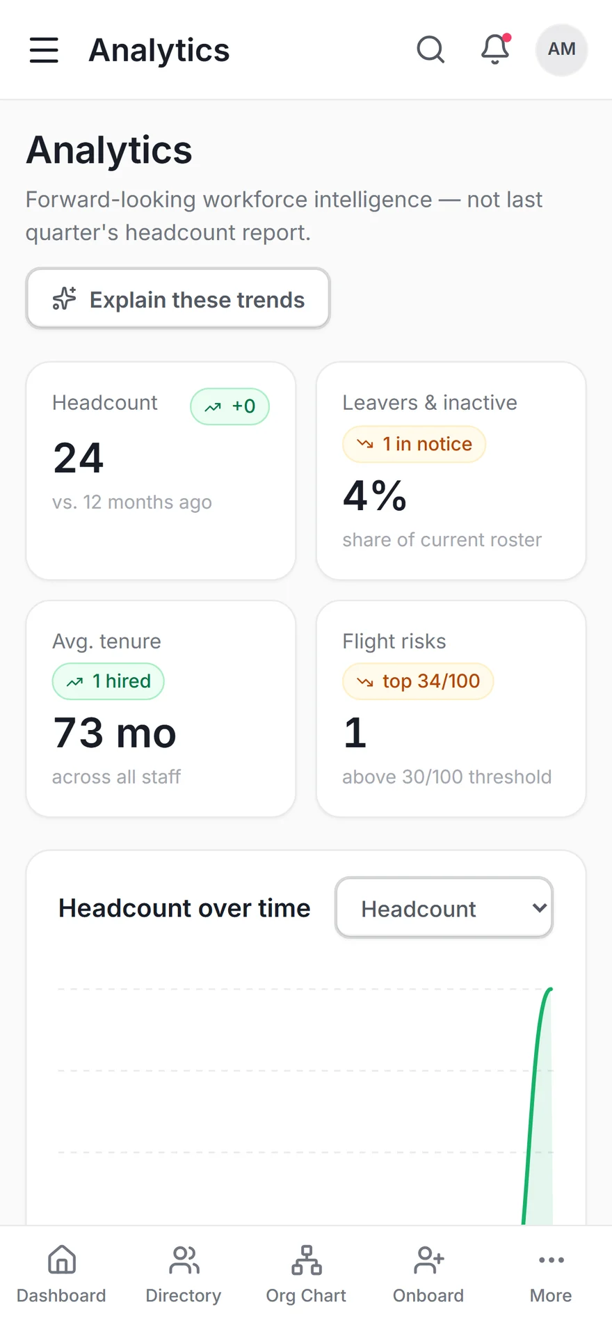
Analytics on the phone — headcount, flight risks and tenure
Analytics
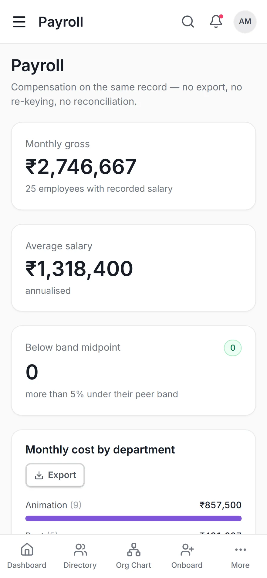
Payroll on the phone — runs, cost by department and band outliers
Payroll
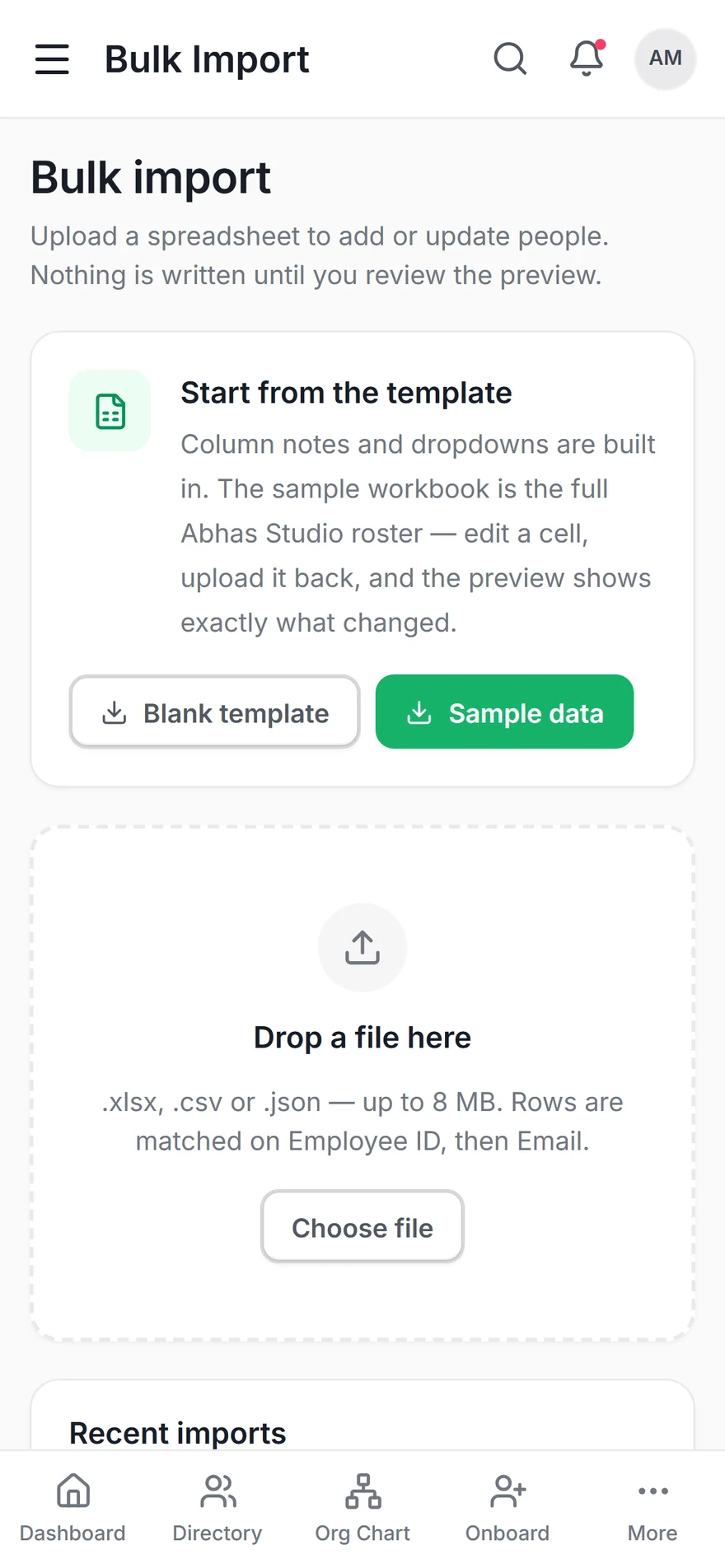
Bulk import on the phone — template, drop zone and batch history
Bulk import
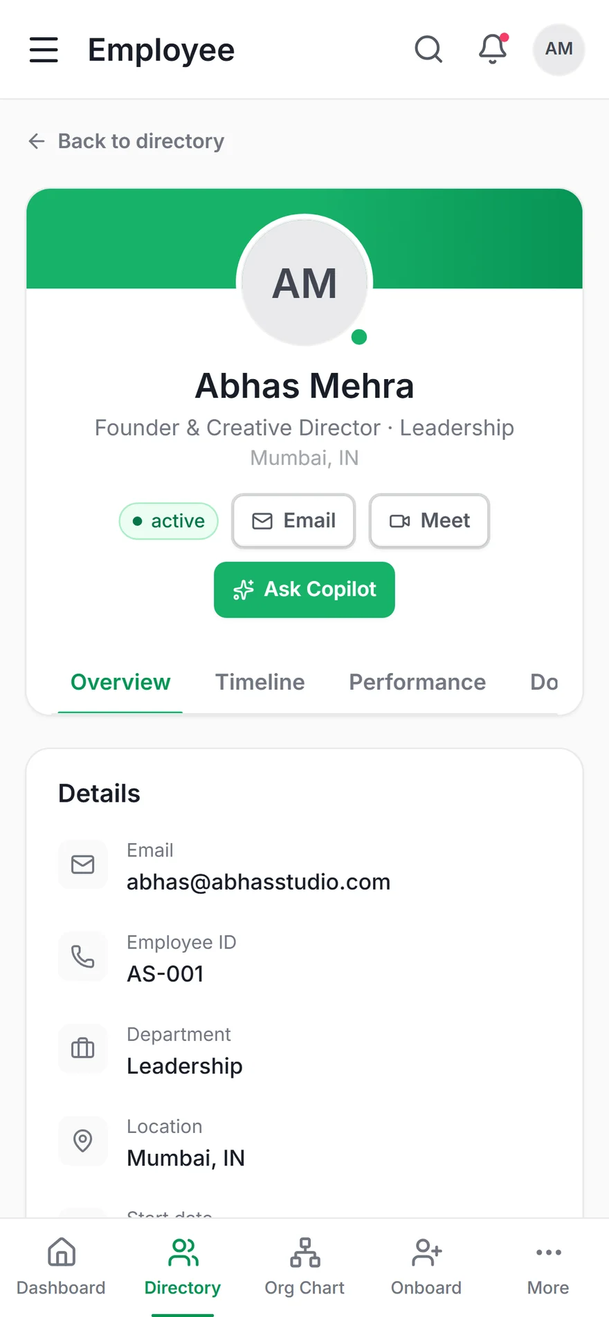
Full employee record on the phone
Employee record

The tab bar carries the five highest-frequency destinations; everything else lives behind More. Analytics, payroll and bulk import are the three most commonly cut from a companion app — they are the reason this section exists.

Design Decisions

Everything that gives
a WebView away

Native feel is not one big thing. It is a finite list of small betrayals, each of which has a fix. All of it is scoped to html[data-native], which the app shell sets only under Capacitor — so the browser build keeps normal browser behaviour.

The hardware back button

Problem
A dead back button is the fastest way for an Android app to feel like a website. The default in a WebView shell is either nothing at all, or an exit that discards the user's place.
Approach
A single handler unwinds the stack in the order the user built it: Copilot, then the command palette, then the nav drawer, then history, then exit.
User Benefit
Back always undoes the last thing you did. You never lose your place, and you never have to hunt for a close button.
Design Benefit
Overlays can be layered freely, because there is a consistent, predictable way out of any depth.

The keyboard and the tab bar

Problem
A fixed bottom tab bar floats on top of the keyboard, covering the field the user is typing into — the single most common flaw in wrapped apps.
Approach
Body resize plus adjustResize, and the tab bar unmounts entirely while the keyboard is up rather than trying to reposition itself around it.
User Benefit
Typing anywhere in the app — Copilot, search, a form field — behaves the way it does in every other Android app.
Design Benefit
Input-heavy screens no longer need bespoke padding hacks to stay usable.

Page feel — the small betrayals

Problem
Rubber-band overscroll, pull-to-refresh, text selecting when you tap a nav item, the long-press callout, a 300ms double-tap-zoom delay, images that drag. Each is minor; together they are unmistakable.
Approach
All of it suppressed on chrome, with inputs and anything marked [data-selectable] opting back in — because a payslip figure you cannot copy is its own bug.
User Benefit
Taps register immediately, scrolls stop where they should, and nothing highlights blue when you meant to navigate.
Design Benefit
The interface can be judged on its own merits rather than through a layer of browser artefacts.

Copilot that answers offline

Problem
An AI assistant that returns a network error is worse than no assistant — it teaches users not to ask. Phones lose signal in exactly the places people use them.
Approach
The model-backed answer is the preferred path; when it is unreachable, a deterministic fallback computes the answer from the roster already loaded on the device.
User Benefit
"Who is at risk of leaving, and why?" or "how many people are on leave today?" still returns a real answer on a train.
Design Benefit
The ask bar can be presented as a primary surface rather than a best-effort extra, which is what makes ⌘K viable as the zero-recall path for episodic users.

Tables become cards, canvases become trees

Problem
The desktop directory, payroll ledger and risk register are all wide tables. Reflowed onto a phone they hide their most important columns behind a scrollbar nobody finds.
Approach
Below md every data table renders as a card list, and the org chart switches from a pannable canvas to an indented tree whose search auto-expands the path to each match.
User Benefit
Every field is visible without horizontal scrolling, and finding a person in a 40-node hierarchy takes one query rather than a hunt.
Design Benefit
Parity stops meaning "the same markup" and starts meaning "the same capability" — which is the only version of it that survives contact with a phone.
Design System

One system,
two form factors

Extracted from Figma via the Figma MCP server and built on Untitled UI primitives — these are the published variables, not approximations of them. The phone inherits the same tokens; only the layout rules change.

Product Tokens
--success-500 (Primary) #17B26A
--gray-900 (Primary text) #181D27
--gray-600 (Body) #535862
--gray-200 (Borders) #E9EAEB
--warning-500 (At risk) #F79009
--rose-500 (Critical) #F63D68
Roles & Read Scope
Owner — all HR Admin — all Manager — team Employee — own Restricted
Native Layout Rules
Tab bar height 64px + safe-area
Touch target minimum 44 × 44px
Table → card list below md
Canvas → indented tree below md
Corner radii 8 / 12 / 16 / 20 / 28
Motion — informational, not decorative
Nav pill (shared layoutId) spring 300 / 30
Page transition y 8→0, 250ms
Metric count-up 900ms, tabular nums
Drawer x 100%→0, spring
prefers-reduced-motion honoured globally
Type Scale — Inter, self-hosted
24 / 32 · 600 display-xs — page titles & metric values
16 / 24 · 600 text-md-semibold — card titles, active nav
14 / 20 · 500 text-sm-medium — table cells and labels
12 / 18 · 600 TEXT-XS-SEMIBOLD — BADGES
One dashboard, three compositions
Employee My balance, my tasks, my team
Manager Team to-dos, approvals, pulse
HR Admin Org metrics, status, risk, birthdays

Role-adaptive rather than role-gated: one route, three compositions. A promotion changes what Marcus sees without changing where he goes — which matters more on a phone, where there is no sidebar to re-learn.


What shipped

Parity, measured
rather than claimed

This is a design and engineering concept running on demo data, so these are build facts rather than adoption numbers — what the Android app can actually do, verified against the same test suite as the web build.

0
Modules on the phone

Dashboard, directory, records, org chart, analytics, import, onboarding, training, performance, time off, payroll, offboarding, documents, settings.

0
Features cut for mobile

Everything the web app can do, the Android build can do — including bulk import and the comp-equity register.

0
RLS checks passing

Authorisation is enforced in Postgres, not in app code — so the phone client cannot widen its own scope even if the UI is wrong.

0
End-to-end API checks

One suite covers both clients, because both clients call the same endpoints with the same permission matrix.

Key Learnings

What this project taught me

01
Parity is a constraint you accept before you design
Deciding up front that nothing would be cut for mobile removed a whole category of argument — no roadmap debate about which modules earn a phone screen, no "v2 will add analytics". It also made every layout problem non-negotiable: you cannot quietly drop the risk register because it is hard to fit, you have to design it. That pressure produced better mobile layouts than a smaller scope would have.
02
"Native feel" is a finite checklist
It felt like an unwinnable, atmospheric problem until I wrote it down: back button, safe areas, keyboard, overscroll, selection, tap delay, drag, splash, haptics. Nine items, each with a specific fix. Naming them turned a vague sense that the app felt wrong into a task list — and it is worth documenting, because the next wrapped app will have exactly the same nine.
03
An offline fallback changes what the AI can be
A copilot that sometimes fails is one users learn to route around. Adding a deterministic answer computed from data already on the device wasn't primarily a resilience feature — it let the ask bar be presented as a primary navigation surface, which is what makes it viable as the zero-recall path for a manager who last logged in six months ago.
04
Auth has to follow the platform, not the pattern
The web app uses an httpOnly cookie. A statically exported bundle has no origin and therefore no usable cookie jar, so the phone sends a bearer token from encrypted storage instead — and one middleware resolves either. Trying to force one mechanism across both would have meant either weakening the web session or shipping an app that silently signs itself out.
05
The failures that matter are the silent ones
Three independent gates — CORS preflight, Android's cleartext policy, and WebView mixed content — all surface as the same useless TypeError: Failed to fetch. The fix was as much diagnostic as technical: the boot screen now shows the compiled-in API address, the app's own origin, and a button that tests the connection. Error messages are interface.

"I went into the Android build expecting the hard part to be layout, and it wasn't. Shrinking a dashboard is a solved problem. The hard part was everything the browser does for free that an app is not supposed to do — the overscroll, the selection highlight, the tab bar drifting over the keyboard. None of it is in a spec, and users can't name any of it, but they feel all of it within about four seconds. Writing that list down was the most useful thing I did on this project, because it turned an unwinnable vibe into nine tickets. The parity decision was the other one: committing to zero cut features before designing anything meant I never got to negotiate my way out of a difficult screen."

Rupesh Chavan — Product Design & Build