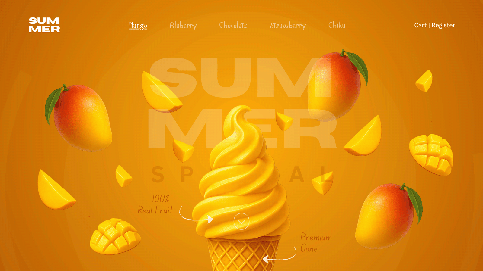
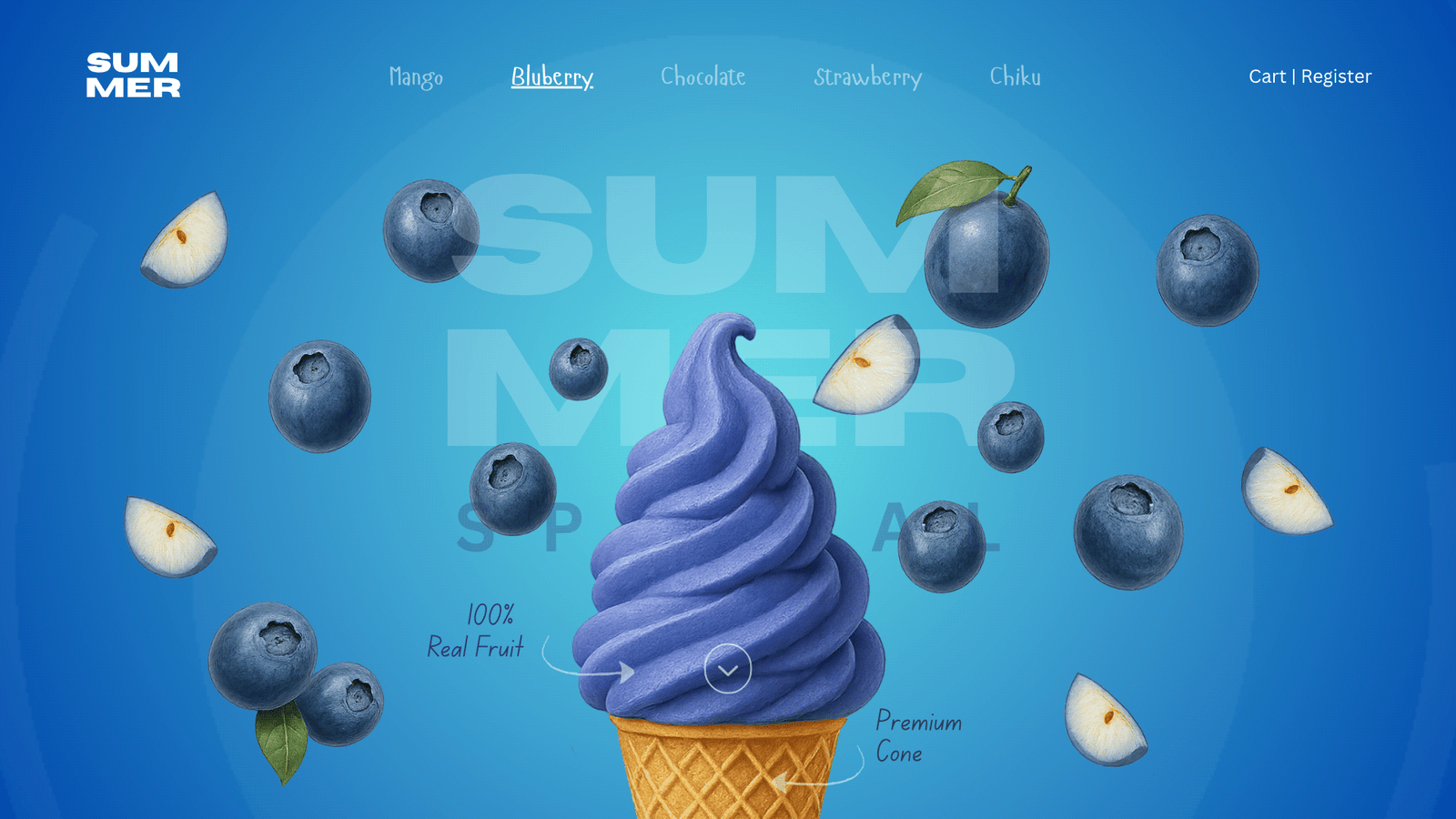
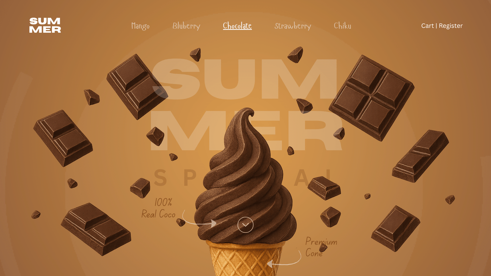
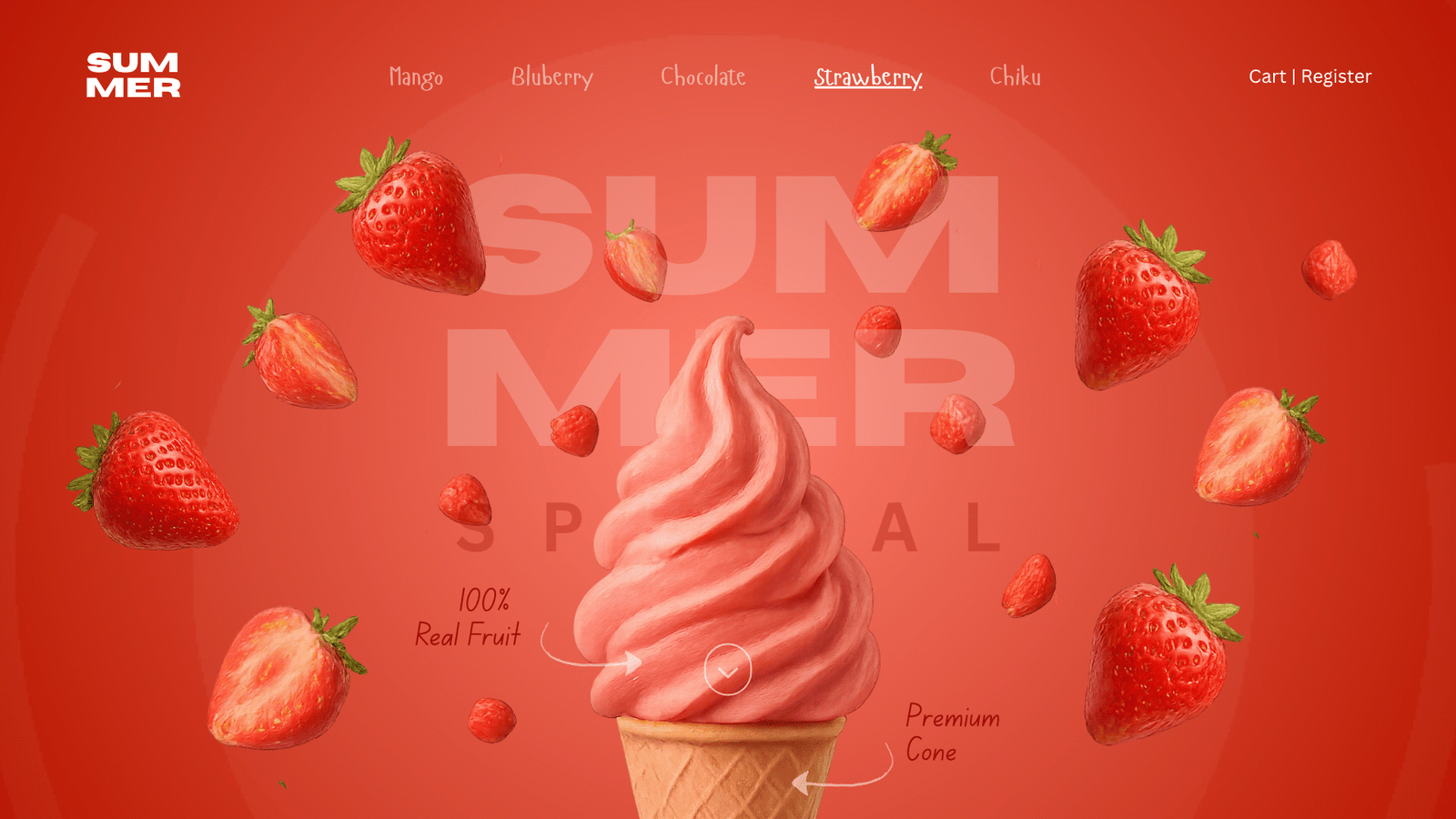
Brand Landing Page / AI-Assisted Design

Designing Taste
You Can See

A premium ice cream brand experience where AI accelerated creativity without replacing it — sensory design for a product you can't taste through a screen.

Role Designer (AI-Assisted)
Timeline 2024
Category Brand Landing Page / AI-Assisted
Behance Featured
🍦 Top Flavor
Mango Sorbet
Happy Customers
4.8k
★★★★★ 5.0 rating
Collate.io enterprise platform
48hrs Built in 48 Hours
AIAccelerated AI-Assisted Workflow
0 Product Flavours
3.5K+ Behance Views

01 — The Problem

You can't taste through a screen.

The Challenge

Summer needed a landing page that made premium ice cream irresistible online — fighting the fundamental limitation that you can't taste or touch through a screen. Ice cream is a physical, sensory product. The flavour, texture, temperature — everything that makes it compelling disappears the moment it goes digital.

The challenge: create a sensory, premium brand experience using only digital tools — colour, typography, motion, and layout — that triggers emotional and physical desire in the viewer.

The AI Dimension

This project was also an experiment in methodology. Could AI tools — image generation, AI copywriting, rapid iteration — meaningfully accelerate a consumer brand design process without diluting creative quality?

The question the project was really asking: if AI removes the friction of execution, what remains? The answer, it turns out, is creative judgment — knowing which direction to pursue, when to stop iterating, what to throw away. A 48-hour sprint that would normally take two weeks became a test case for that proposition.

Research Insights

INSIGHT 01
Sensory Transfer Design
Premium food brands that succeeded digitally used extreme visual richness — texture photography, warm colour palettes, and motion — to trigger emotional sensory responses. The brain can be tricked into taste anticipation through the right visual language alone.
INSIGHT 02
The Premium Signal
Low-end ice cream brands use cartoon mascots and bright primary colours; premium brands like Häagen-Dazs use photography, minimal text, and elevated typography. Summer needed to signal premium instantly — before a word was read. Every pixel had to feel considered.
INSIGHT 03
AI as Creative Accelerator
AI tools (image generation, copywriting) were used not to replace design thinking, but to accelerate iteration. The creative decision-making — every colour choice, every typographic pairing, every layout decision — remained entirely human. AI compressed weeks into hours.

02 — User Research

User Persona & Goals

Summer's audience spans health-conscious millennials seeking ingredient transparency, experience-driven foodies discovering new flavours, and parents ensuring allergen safety — each requiring different content and trust signals from the landing page.

👤
Priya Sharma
Health-Conscious Young Adult, 24
  • Verify that ingredients are natural and free from artificial additives
  • Find calorie and nutritional information per serving
  • Order online for home delivery with clear delivery info
  • No ingredient transparency or "what's in it" section visible
  • Online ordering not prominently featured on landing page
🧑
Ravi Menon
Foodie & Experience Seeker, 32
  • Discover new and seasonal flavour drops before they sell out
  • Understand the brand story and what makes Summer different
  • Find the nearest outlet or cafe stocking Summer ice cream
  • Generic food photography with no brand personality or story
  • Outlet locator buried deep in the navigation or footer
👩
Anjali Patel
Parent, 40
  • Confirm no artificial colours or preservatives in any flavour
  • Find family pack and bulk options for weekend treats
  • Check allergen information — specifically nuts and dairy — quickly
  • No quick-reference allergen checker on product pages
  • Family size options not highlighted or easy to find

03 — Business Challenges

Core Challenges

CHALLENGE 01
🍦
Standing Out in an Artisanal Market

The premium ice cream space is crowded with brands claiming "handcrafted" and "artisanal." Summer needed a visual identity and brand voice distinctive enough to own a market position — not just share one. Every design decision had to amplify the difference, not echo it.

CHALLENGE 02
🌿
Communicating "Premium Real Ingredients"

Ingredient transparency is a purchase driver for health-conscious buyers — but spelling it out risks feeling preachy or clinical. The design needed to communicate natural, real ingredients through colour, photography, and micro-copy without triggering the "trying too hard" response.

CHALLENGE 03
🛵
Driving Online Orders vs Retail Discovery

Summer needed to convert both online-first buyers (who wanted home delivery) and discovery-first foodies (who wanted to find the nearest outlet). A single landing page had to serve both conversion goals without confusing either journey with conflicting CTAs.

CHALLENGE 04
❤️
Building Emotional Brand Connection

Ice cream is fundamentally an emotional product — it carries memories, occasions, and warmth. The brand story needed to trigger those associations immediately. A purely transactional landing page would miss the emotional register entirely and position Summer as just another e-commerce product.


04 — Secondary Research

Market Insights

FINDING 01
12%
Premium Ice Cream Market Growth

The premium ice cream market is growing at 12% YoY in India — driven by rising disposable income and health-conscious lifestyle shifts. Summer was entering a market at an inflection point, where positioning early as the premium real-ingredient brand could own the narrative.

FINDING 02
84%
Millennials Check Ingredients First

84% of millennial consumers check ingredient lists before making a food purchase — making ingredient transparency not a nice-to-have but a primary conversion signal. The landing page needed an "ingredients story" section, not a buried text block.

FINDING 03
55%
Brand Storytelling Increases Purchase Intent

Brand storytelling increases purchase intent by 55% in premium FMCG categories. This directly justified investing significant design effort in the brand origin narrative and flavour "world" photography — treating story as a conversion mechanism, not decoration.


05 — User Stories

What Users Need

As a... I want to... So that... Priority
Health-Conscious Consumer See a full ingredient list per flavour with natural certifications I can make a purchase without compromising my dietary values High
Foodie Discover new seasonal flavours with rich visual storytelling I feel excited to try something new and share it with my network High
Parent Check allergens for every flavour in under 10 seconds I can safely order for my children without reading dense small print High
Gift Buyer Order a curated gift box of multiple flavours with premium packaging I can give a thoughtful, premium gift for birthdays or celebrations Medium
Brand Ambassador Find and share the brand story and values easily I can authentically recommend Summer to friends who share my values Medium

06 — Competitor Analysis

Market Landscape

Feature Häagen-Dazs India Baskin-Robbins Naturals Noto Ice Cream Summer
Ingredient Transparency ~ ~
Flavour Showcase ~
Brand Story ~ ~
Outlet Locator ~
Online Order CTA
Allergen Info ~ ~
Social Proof / Reviews ~

07 — User Flow

The Journey

STEP 01
Hero — Brand Impression
The full-screen hero creates a sensory brand impression within 3 seconds — warm colour, product imagery, and brand typography signal premium before any copy is read.
STEP 02
Flavour Showcase
Each of the five flavours is presented in its own colour world — creating desire and discovery. Visitors can explore by flavour personality, not just name. Seasonal specials are highlighted with limited availability urgency.
STEP 03
Ingredient Story
The "real ingredients" narrative converts health-conscious visitors — showing sourcing stories, natural certifications, and allergen information in a visually rich format that feels editorial, not clinical.
STEP 04
Social Proof
User reviews, UGC photography, and media mentions build community credibility. Foodies see real people loving the product — reducing the risk of first purchase for new visitors.
STEP 05
Order Online / Find Outlet
Dual CTA — "Order Online" for delivery customers, "Find Nearest Outlet" for discovery shoppers. Both conversion paths are equally prominent, serving two distinct purchase journeys without hierarchy conflict.

08 — Toolkits

Tools & Workflow

Tools and methods used throughout the Summer brand landing page design process — from AI-accelerated concepting through to final sensory-driven visual execution.

🎨FigmaUI Design
✏️Adobe IllustratorBrand & Illustration
🗺️FigJamConcept Mapping
🔥HotjarUX Validation
📝NotionResearch & Docs

02 — Process

From brief to brand
in 48 hours.

A focused six-phase sprint combining traditional design methodology with AI acceleration at every stage — strategy first, execution accelerated, creative judgment never outsourced.

01
Brand Positioning
Defined Summer's competitive position: premium lifestyle ice cream that signals indulgence and warmth. Mapped against key competitors to identify visual white space.
02
Mood Board
AI-assisted imagery generation to rapidly explore 12 visual directions in parallel. Narrowed to one direction in hours rather than days — warm, editorial, food-photography-inspired.
03
Colour & Typography
Built the warm amber/orange palette system with flavour-specific accent colours. Selected a premium serif + minimal sans-serif pairing that communicates indulgence and quality.
04
Landing Page Design
Designed the full landing page: immersive hero, product showcase with flavour-specific colour worlds, sensory copy, and smooth scroll transitions. Every section intentional.
05
AI Copy & Visual Integration
AI-generated copy was used as raw material — then edited, refined, and elevated through human creative judgment. AI supplied the volume; the designer supplied the voice.
06
Behance Showcase
Packaged the project for Behance — documenting the AI workflow transparently and presenting the final design system. Featured within the first week of publication.

Solution Exploration

Three decisions that
shaped the experience.

Premium consumer brand design is as much about what you remove as what you add. The three decisions below defined the visual language and user experience before a single layout was built.

Decision 01
Feature-rich landing page vs. Immersive brand experience
Option A
Feature-rich: product grid, nutrition info, allergen checker, FAQs, detailed ordering flow — comprehensive but commodity
Option B — Chosen
Immersive brand experience: sensory visuals, minimal copy, emotional register — desire first, information second
Premium ice cream doesn't compete on information — it competes on desire. The visitor should feel something before they read anything. Feature-rich pages are appropriate for utilities; immersive brand pages are appropriate for indulgences.
Decision 02
Unified product palette vs. Flavour-specific colour worlds
Option A
Single brand palette applied to all flavours — consistent, safe, minimal visual complexity
Option B — Chosen
Each flavour gets its own colour gradient and atmosphere — orange, coral, mint, caramel gold, dusk purple
Ice cream is about personal preference — the flavour you choose is an expression of your taste. A unified palette treats all flavours equally; flavour-specific colour worlds make each product feel like its own world, driving emotional attachment before purchase.
Decision 03
Neutral sans-serif vs. Premium serif display typography
Option A
Modern sans-serif: clean, contemporary, safe — reads as a functional D2C brand, not a premium one
Option B — Chosen
Instrument Serif italic for display: heritage, indulgence, premium — the typographic register of Häagen-Dazs and artisan food brands
Typography signals price bracket before the user reads price. Serif italic at this weight signals heritage and craft — the same register used by premium food brands globally. Sans-serif signals efficiency; serif signals indulgence. Summer is the latter.

03 — Design

A brand that feels
warm before you read.

The brief for this section was simple: make the viewer feel the warmth and indulgence of premium ice cream before a single word is processed. Warm amber dominates because warm amber is the colour of something good about to happen. Typography reinforces the register — unhurried, considered, premium. Whitespace gives it room to breathe. The page earns the product's price before displaying it.

behance.net/gallery/229537815/Landing-page-Using-AI
Summer — Main View

Summer — AI-Generated Brand Landing Page

Summer — Screen 2
Summer — Screen 3
Summer — Screen 4

Design Highlights

🎨
Warm, Immersive Colour Palette
Problem
Most D2C food brands use neutral or pastel palettes that feel safe but fail to generate desire in the first three seconds of a visit.
Approach
Deep amber backgrounds, orange and gold accents, and radial warm glows — a palette that communicates heat, indulgence, and premium quality before a word is read.
User Benefit
Visitors feel the product before they process it. The emotional register is set before any copy or price is visible.
Business Benefit
Desire-first design increases time-on-page and scroll depth — both leading indicators of purchase intent in consumer e-commerce.
🍦
Flavour-Specific Colour Worlds
Problem
A unified palette applied across all SKUs flattens product differentiation — every flavour looks like a variation on a theme rather than its own experience.
Approach
Each flavour has its own colour gradient and atmospheric world: orange, coral red, emerald mint, caramel gold, dusk purple — unified brand system, distinct product identities.
User Benefit
Visitors form personal attachment to specific flavour aesthetics. The colour world drives choice before the name is read.
Business Benefit
Differentiated visual identities make each SKU marketable independently — social assets, seasonal campaigns, and product launches can own a specific aesthetic.
Premium Serif Typography
Problem
Clean sans-serif type reads as efficient and modern — correct for SaaS, wrong for premium food. The typography was signalling the wrong price bracket.
Approach
Instrument Serif italic for display — heritage, indulgence, unhurried. The same typographic register used by Häagen-Dazs, Magnum, and artisan food brands globally.
User Benefit
Typography sets the expectation of quality before price is visible. Visitors calibrate their perception to premium before encountering any product detail.
Business Benefit
Premium typographic register reduces price sensitivity — when the experience signals luxury, the price point is contextualized correctly.
Minimal, Confident Hierarchy
Problem
Consumer brands over-explain — nutrition tables, allergen lists, ordering flows — competing with their own product in the visual hierarchy and diluting the primary emotion.
Approach
Product at the centre, copy reduced to the minimum needed to communicate. Every section trusts the visual. Information architecture supports desire, not the reverse.
User Benefit
Reduced cognitive load. Visitors make emotional decisions faster when they're not processing competing information.
Business Benefit
Fewer distractions on the path to purchase means higher conversion rate for first-time visitors who arrived through brand awareness rather than intent.
🔮
Sensory-Driven Section Transitions
Problem
Static scroll on a premium food site creates a clinical, catalogue-like experience — products appear on the page rather than being revealed. The gap between digital and physical widens.
Approach
Smooth scroll reveals, warm radial glows expanding with scroll, and subtle film grain overlays create tactile richness — motion that reinforces the sensory promise of the product.
User Benefit
The digital experience feels physical. Visitors engage longer because each scroll reveals something — creating anticipation rather than information delivery.
Business Benefit
Higher scroll depth and dwell time correlate directly with purchase intent. Sensory-rich digital environments reduce the cognitive gap between browsing and buying.

Design System

The language
of summer warmth.

A cohesive brand design system built to evoke premium indulgence across every touchpoint — from the colour palette to the flavour-specific accent system, every token was chosen to serve the sensory goal.

Brand Colour Palette
Primary #f97316
Gold #fbbf24
BG Base #090503
BG Raised #120a06
Text #f4f4f5
Flavour Accents
Classic
Orange
Wild
Strawberry
Cool
Mint
Burnt
Caramel
Blueberry
Dusk

Warm amber anchors the brand; each flavour has its own gradient world. The system is unified at the palette level but expressive at the product level.

Premium Typography
72px Summer
36px Taste. Feel. Indulge.
16px Premium small-batch ice cream
11px Handcrafted · Small Batch

Instrument Serif italic leads the brand voice — warm, editorial, indulgent. Space Grotesk light handles product copy with quiet confidence.

Motion Principles
Reveal Transitions
Slow upward fades (700ms ease-out cubic) for section reveals. Nothing snappy — everything languid and warm.
Hover States
Flavour cards lift on hover (–4px translate, 1.02 scale). Glow intensifies. Feels like picking up a product.
Ambient Glow
Background radial glows breathe gently — orange/amber — creating a sense of warmth and depth throughout the scroll.
Design Tokens
Warm Palette Flavour System Serif Display Grain Overlay Amber Glows Motion Tokens Scroll Reveals

04 — Impact

Proof of concept
for human-AI design.

Summer wasn't just a brand project — it was a methodology test. The results demonstrated that AI acceleration, when guided by strong creative judgment, can compress timelines without compressing quality.

48hrs
Complete Brand + Page
Full brand identity and landing page delivered in a single 48-hour sprint.
0
Distinct Flavour Worlds
5 unique product colour systems, each with its own visual identity and emotional register.
0K+
Behance Views, First Week
3,500+ views on Behance in the first week of publication — organically featured.
2wks→
AI Workflow Compression
Documented, repeatable AI workflow reduces a 2-week design process to 48 hours — without loss of craft.

Key Learnings

What this project taught me

01
AI accelerates execution, not judgment
Midjourney generated assets in minutes that would take hours to produce. But the judgment calls — which colour reads as premium, which composition creates desire, which copy to cut — remained entirely human. The bottleneck moved from production to editorial curation.
02
Emotional register is set before the fold
In consumer brand design, the first impression is the entire argument. If the warmth, quality, and desire aren't established in the hero, no amount of product copy or feature listing will recover it. The work happens before the scroll.
03
Discipline is the constraint that separates premium from busy
With AI removing production friction, the temptation was to add — more sections, more imagery, more colour. Premium design is restraint: knowing exactly what to cut, what to keep, and trusting that whitespace and confidence communicate quality better than density.
04
Typography is pricing strategy
The choice between Instrument Serif italic and a clean sans-serif wasn't aesthetic — it was commercial. Serif italic signals the same price bracket as Häagen-Dazs. Type sets expectations before price is visible, and those expectations either support or undercut the premium positioning.

Reflection

"Summer was the project where I understood what AI actually changes about the design process. It doesn't change what good design is. It changes how fast you can find out whether you're making it. The 48 hours weren't fast because AI did the creative work. They were fast because AI removed the hours between decisions — the time spent waiting for renders, writing copy drafts, generating moodboard references. The decisions themselves were still the same kind of decisions. Just closer together."
— Rupesh Chavan, Lead Product Designer
"The hardest part wasn't the speed — it was discipline. With AI removing the friction of execution, the only constraint is creative judgment. You must know exactly what you want before you ask for it."
On the AI-Accelerated Creative Process