Most finance apps are rear-view mirrors - they tell you, in increasingly beautiful charts, what you already spent. Sahara inverts that. You name a goal, and every surface in the app reorganises to answer one question: how much sooner can I get there, and what would I have to change?
01 — The Problem
Open any banking or budgeting app and you get the same thing: a balance, a spend breakdown, and a chart of the past. All of it accurate, none of it actionable. The user already knows they spent too much on coffee. What they cannot see is whether the thing they actually want is getting closer or further away.
05 — Solution Exploration
Each had a conventional option that would have looked more like the category, and would have made Sahara another rear-view mirror.
06 — Final Solution
Every capability answers the same thing - how much sooner do I get there - from a different angle.
07 — Design System & Scalability
The system is deliberately narrow: two typefaces, one accent, one dark surface, and a 32px radius applied without exception. Restraint is what keeps a money app from feeling either clinical or gaudy.
08 — Outcomes & Impact
Sahara is a working React build that wraps to Android through Capacitor - the same bundle serves the web and the mobile package, which is why every layout is designed at phone width first.
09 — Key Learnings
Explore the Project
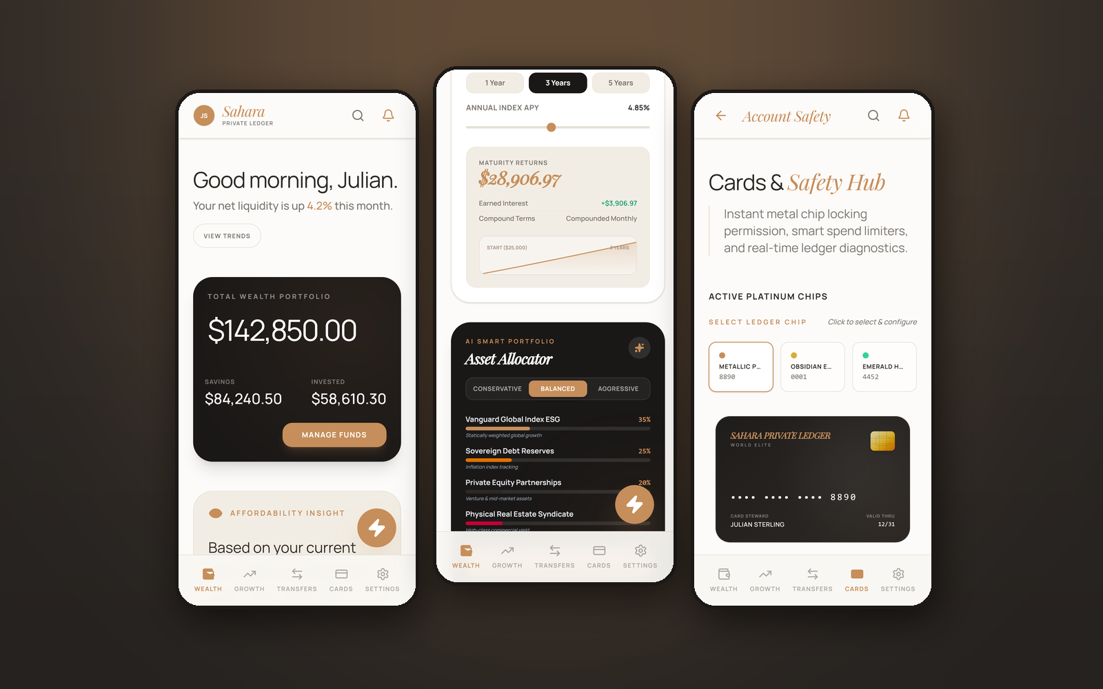
Every screen below is captured from the running React build at 390×844 - step through with the arrow keys, or click any screen to open it full size.