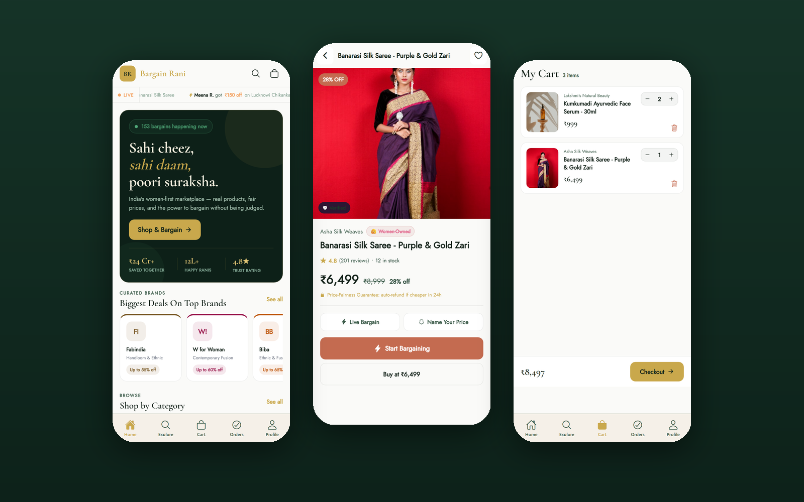
The mobile build is not a companion app with its own data — it is the same marketplace, on the same Supabase backend, rendering from the same design tokens. The design problem was not what to build. It was how to make two codebases stay honest with each other while giving each platform the ergonomics it deserves.
01 — The Problem
Most products that ship web and mobile end up with two design systems wearing the same logo. A colour gets nudged on one platform, a spacing scale diverges, a feature lands on web and waits two sprints for mobile. The user notices before the team does — and on a marketplace built on trust, an inconsistency reads as carelessness about everything else.
05 — Solution Exploration
Every one of these traded short-term speed for the property that matters most on a cross-platform marketplace: the two clients cannot quietly become different products.
06 — Final Solution
Five things carry the mobile build. Each one either preserves parity with web or earns its difference by being genuinely better on a phone.
07 — Design System & Scalability
The mobile design system is not a reinterpretation of the web system — it is the same system, declared in the idiom React Native understands. What changes is layout, navigation and gesture; what never changes is colour, type and voice.
08 — Outcomes & Impact
The mobile build reaches feature parity on everything that matters for browsing, negotiating and selling, while diverging deliberately where the phone can do better.
09 — Key Learnings
Explore the Project
Every screen below is captured from the running Expo build on device, against the same live Supabase backend the web app uses.