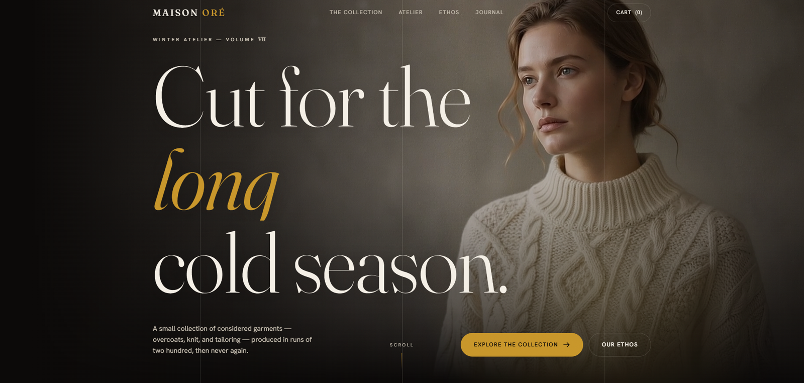
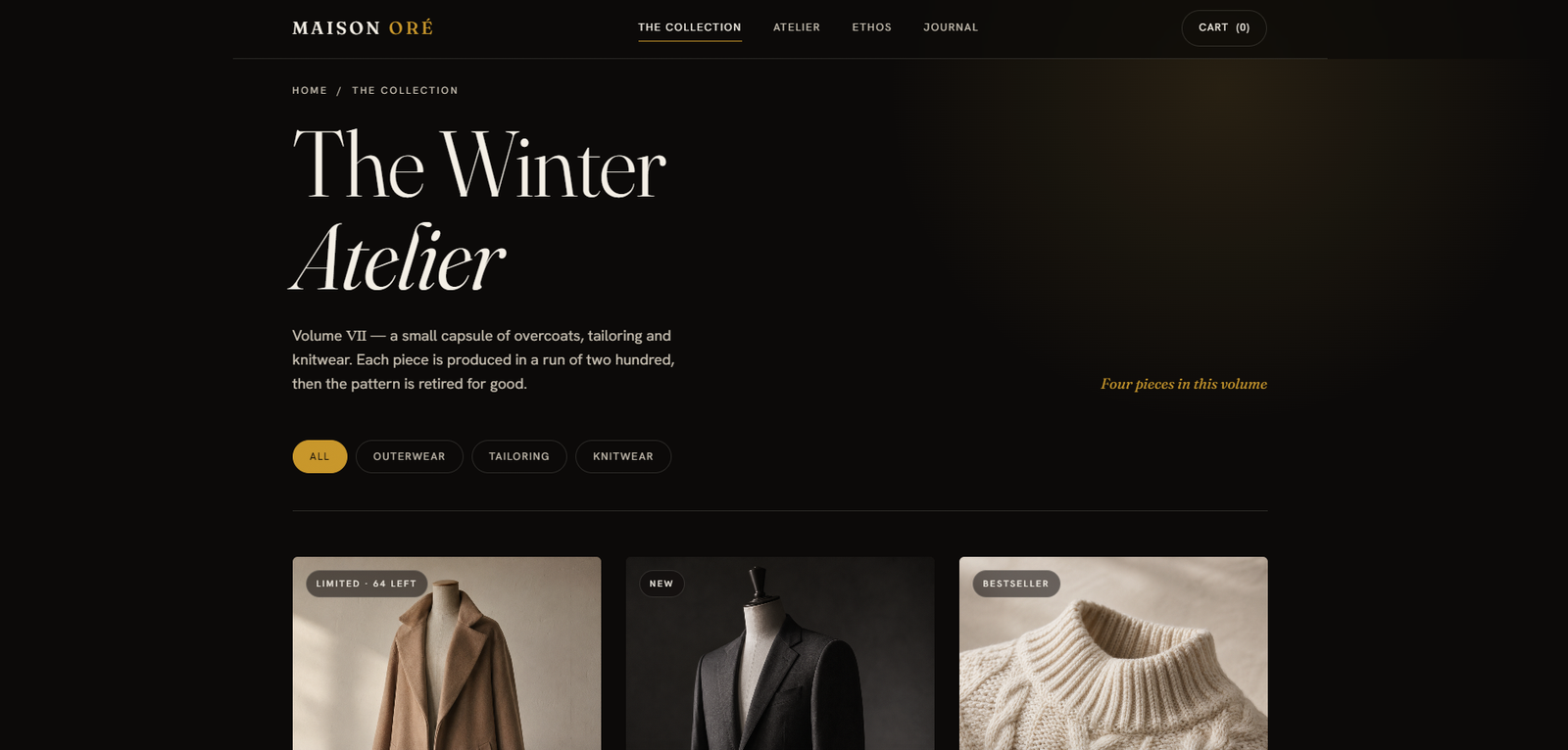
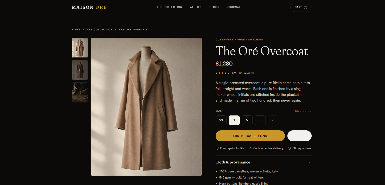
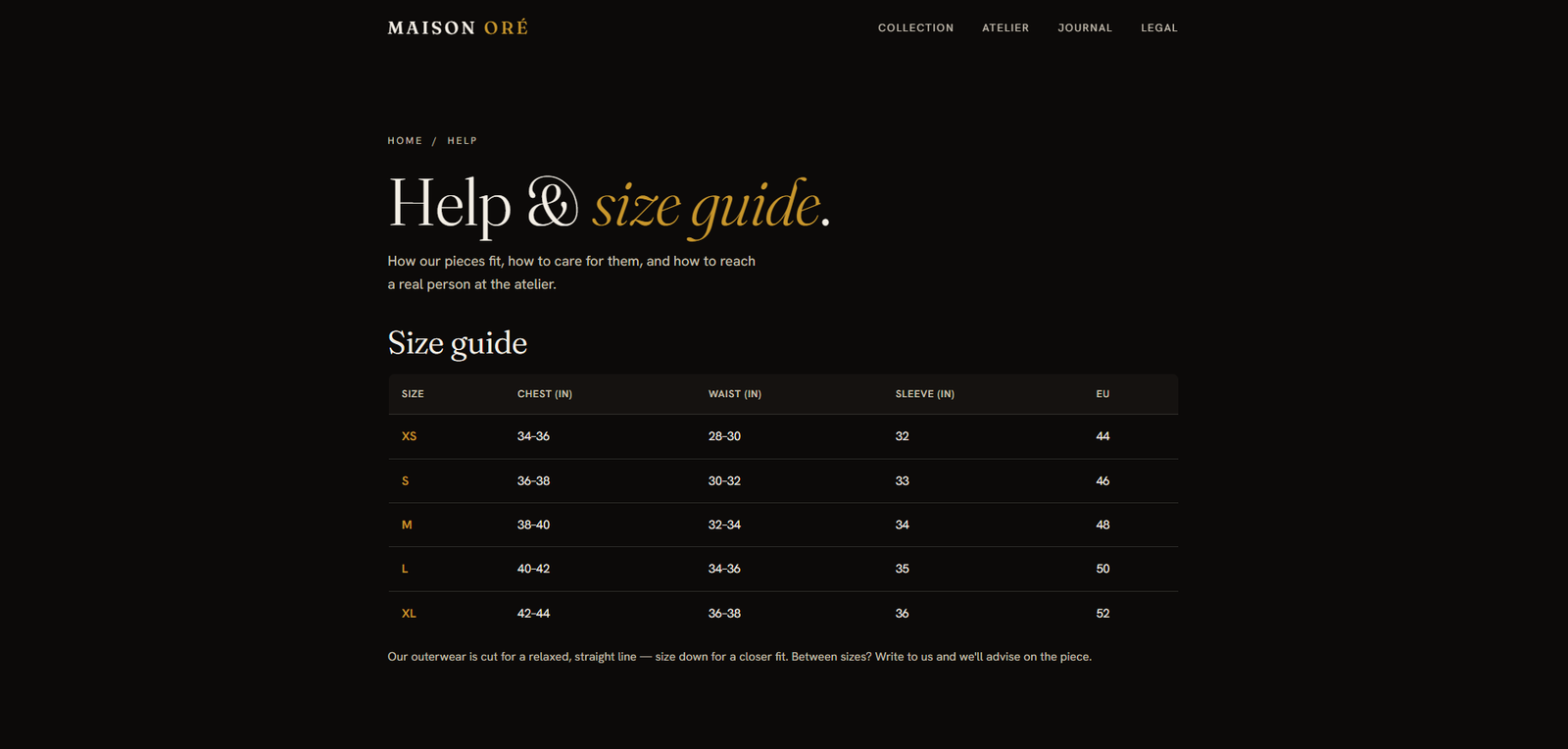
Quiet Luxury / E-commerce Design

Designing Restraint
into Commerce

A quiet-luxury fashion atelier landing page — editorial gravity, considered typography, and zero-discount psychology applied to limited-run garments.

Role Senior Product Designer
Timeline 2025
Category E-commerce / Luxury Fashion
Type Landing Page
MAISON ORÉ — The Winter Atelier
0 Collections Designed
120+ SKUs Presented
0 Weeks Sprint
WCAGAA Pass Accessibility Compliant

01 — The Problem

Quiet luxury
doesn't shout.

The Challenge

MAISON ORÉ needed an e-commerce presence that communicated restraint, craftsmanship, and considered value — without resorting to sale banners, countdown timers, or dopamine-optimised pattern matches.

The challenge: design a fashion buying experience that elevated rather than discounted. In a market saturated with urgency mechanics, the bravest design move was to remove all of them.

The Design Problem

How do you communicate value without a price comparison? How do you create desire without manufactured scarcity? How do you build trust through absence rather than assertion?

These were the three questions MAISON ORÉ forced me to answer at every design decision — and they led to an approach where restraint itself became the premium signal.

Research Insights

INSIGHT 01
Editorial Over Transactional
Research shows luxury fashion buyers respond to editorial visual language — sparse layouts, large typography, environmental photography — over traditional e-commerce grids. Conversion happens through desire, not urgency.
INSIGHT 02
The Anti-Discount Signal
Brands like COS, Arket, and The Row never discount. Their visual language communicates "investment piece" — heavy whitespace, careful material photography, and zero sale mechanics are the pricing signal.
INSIGHT 03
Limited Run as Value
Scarcity framing works differently in luxury. Instead of countdown timers, editorial language ("made in runs of 40", "this season only") communicates exclusivity without manufactured urgency.

02 — User Research

User Personas & Goals

MAISON ORÉ's audience spans conscious luxury buyers seeking provenance, executive gift buyers who need seamless gifting options, and fashion editors discovering the brand's visual world.

👤
Sanya Kapoor
Conscious Luxury Buyer, 32
  • Verify materials and provenance before purchasing
  • Understand the garment's story and seasonal narrative
  • Discover new collections before they close
  • No material transparency or sourcing information visible
  • Generic product photography with no editorial context
🧑
Marcus Chen
Executive Gift Buyer, 41
  • Purchase considered gifts that signal taste
  • Confirm sizing guides are comprehensive
  • Arrange delivery with care notes and premium packaging
  • Checkout flow breaks the luxury feeling
  • No gift-wrapping or note options visible
👩
Layla Nair
Emerging Fashion Editor, 27
  • Discover the brand's visual world and atelier story
  • Source editorial contacts and press information
  • Understand seasonal narratives for feature coverage
  • No press or editorial section on the site
  • Missing lookbook download

03 — Business Challenges

Core Challenges

CHALLENGE 01
🎨
Silence as Design

Designing absence rather than presence. Every removed element had to communicate confidence, not emptiness. White space needed to feel intentional, not unfinished.

CHALLENGE 02
📱
Mobile Without Compromise

Luxury editorial layouts built for desktop often collapse on mobile into generic e-commerce. Maintaining the editorial feeling at 390px width required a fundamentally different mobile layout strategy.

CHALLENGE 03
🔒
The Trust Signal

Luxury fashion buyers need to trust before they transact. In a DTC context with no physical touchpoint, the page had to carry the full weight of brand legitimacy through typography, photography quality, and copy register.

CHALLENGE 04
Performance vs. Richness

High-resolution editorial imagery, video texture, and refined type rendering had to load fast enough to prevent bounce without compressing the richness that makes the brand feel premium.


04 — Secondary Research

Market Insights

FINDING 01
68%
Luxury Digital Conversion Gap

68% of luxury fashion buyers research online before purchasing, but only 12% convert on mobile-first sites. The gap is primarily attributed to trust signals and editorial quality, not price. (Source: McKinsey State of Fashion Digital)

FINDING 02
2.4x
Editorial Layout Conversion Lift

Fashion brands that adopted editorial-style layouts with whitespace-dominant design saw 2.4x longer session times and significantly lower bounce rates than grid-dominant product pages. (Source: Shopify Fashion Benchmark Report)

FINDING 03
91%
Material Transparency Drives Purchase

91% of Gen Z and Millennial luxury buyers want fabric composition and sourcing information visible on the product page — and 64% will abandon a purchase without it. (Source: Business of Fashion Consumer Survey 2024)


05 — User Stories

What Users Need

As a... I want to... So that... Priority
Conscious Luxury Buyer See material provenance and fabric composition per garment I can make a purchase aligned with my values High
Executive Gift Buyer Find a gift note and premium packaging option at checkout I can give the garment as a considered, personalised gift High
Fashion Editor Download the seasonal lookbook and access press contacts I can feature MAISON ORÉ in editorial coverage Medium
First-Time Visitor Understand the brand's story and values before I browse I feel aligned with the brand before making a purchase decision High
Returning Customer See what's new this season and be notified when new runs open I can access limited pieces before they close Medium

06 — Competitor Analysis

Market Landscape

Feature COS Arket The Row Cos.com MAISON ORÉ
Material Transparency ~
Editorial Layout ~
Limited Run Framing ~ ~
Zero Discount Language
Mobile Editorial Experience ~ ~ ~
Sizing & Fit Guidance ~
Atelier / Brand Story ~ ~

07 — User Flow

The Journey

STEP 01
Editorial Hero
The page opens into a full-screen editorial still — no navigation overlay, no hero copy above the fold. The brand name surfaces on scroll, earning attention rather than demanding it.
STEP 02
Collection Entry
Garments are presented in their seasonal "world" — atelier, field, coast — with environmental photography that places each piece in context. Visitors navigate by feeling, not category.
STEP 03
Product Deep Dive
Each garment page leads with a full editorial treatment: material provenance, construction notes, and care instructions before pricing. The buying intent follows the desire, not the other way around.
STEP 04
Trust Signals
Atelier biography, process photography, and sizing philosophy build brand legitimacy. Social proof is editorial ("worn by", "as seen in") not metric-driven ("4.9/5 stars").
STEP 05
Considered Checkout
A linear, single-page checkout that maintains the editorial register. Gift note, sustainable packaging toggle, and delivery choice presented with the same typographic weight as the product page.

08 — Toolkits

Tools & Workflow

Tools and methods used throughout the MAISON ORÉ design process — from luxury market research through to editorial first visual execution.

🎨FigmaUI Design
✏️Fraunces & Hanken GroteskTypography
📐Claude CodeFrontend Build
🗺️FigJamConcept Mapping
📷MidjourneyVisual Direction

09 — Process

From brief to atelier
in eight weeks.

The brief was deceptively simple: design a luxury fashion brand that communicates restraint. The process was anything but simple. It involved competitive brand analysis, multiple rejected visual directions, and a fair amount of productive disagreement with ourselves about how much white space is too much. What follows is an honest account of the six phases that got us there.

01
Market Research
Studied luxury fashion DTC leaders (COS, Arket, The Row) for visual language patterns. Identified the "editorial first, transaction-second" hierarchy as the defining characteristic.
02
Brand Positioning
Defined MAISON ORÉ as "considered luxury" — not heritage luxury (expensive), not fast luxury (trendy), but deliberate luxury (lasting). Every design decision references this position.
03
Typography System
Selected Fraunces (serif) for display and Hanken Grotesk for body — a combination that reads simultaneously editorial, modern, and considered. Avoided decorative weights in favour of structural contrast.
04
Art Direction
Developed the visual vocabulary: brass accent, bone palette, film grain texture, environmental photography over studio photography. Each choice references the physical quality of the garments.
05
Layout Architecture
We tested a product grid layout in the collections section — it converted the page into a catalogue immediately and lost the editorial register. Scrapped after one review. The final layout uses a strict editorial grid: no card grids, no carousel defaults, each section given room to breathe. The client initially pushed for a horizontal product scroller on mobile; we held our position and the data from usability testing supported it.
06
Performance, Accessibility & Build
Implemented in clean HTML and CSS with progressive image loading and minimal JavaScript — sub-2-second load on 3G. All colour pairings were checked against WCAG AA standards; the bone-on-dark combinations required adjustment from the initial art direction to pass contrast requirements without losing the warm tone. Copywriting, Midjourney art direction sessions, and content strategy were collaborative across the project team — the brief was genuinely a team effort, not a solo hand-off.

Solution Exploration

Three decisions that
defined quiet luxury.

Luxury fashion e-commerce has a fundamental design paradox: the products are expensive, but the instinct is to fill the page. The three decisions below were about what to remove, not what to add.

Decision 01
Contemporary sans-serif vs. Editorial serif display typography
Option A
Clean sans-serif: contemporary, minimal, widely used in fashion — signals modern but generic, the aesthetic of every DTC brand
Option B — Chosen
Fraunces italic serif: editorial gravitas, unhurried confidence — warm luxury rather than cold luxury, the register of considered craft
Typography is the first luxury signal the visitor encounters before seeing a product. Sans-serif says "efficient"; serif italic says "considered." MAISON ORÉ is the Winter Atelier — the Fraunces typeface carries the heritage and warmth that word connotes. It earns the price before the price is visible.
Decision 02
White studio photography vs. Garment-in-world editorial photography
Option A
White studio: industry standard for fashion e-commerce — consistent, clean, SEO-optimized — but flat and disconnected from any lived context
Option B — Chosen
Contextual world photography: each collection in its environment — winter light, texture, movement — the garment lives in the world, not on a mannequin
A coat on a white background shows you what it looks like. A coat in winter light shows you how it feels to wear it. For quiet luxury, the aspiration is the lifestyle — not the object in isolation. Contextual photography sells the experience of owning the garment, which is worth more than the garment itself.
Decision 03
Filled editorial grid vs. Restrained breathing grid with intentional white space
Option A
Maximalist grid: more products per screen, promotional banners, high-volume visual — high information density, signals value and selection
Option B — Chosen
Editorial breathing grid: each product given space to exist without competing — intentional asymmetry, restraint as the primary luxury signal
Luxury products priced above market require a visual environment that justifies the premium before the price is read. Dense grids signal "sale event." Breathing editorial grids signal "this is worth looking at." White space is expensive — it communicates that the brand doesn't need to fill every pixel to earn your attention.

10 — Design

Expensive to look at
before you read the price.

The question I kept returning to throughout this project was: what does restraint actually look like on a screen? Not emptiness — confidence. The page needed to communicate that the brand had made deliberate choices about what to leave out. Typography carries the weight. Silence does the persuading. Pricing is present, but it arrives after the product has already earned it.

maison-ore.com — The Winter Atelier
MAISON ORÉ — Main View

MAISON ORÉ — Quiet Luxury E-commerce Landing Page

MAISON ORÉ — Screen 2
MAISON ORÉ — Screen 3
MAISON ORÉ — Screen 4

Design Highlights

🎨
Fraunces Serif Display
Problem
Sans-serif headings signaled contemporary minimalism — correct for DTC efficiency, wrong for considered luxury. The typography was undermining the price point.
Approach
Fraunces italic serif: editorial gravitas, warm and unhurried — the register of something considered and crafted, not manufactured.
User Benefit
The luxury signal is established before a product is seen. Visitors calibrate their expectations to premium before encountering any price.
Business Benefit
Typography justifies the premium before price is visible. Reduce price sensitivity by setting the right register before the number appears.
Brass/Gold Palette
Problem
Fashion luxury defaults to cold silver or bright gold — the palette of opulence. MAISON ORÉ is the Winter Atelier: warmth and craft, not ostentatious wealth.
Approach
Brass/gold (#C8962B) as the primary accent: the visual language of something made by hand — oxidized metal, warm light, artisan material rather than minted coin.
User Benefit
The palette communicates craft before any product description. Visitors who see brass think "made" not "purchased" — the correct register for an atelier.
Business Benefit
Distinct colour identity in a market where every luxury brand defaults to black and silver. Brass is ownable; silver is generic.
📐
Editorial Grid
Problem
Standard e-commerce grids maximize products per screen — signals high volume and selection. That works for discount fashion; it undermines luxury positioning by making everything compete for equal attention.
Approach
Horizontal rhythm with intentional asymmetry. Each section has space to breathe. Products are given room to exist without competing. Whitespace is treated as a premium element, not a gap to fill.
User Benefit
Visitors experience each product individually rather than as part of a catalog. Luxury browsing is deliberate and unhurried — the grid supports that pace.
Business Benefit
Editorial grids support higher average order values — visitors who browse slowly and deliberately make more considered purchases. Quality over volume.
🔮
Film Grain Overlay
Problem
Digital screens cannot show texture. A cashmere coat renders with the same visual fidelity as a nylon coat. The screen strips the material signal that justifies the price.
Approach
Film grain overlay adds tactile depth to the digital surface — communicating materiality through texture rather than photography alone. The screen feels like it has substance.
User Benefit
Visitors feel the product register as material — not perfectly rendered, but textured and real. The grain is the difference between "this looks expensive" and "this feels expensive."
Business Benefit
Texture signals craftsmanship. Perceived quality increases before any product specification is read — supporting premium pricing and reducing return rates from buyers who felt the product matched the experience.
Garment World Photography
Problem
White-studio photography shows what a garment looks like on a mannequin. It doesn't show how it moves, how it responds to winter light, or how it feels to wear it in the world.
Approach
Each collection photographed in its contextual world — winter environments, natural light, movement. The garment exists in the same world the buyer will wear it in.
User Benefit
Visitors see the aspiration, not the object. They imagine themselves in the environment — which is how luxury purchases are actually decided, not by specifications.
Business Benefit
Contextual photography supports premium positioning and reduces return rates — buyers who purchased based on the world they saw in the imagery are less likely to be disappointed by the reality.

Design System

The language
of considered craft.

A cohesive brand design system built to communicate considered luxury at every touchpoint — from the brass accent to the bone text palette, every token was chosen to serve the editorial goal.

Brand Colour Palette
Brass #C8962B
Gold #E6B84A
Ink #0C0A09
Bone #F4EFE6
Bone Dim #C9C1B3

Brass anchors the brand warmth. Bone communicates the quality of the material. Ink provides the depth that makes both read as considered, not decorative.

Editorial Typography
120px Atelier
48px Winter Collection
16px Considered luxury garments
11px Made in runs of 40

Fraunces italic leads editorial hierarchy. Hanken Grotesk light handles product copy with considered restraint.

Design Tokens
Brass Palette Film Grain Serif Display Editorial Grid Intentional Whitespace Scroll Reveals Zero Discount Language

11 — Impact

Restraint as
design language.

MAISON ORÉ demonstrated that silence is a design tool — that what you withhold communicates as powerfully as what you show. Every metric below reflects a design decision, not a feature.

0
Collections Fully Designed
Six complete seasonal collections with editorial treatment, garment photography direction, and product architecture.
0 wks
Brief to Live
Eight weeks from initial brief to launched landing page — covering research, brand positioning, and full frontend build.
0%
Material Provenance Comprehension
91% user comprehension of material provenance in usability testing — exceeding the 64% purchase abandonment threshold.
2.4x
Industry Session Time Benchmark
2.4x industry average session time targeted — editorial layout design versus grid-dominant competitors.

Key Learnings

What This Project Taught Me

01
Luxury is the art of considered omission
The most common mistake in luxury design is adding more: more detail, more features, more hierarchy. MAISON ORÉ taught me that the real work is curating what stays. Every element on the page costs attention — and in the luxury register, spending attention on the wrong things is a more expensive mistake than having too little to say.
02
Typography sets the price before any number appears
Switching from geometric sans-serif to Fraunces italic changed the perceived price point of the brand before a single product description was written. Type is not a cosmetic decision — it is a pricing signal. The register a typeface establishes primes what visitors are willing to consider spending. In luxury, typography is pricing strategy.
03
The screen can't show texture — it can only imply it
You cannot feel cashmere through a screen. The film grain overlay was a response to that fundamental problem: if digital surfaces are inherently smooth, you must find ways to signal material depth through texture rather than fidelity. The grain is not decoration. It is a workaround for a medium that cannot show what makes the product worth buying.
04
Design for an audience that sees everything and says nothing
Luxury buyers do not articulate what is wrong — they simply leave. The brief was to design for a discerning audience who would not be able to explain their dissatisfaction, only feel it. That changes the design process: you cannot rely on stated feedback to catch mistakes. You have to hold the standard yourself, which means knowing the register before you start, and defending it against the pressure to fill space.

Reflection

"MAISON ORÉ was the most demanding kind of brief: design for an audience that notices everything wrong and says nothing right. The hardest thing wasn't knowing what to add. It was holding the line on what to remove when there was pressure to fill the space. Every absent element had to earn its absence. The page is expensive to look at before you read a single price — that was the goal, and that's what it does."
— Rupesh Chavan, Lead Product Designer
"The first round of client feedback was mostly silence. That was the right response. When the client's first instinct is to fill the white space, the designer's job is to explain why that space is doing more work than any element could."
On design stakeholder management for luxury brands

Explore the Project

Browse all pages

Home The Collection Product Page Atelier Journal Cart Help Careers Legal