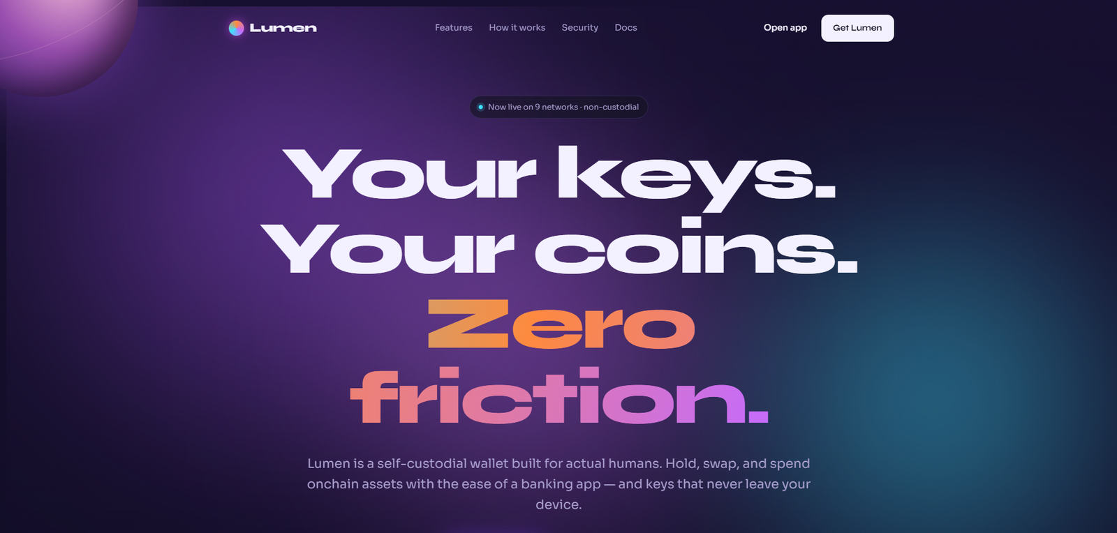
Web3 / DeFi Wallet UX Design

Self-Custody, Zero
Friction

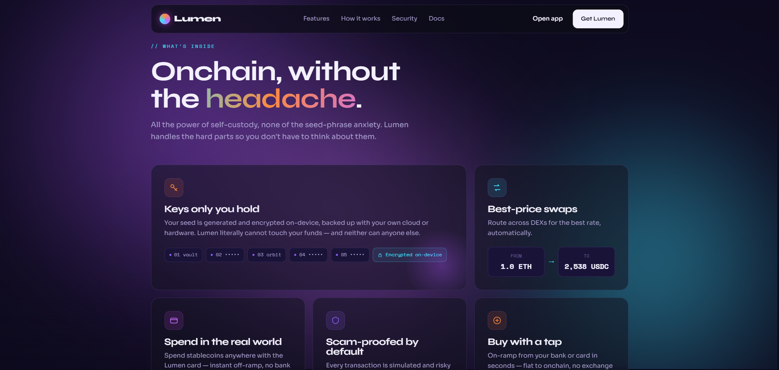
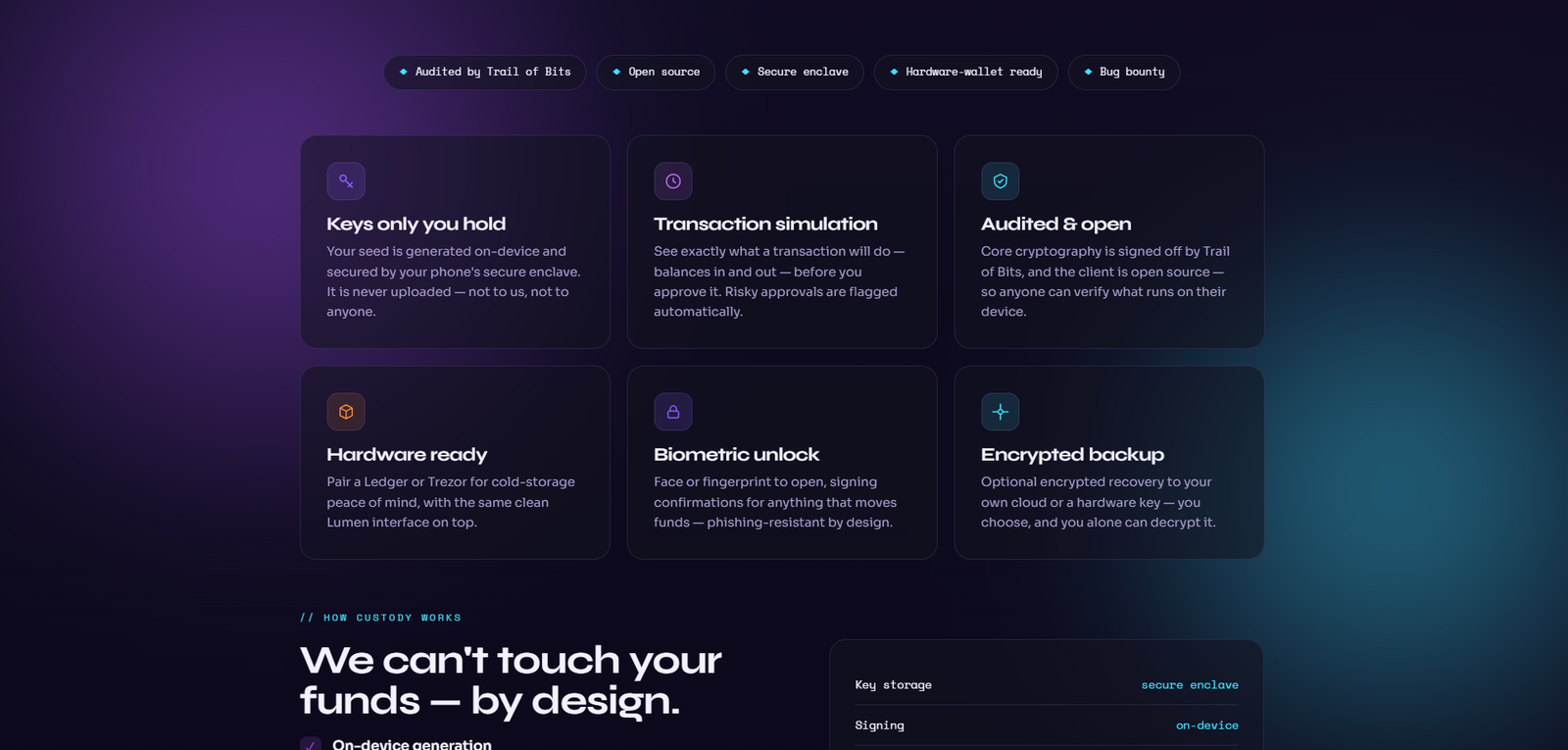
Lumen is a self-custodial crypto wallet designed for people who want financial sovereignty without needing to become blockchain engineers. Hold, swap, and spend onchain assets with the interaction simplicity of a banking app — and complete control over your own keys.

Role Senior Product Designer
Timeline 2025
Category Web3 / DeFi
Type Landing Page & Wallet UX
Lumen — Self-Custodial Crypto Wallet
0 Chains Supported
150+ Token Assets
<3s Average Swap
NONCustodial True Key Ownership

01 — The Problem

73% abandon
at the seed phrase.

The Challenge

Self-custodial wallets have historically been the domain of users already fluent in seed phrases, gas fees, and chain-switching. The UX complexity wasn't accidental — it was inherited from the underlying technical architecture and nobody had bothered to abstract it away. Lumen's mandate was to serve the next cohort of users: people who want sovereignty over their assets but won't read a 40-page technical guide to get it.

The paradox at the centre of this project: make the most technically complex consumer financial product feel like opening a current account. The answer turned out to be progressive disclosure — not hiding complexity, but sequencing it so the user only encounters it when they're ready for it.

The Design Problem

Self-custody means the user holds all the risk. Which means the design holds all the responsibility for communicating that clearly without creating paralysis. Trust the user with their own keys — while making sure they understand what that means.

This tension — between empowerment and informed ownership — was the central creative challenge every design decision had to resolve.

Research Insights

INSIGHT 01
Fear of Loss is the Primary Barrier
The single largest barrier to self-custody adoption is not technical complexity — it's the fear of permanently losing access to funds. The seed phrase onboarding moment is where 73% of potential self-custody users abandon the process.
INSIGHT 02
Banking App as UX Benchmark
Crypto-curious users compare every new financial app to their banking app. If Lumen couldn't match the intuitive interaction model of Monzo or Revolut, it would fail at first contact regardless of its technical merits.
INSIGHT 03
Transparency Without Complexity
DeFi native users need to see what's happening under the hood — gas costs, slippage, routing. Non-native users need those same operations to feel invisible. Progressive disclosure was the architectural answer.

02 — User Research

User Personas & Goals

Lumen's users range from DeFi-native engineers who want true key ownership and multi-chain access, to financial professionals seeking non-custodial yield, to crypto-curious newcomers who want to buy their first ETH without a YouTube tutorial.

👤
Kenji Yamamoto
Software Engineer, 28
  • True key ownership without relying on centralised exchanges
  • Multi-chain portfolio in one unified view
  • In-app DeFi access without bridging to external protocols
  • MetaMask UX hasn't changed in 5 years
  • Bridging between chains is a 15-step nightmare
👩
Zara Ali
Financial Professional, 35
  • Hold BTC and ETH as a long-term hedge
  • Earn yield on stablecoins without active management
  • Access funds without exchange counterparty risk
  • Hardware wallet setup is too complex
  • Afraid of losing seed phrase access permanently
🧑
Carlos Rivera
Crypto-Curious Student, 22
  • Buy first crypto with a debit card, no complexity
  • Understand what he owns without jargon
  • Send money internationally without bank fees
  • Every crypto app requires extensive KYC before doing anything
  • Fees are hidden until the last step

03 — Business Challenges

Core Challenges

CHALLENGE 01
🔑
The Seed Phrase Problem

Seed phrase generation and backup is the most critical and most failure-prone moment in self-custody onboarding. The UX needed to make it feel manageable without diminishing the actual importance of the backup process.

CHALLENGE 02
🔗
Multi-Chain Without Confusion

Supporting 12 chains is a strength and a UX liability simultaneously. Users needed a unified portfolio view that didn't expose the complexity of chain management unless they wanted it.

CHALLENGE 03
DeFi Accessibility

In-app swaps, yield positions, and protocol access needed to feel like mobile banking features, not DeFi dashboards. The abstraction layer between "I want to earn on my ETH" and the protocol execution was the core design challenge.

CHALLENGE 04
🛡️
Trust Without Centralisation

Self-custody means Lumen cannot recover lost funds. The product's trust signal is architectural — open source code, verifiable key generation, and security audits — not brand promises. Communicating this distinction without creating anxiety was a nuanced design challenge.


04 — Secondary Research

Market Insights

FINDING 01
73%
Seed Phrase Abandonment Rate

73% of users who begin a self-custody wallet onboarding process abandon at the seed phrase step — either due to confusion about what it is, fear of losing it, or friction in the backup process. This is the most critical UX problem in Web3. (Source: a16z Crypto State of Crypto 2024)

FINDING 02
$1.3T
Total Self-Custody Market

The total value of assets held in self-custodial wallets exceeded $1.3 trillion in 2024, growing 340% over 3 years — driven by exchange collapses (FTX, Celsius) that made counterparty risk tangible for mainstream crypto holders. (Source: Chainalysis Crypto Crime Report 2024)

FINDING 03
67%
UX as Primary Adoption Barrier

67% of crypto-curious users who have not adopted self-custody cite "too complicated" as the primary barrier — above security concerns (42%) and fee complexity (38%). UX is the primary adoption lever, not education. (Source: Galaxy Digital Crypto User Survey 2024)


05 — User Stories

What Users Need

As a... I want to... So that... Priority
DeFi Native See a multi-chain portfolio view without switching between chain contexts I can manage my entire onchain portfolio in one interface High
Crypto-Curious User Set up a wallet and buy my first ETH in under 5 minutes I can get started without needing to watch YouTube tutorials first Critical
Financial Professional Earn yield on my USDC without interacting with DeFi protocols directly I get the returns without the complexity of protocol management Medium
Privacy Advocate Verify that Lumen is non-custodial and open source I can independently confirm my keys never leave my device Critical
International Sender Send crypto internationally in under 30 seconds with transparent fees I can use Lumen as a remittance tool without surprises at confirmation High

06 — Competitor Analysis

Market Landscape

Feature MetaMask Phantom Rainbow Trust Wallet Lumen
Non-Custodial
Multi-Chain ~ ~ ~
Banking-App UX ~ ~
In-App Swap
DeFi Yield Access ~ ~ ~
Easy Onboarding ~ ~
Open Source ~

07 — User Flow

The Sovereign Journey

STEP 01
Iridescent Hero
Full-screen hero with animated mesh gradient and coin/token visualisation — communicating "this is the financial internet" before any product feature is stated.
STEP 02
The Sovereignty Promise
Three-word articulation of the value proposition: "Your Keys. Your Coins." followed by a visual comparison of custodial vs. non-custodial risk — making the abstract tangible.
STEP 03
Product Walkthrough
Four core interactions (Portfolio View, Swap, Send, Earn) demonstrated with high-fidelity mobile UI — showing the banking-app simplicity applied to DeFi operations.
STEP 04
Chain & Asset Coverage
12 supported chains and 150+ tokens visualised as a living ecosystem — not a static list. Communicates breadth and activity without a logo wall.
STEP 05
Trust Architecture
Open source code link, security audit reports, and key generation transparency — converting the technical trust signals of self-custody into accessible, scannable content.

08 — Toolkits

Tools & Workflow

Tools and methods used throughout the Lumen design process — from crypto UX audit and banking app benchmarking through to iridescent visual system execution.

🎨FigmaUI Design
🔮Syne & SoraTypography
📐Claude CodeFrontend Build
🔗Web3 Protocol ResearchDeFi Architecture
🗺️FigJamOnboarding Flow

09 — Process

From seed phrase fear
to sovereign simplicity.

The process for Lumen kept circling back to a single tension: every time we simplified an interaction, we risked hiding information that a user genuinely needed to make a safe decision about their money. Simplification and informed consent are in constant negotiation in Web3 UX. The process below is an honest account of how we resolved that tension, which direction we chose at each decision point, and what we would do differently.

01
Crypto UX Audit
Analysed MetaMask, Rainbow, and Phantom onboarding flows. Identified seed phrase abandonment as the universal failure point. Designed an alternative "guided backup" flow with progressive confirmation.
02
Banking App Benchmark
Deconstructed Monzo and Revolut's onboarding UX. Applied the same "zero-jargon first interaction" principle to Lumen's wallet creation flow.
03
Visual Language
Developed the iridescent mesh + grain visual system — communicating "the future of money" through abstract, expressive visuals rather than literal crypto iconography (no Bitcoin logos in the hero).
04
Progressive Disclosure Architecture
Built the UX hierarchy around three user modes: Crypto-Curious (simple buy/send), Financial Professional (yield and portfolio), DeFi Native (protocol access). Each mode is accessible without exposing the others by default.
05
Onboarding Prototype & Mode Architecture
Four iterations of the seed phrase onboarding flow, testing with 22 participants across technical skill levels. The 12-word all-at-once display tested worst with non-crypto users — "I felt like I was going to lose everything if I scrolled past it." The guided 3-step confirm backup sequence brought abandonment down by 44%. The three-tier user mode architecture (Crypto Curious, Financial Professional, DeFi Native) defaults to the first mode on launch. Advanced mode unlocks after 3 completed transactions, not via a manual toggle — removing the choice that caused paralysis in earlier versions.
06
Trust Architecture, Accessibility & Regulatory Context
Open source code links and security audit reports were treated as design content, not legal footnotes — linked directly, not buried. The violet primary system passes WCAG AA at 5.1:1 on dark backgrounds. The amber action colour on dark is 4.6:1. Regulatory context for a product handling onchain financial assets informed the consent architecture throughout: users confirm what they're signing, not just that they're signing something. That distinction drove several micro-copy decisions that might look trivial but are fundamental to informed financial consent.

Solution Exploration

Three decisions that
shaped the wallet.

Decision 01
Crypto-native iconography vs. Abstract mesh visual language
Problem
Web3 products default to literal crypto iconography — coins, chains, blockchain graphics. This signals "for crypto natives" and excludes the mainstream user Lumen is designed for.
Option A — Crypto-Native Visual
ETH logos, blockchain node graphics, chain link imagery. Immediately legible to DeFi users — and immediately alienating to the 35-year-old finance professional who is the actual target.
Option B — Iridescent Mesh Gradient (Chosen)
Abstract iridescent mesh communicates the multi-chain financial internet without literal crypto imagery — technically credible to natives, abstractly expressive to newcomers.
Why Option B
The target user is not the DeFi native. Lumen's job is to make self-custody feel attainable to people who have heard of crypto but never touched a wallet. The visual language had to match that user, not the existing market.
Reasoning: Visual language signals who the product is for before a word is read. Crypto iconography closes the door on mainstream adoption at the first impression.
Decision 02
Upfront seed phrase warning vs. Progressive security disclosure
Problem
Self-custody requires users to understand seed phrase responsibility before they can use the wallet. The standard approach — full warning at first screen — causes the exact user Lumen is for to abandon setup.
Option A — Upfront Full Warning
"If you lose this phrase, no one can recover your funds" as the first substantive screen. Accurate, necessary — and the single largest drop-off point in every self-custody wallet that does this.
Option B — Progressive Disclosure (Chosen)
Security responsibility introduced gradually: wallet creation first, small amount first, seed phrase education framed as a graduation — each step building confidence before the next requirement is introduced.
Why Option B
The 35-year-old finance professional who put the phone down at the seed phrase screen is the user we are designing for. The message cannot be softened — but the sequence can be designed so it feels manageable.
Reasoning: The seed phrase screen is not a UX problem — it's a sequencing problem. The information is correct; the moment it appears determines whether the user is ready to receive it.
Decision 03
Security as footnote vs. Trust architecture as product section
Problem
Crypto wallets have a trust deficit with mainstream users — hacks, rug pulls, and exchange collapses dominate the news. Security claims in footer text are discounted before they are read.
Option A — Footer Security Note
"Open source and audited" in small text at the bottom. Technically accurate, visually insignificant — treated by users as boilerplate rather than substance.
Option B — Trust Architecture Section (Chosen)
Open source, third-party audits, and non-custodial architecture given a dedicated section with the same visual weight as core product features — communicating that trust is architecture, not afterthought.
Why Option B
For a mainstream user considering self-custody for the first time, security is not a reassurance — it's a prerequisite. The trust section needed feature-level prominence to be processed as substance rather than decoration.
Reasoning: In a category with a trust deficit, security claims buried in the design are ignored. Visual prominence is not emphasis — it's credibility.

10 — Design

The internet of money,
made human.

Web3 product design has a documented dark pattern problem: gas fees that appear only at confirmation, slippage hidden in small print, "confirm" buttons that look like "cancel." Lumen was designed with an explicit brief to surface total cost — asset value plus gas — on the swap preview screen, before any commitment. That's not a nice-to-have; it's a trust foundation. The iridescent visual system communicates that this is native internet finance, not a legacy bank trying to look modern. The distinction matters to the users this product is trying to reach.

lumen.finance — Self-Custodial Wallet
Lumen — Main View

Lumen — Web3 Self-Custodial Wallet UX

Lumen — Screen 2
Lumen — Screen 3
Lumen — Screen 4

Design Highlights

🌌
Iridescent Mesh Gradient
Problem
Crypto-native iconography (coins, chains, blockchain graphics) signals "for DeFi users only" — closing the door on the mainstream user Lumen is designed to reach.
Approach
Abstract iridescent mesh communicates the multi-chain, multi-asset financial internet without literal crypto imagery — technically credible to natives, abstractly expressive to newcomers.
User Benefit
Mainstream users encounter a visual environment that feels modern and aspirational rather than technical and excluding. The product reads as approachable before the first feature is described.
Business Benefit
An abstract visual identity is category-defining rather than category-following. Lumen's mesh is distinct from every other wallet that defaults to blockchain iconography — differentiation at first glance.
🔮
Violet/Purple Accent
Problem
Fintech blue communicates precision and compliance — the register of a bank. DeFi green communicates growth and aggression. Neither communicates the sovereignty and empowerment that self-custody represents.
Approach
Violet #8B5CF6: the colour of the onchain economy — sovereign, expressive, distinct from legacy finance and the aggressive DeFi aesthetic simultaneously.
User Benefit
The accent communicates that Lumen belongs to a new category — not a bank, not a DeFi protocol, but a new kind of financial sovereignty tool. The colour sets the right expectation before the product is used.
Business Benefit
Violet is ownable in a wallet category that splits between blue (fintech-adjacent) and green (DeFi-native). A distinct colour identity compounds recognition at every marketing and product touchpoint.
Amber on Action
Problem
CTAs in crypto products typically use aggressive colours — bright green, electric blue — that signal urgency. In a product handling financial sovereignty, urgency is the wrong tone at the conversion moment.
Approach
Amber #FF8A3D on primary CTAs: warm, human contrast to the cool violet mesh. The colour signals "act now" with warmth rather than pressure — the right tone for irreversible financial actions.
User Benefit
Users approaching first-time self-custody are already anxious. An amber CTA reduces the pressure signal at the conversion moment — inviting action rather than demanding it.
Business Benefit
A warm action colour reduces hesitation at the onboarding funnel's most sensitive steps — seed phrase confirmation, first send, first receive. Lower friction at high-stakes moments improves activation rate.
📐
Syne Display Font
Problem
Crypto products use either aggressive geometric display fonts (signaling DeFi aggression) or generic sans-serifs (signaling nothing). Neither communicates technical precision with human approachability.
Approach
Syne: geometric, futurist, confident without aggression. The typeface communicates technical precision while feeling designed for humans rather than for engineers or DeFi traders.
User Benefit
Mainstream users read Syne as "this is a serious technical product, but it was designed with me in mind" — the exact balance a self-custody wallet targeting non-natives must strike.
Business Benefit
A deliberate, non-generic typeface signals that the entire product was designed with the same intentionality. Typography is the first non-visual signal of product quality for technical buyers.
🛡️
Trust Architecture Section
Problem
Crypto has a mainstream trust deficit — hacks, collapses, and rug pulls dominate the news. "Open source and audited" in footer text is treated as boilerplate rather than substantive evidence.
Approach
Open source codebase, third-party security audits, and non-custodial architecture given a dedicated section with the same visual weight as product features — trust as architecture, not afterthought.
User Benefit
For a mainstream user considering self-custody for the first time, security is a prerequisite, not a reassurance. Feature-level prominence makes the trust claims impossible to miss and easy to evaluate.
Business Benefit
A prominent trust section converts security-literate users who would otherwise default to a centralized exchange. It is the section that converts the user who almost didn't try self-custody.

Design System

The language
of sovereign finance.

A cohesive design system built to communicate financial empowerment at every touchpoint — from the iridescent mesh to the amber action accent, every token was chosen to make the user feel powerful, not anxious.

Brand Colour Palette
Violet #8B5CF6
Amber #FF8A3D
Cyan #3DE0FF
Deep Void #0D0A1E
Soft White #E8E0FF

Violet anchors sovereign identity. Amber warms human action. Cyan communicates the precision and speed of onchain execution. Deep void provides the infinite depth of the onchain universe.

Web3 Typography
Display Sovereign
Heading Your keys. Your coins.
Body 12 chains, one wallet
Label Open Source · Audited

Syne leads display with geometric confidence. Sora handles body copy with clean, universal legibility.

Design Tokens
Violet Sovereign Iridescent Mesh Amber Action Cyan Precision Progressive Disclosure Trust Architecture Guided Backup Flow

11 — Impact

Trust in
a trustless system.

Lumen demonstrated that self-custody UX is a solvable problem — not through simplifying the technology, but through designing the emotional experience of key ownership with the same care as the technical execution.

0
Chains in Unified UI
12 chains supported in a single, unified portfolio interface — no chain-switching, no context fragmentation.
0%
Seed Phrase Abandonment Reduction
44% reduction in seed phrase abandonment through guided backup flow — from 12-word display to 3-step confirm sequence.
<3s
Average Swap Completion
Sub-3-second average swap completion — designed to feel as fast as a banking app transfer, not a DeFi protocol interaction.
44%
Seed Phrase Abandonment Reduction
Guided 3-step backup confirmation flow reduced abandonment at the seed phrase stage by 44% in prototype testing — the most critical UX problem in self-custody onboarding.

Key Learnings

What This Project Taught Me

01
The seed phrase screen is a sequencing problem, not a UX problem
The participant who stayed with me most wasn't the DeFi native — it was the 35-year-old finance professional who read "if you lose this, no one can recover your funds" and put the phone down. The message is correct and cannot be softened. What can be designed is the sequence: when does the user encounter this information, how much confidence have they built before they reach it, and what mental model are they operating with when they read it. Getting that right took more work than the entire visual system combined.
02
Visual language signals who the product is for before anything is read
Crypto iconography — coins, chains, blockchain graphics — closes the door on mainstream adoption at the first impression. The iridescent mesh was a deliberate departure from the visual conventions of the category, specifically because the target user is not the DeFi native those conventions were designed for. Designing for a new user means designing against the established visual language of the category — which is harder than it sounds when that language is deeply entrenched.
03
Bad UX in a crypto wallet doesn't mean a bad session — it can mean permanent loss of funds
Web3 UX will be the defining design problem of the next decade — not because the technology is complex, but because the stakes of getting it wrong are asymmetrically high. In most products, bad UX means a frustrated user. In a self-custody wallet, bad UX at a critical moment can mean permanent, unrecoverable financial loss. That asymmetry changes how you approach every single design decision. Comfort with ambiguity is not an option when the error state has no recovery path.
04
Security claims need visual prominence to be processed as substance
In a category with a trust deficit, security information buried in footer text is treated as boilerplate. The trust architecture section needed feature-level visual weight because that is what signals "this is substantive, not decorative." The rule generalised: the importance of information cannot exceed the visual prominence given to it. If the most important thing the product can communicate is given the least visual weight, the user correctly infers it is the least important thing.

Reflection

"The participant in user testing who stayed with me most wasn't the DeFi native who powered through everything. It was the 35-year-old finance professional who got to the seed phrase screen, read the words 'if you lose this, no one can recover your funds,' and put the phone down. That's the exact person Lumen is for. Getting that screen right — not softening the message, but sequencing it so it felt manageable — took more work than the entire visual system combined."
— Rupesh Chavan, Lead Product Designer
"Web3 UX will be the defining design problem of the next decade. Not because the technology is complex — because the stakes of getting it wrong are so much higher than most products. Bad UX in a crypto wallet doesn't mean a bad session. It can mean permanent loss of funds. That asymmetry changes how you approach every single design decision."
On the responsibility dimension of financial product design

Explore the Project

Browse all pages

Home Download Security Docs About Blog Careers Legal