Redesigning OpenMetadata's platform UX and marketing website — making enterprise-grade data discovery,
lineage, and governance feel as intuitive as a consumer product.
Data DiscoveryData LineageData Governance500+ IntegrationsISO 27001 Compliant50K+ Active UsersSemantic SearchRole-Based AccessEnterprise Open SourceData DiscoveryData LineageData Governance500+ IntegrationsISO 27001 Compliant50K+ Active UsersSemantic SearchRole-Based AccessEnterprise Open Source
0Active Users
0Native Integrations
0Search Speed Increase
ISO 27001Security Compliant
The Challenge
OpenMetadata is one of the world's most comprehensive open-source data catalog and metadata management
platforms. Despite its powerful backend, the user experience needed a complete rethink — one that would
serve both the data engineer writing SQL at 2am and the CDO presenting data governance posture to a board.
My scope covered the full product experience: the core application UX, the information architecture for
200+ entity types, and the marketing website that had to translate deeply technical capabilities into
business value for enterprise buyers.
My Contribution
Product StrategyInformation ArchitectureUI System DesignData VisualizationNavigation DesignMarketing WebsiteComponent LibraryUser Research
Sole designer responsible for both the product and the marketing site. Worked directly with the founding
engineering team, research from enterprise design partners, and conducted usability testing across data
engineer, analyst, and data governance personas.
The problem
Enterprise data discovery, lineage and governance are genuinely complex — and most tools pass that complexity straight to the user.
The approach
Make the hard thing feel simple without hiding it. Clear hierarchy, progressive depth, and lineage rendered as something readable.
The outcome
A platform UX and marketing site where discovery and governance feel approachable at first contact.
1
Discovery surface
1
Lineage view
1
Governance model
2
Surfaces designed
Research & Problem
Data teams were flying blind
Enterprise data teams had no unified view of their data landscape. Metadata was scattered across warehouses, BI
tools, and pipelines. Data engineers spent 40% of their working time just finding and understanding data — not
analyzing it. The real problem was invisible infrastructure.
01 — Discovery
The Data Discovery Problem
Data engineers spent an average of 2.5 hours per day searching
for the right dataset. Discovery was tribal knowledge, not systematic — the "right" dataset lived in
someone's head, not in any tool. New hires took months to reach full productivity.
02 — Trust
Trust and Lineage
Without data lineage visualization, teams couldn't trust data freshness or understand upstream/downstream
dependencies. A single schema change in a source database would silently break 12 dashboards. There was no
way to see the blast radius before making changes.
03 — Governance
Governance Complexity
Data governance tools were either too technical (CLI-only, no visualisation) or too simplified (no depth for
power users). Enterprise teams needed both: the power of a developer tool and the accessibility of a
business application — in the same interface.
05 — User Stories
What Users Need
As a...
I want to...
So that...
Priority
Data Engineer
Search for datasets by name, tag, or description instantly
I stop spending hours asking colleagues which table to use
High
Data Scientist
See data lineage and ownership on every dataset
I can trust the data before investing modelling time
High
Governance Lead
Define and enforce data policies across all assets
Compliance is automated rather than manually audited
High
Data Consumer
See freshness indicators and quality scores inline
I know whether the data is safe to use before I query it
Medium
Data Owner
Receive alerts when my datasets are accessed or modified
I maintain visibility and accountability for my data assets
Medium
06 — Competitor Analysis
Market Landscape
Feature
Alation
Collibra
Atlan
DataHub
OpenMetadata
Auto-discovery
✓
~
✓
✓
✓
Data Lineage
✓
✓
✓
✓
✓
Quality Checks
~
~
✓
✕
✓
Collaboration
✓
✓
✓
~
✓
API-first
~
✕
~
✓
✓
Open Source
✕
✕
✕
✓
✓
Data Glossary
✓
✓
✓
~
✓
Key Design Decisions
How we decided
Three decisions shaped everything that followed. Each started with a genuine fork — competing approaches with real tradeoffs. Here's the problem, the options, what we chose, and why.
Decision 01
Unified Search vs. Per-Entity Search Pages
Option A — Rejected
Separate search interfaces per entity type — tables search, dashboards search, pipelines search. Follows the mental model of "I already know what I'm looking for."
Option B — Chosen
One unified global search with entity-type filters and inline contextual previews. Mirrors how data professionals actually begin a discovery session — with a concept, not a category.
Reasoning
Discovery sessions start with a concept, not a category. Asking users to choose a search context before they search assumes knowledge they're trying to gain. Unified search with smart entity filters lets intent drive the journey — the engine surfaces what's relevant, not what the user was forced to pre-categorize.
Decision 02
Flat Navigation vs. Role-Based Contextual Navigation
Option A — Rejected
One unified navigation structure serving all user types equally. Simpler to build and consistent — but forces every user through the same primary path regardless of role.
Option B — Chosen
Navigation that adapts primary sections to the user's function. Engineers land at the catalog; governance leads land at policy dashboards; analysts land at their activity and certification feeds.
Reasoning
A governance lead's starting context is completely different from a data engineer's. Flat navigation meant everyone started in a place that was the right place for someone and the wrong place for most. Role-based navigation adds zero complexity for users — they simply arrive where their work lives — while eliminating the daily friction of navigating past irrelevant primary sections.
Decision 03
Force-Directed Graph vs. DAG Left-to-Right Lineage Layout
Option A — Rejected
Force-directed graph where node positions emerge organically from relationship weight. Visually dynamic and handles complex graphs — but spatial positions are arbitrary and can shift on re-render.
Option B — Chosen
Directed acyclic graph with fixed left-to-right flow: sources on the left, transformations in the middle, consumers on the right. Consistent spatial logic that matches how engineers think about data pipelines.
Reasoning
Data engineers think in pipeline terms — data flows left to right. A force-directed layout looks sophisticated in demos but disorients users who expect to trace a directional flow. The DAG constraint makes even complex graphs readable because spatial position carries semantic meaning: left is upstream, right is downstream. Every trace interaction becomes intuitive once that axis is fixed.
Final Design
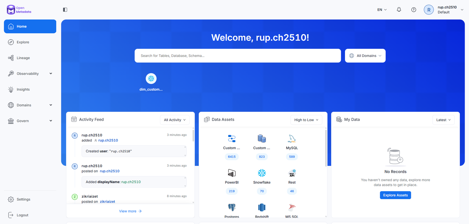
The Platform
A unified data catalog with intelligent search, interactive lineage visualization, and role-based navigation.
Every interaction designed around how data professionals actually think — not how data is stored.
sandbox.open-metadata.org
OpenMetadata — Data Catalog Explore View
Design Highlights
Five systems, one experience
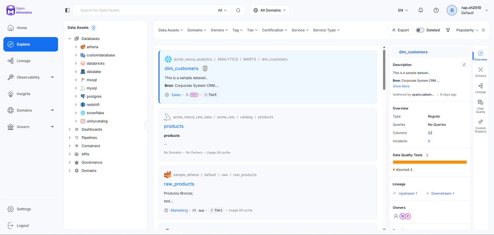
Unified Catalog with Semantic Search
Problem
No single place to search across warehouses, BI tools, pipelines, and ML models. Engineers relied on tribal knowledge to find the right dataset.
Approach
Semantic search engine with entity-type filtering, relevance scoring, freshness indicators, and inline contextual previews — accessible from one search bar.
User Benefit
Discovery time dropped from 2.5 hours to under 20 minutes. Engineers find the right dataset without knowing which system it lives in.
Business Benefit
40% reduction in data-related support tickets. Faster onboarding for new data hires — 3x vs. industry baseline.
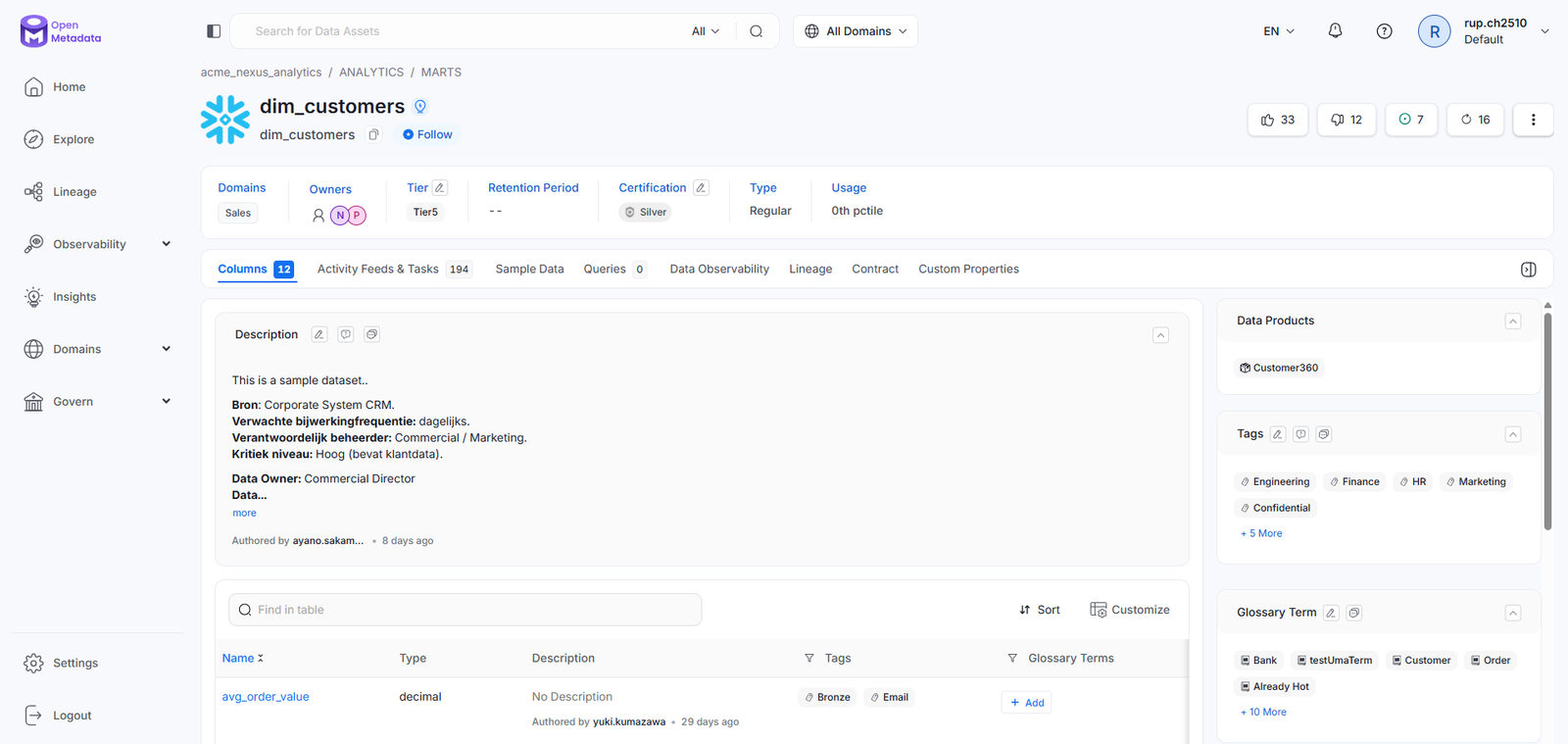
Interactive Data Lineage Graph
Problem
A single schema change silently broke downstream dashboards. Teams had no way to see the blast radius of a change before making it.
Approach
DAG-based lineage with collapse/expand, upstream/downstream isolation, impact path highlighting, and inline freshness status — all within the catalog record.
User Benefit
Engineers trace impact paths in seconds before any schema change. Governance leads see cross-system data flows in a single, consistent view.
Business Benefit
Faster incident response for pipeline failures. Enables proactive governance rather than reactive fire-fighting after a breakage.
Role-Based Personalised Dashboard
Problem
Engineers, analysts, and governance officers needed completely different starting contexts but the same navigation forced everyone through identical primary paths.
Approach
Navigation adapts to the user's function on first load — surfacing the most relevant entities, quality signals, and activity feeds per role, with full catalog access always available.
User Benefit
Users arrive where their work is. No daily friction of navigating past irrelevant sections to reach primary workflows.
Business Benefit
Higher daily active usage and better adoption across all three user segments. Lower time-to-value for new users within the first week.
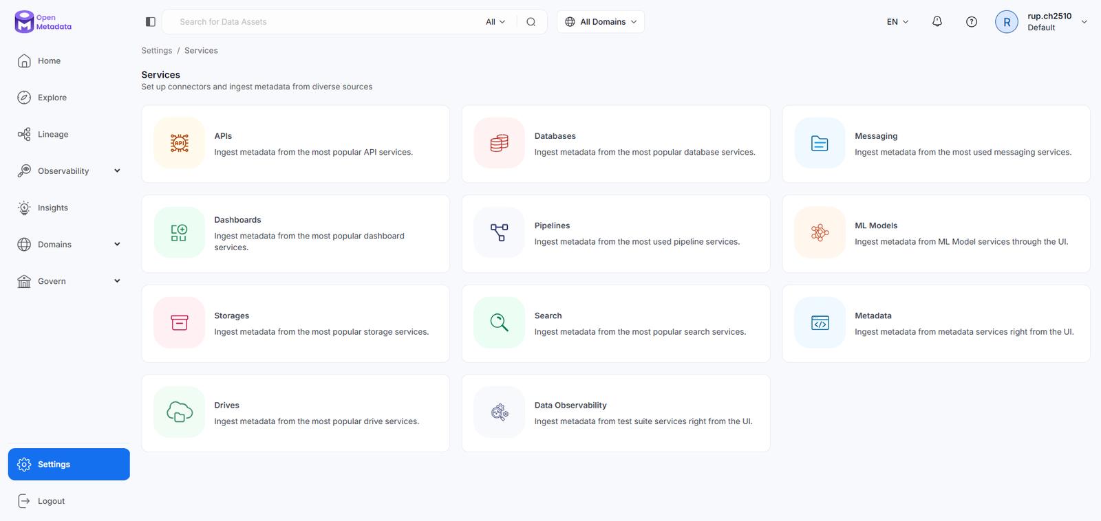
Marketing Website (open-metadata.org)
Problem
The site needed to convert two different buyers simultaneously: technical evaluators (CDOs, senior engineers) and business stakeholders — with fundamentally different language and concerns.
Approach
Layered conversion architecture — business value and governance positioning above the fold; integration directory and API-first proof points for technical evaluators below it.
User Benefit
Technical evaluators find integration depth quickly. Business buyers see compliance positioning without having to read documentation.
Business Benefit
Shorter time-to-trust for enterprise procurement. Clearer documentation onboarding funnel reduced time-to-first-value for new deployments.
Documentation-Integrated In-App Help
Problem
Users left the application to search docs — interrupting their flow at the exact moment they needed help most. Enterprise data tools have steep learning curves that external docs don't solve in context.
Approach
Contextual help panels, inline tooltips, and deep-linked documentation that activate at point of need — built as a design system component so engineering could wire it to any entity type.
User Benefit
Help appears in context without page abandonment. New users learn while doing — documentation that gets read because it shows up in the moment of confusion.
Business Benefit
Lower support burden. Documentation component scales across entity types without additional design resources per feature shipped.
Design System
Built for enterprise scale
A comprehensive component library and design token system built specifically for enterprise data UI — covering
data visualization, entity cards, lineage components, form patterns, and status indicators.
Monthly active users across enterprise and open-source deployments
0
Faster Discovery
3x improvement in data discovery speed post-redesign, measured by user sessions
0
Integrations
Native integrations with data warehouses, BI tools, pipelines, and ML platforms
0
Fewer Support Tickets
Reduction in data-related support tickets, attributed to improved
discoverability
Key Learnings
What this project taught me
OpenMetadata was one of the most technically complex and politically nuanced design problems I've worked on. Four things became true in ways I didn't fully anticipate at the start.
01
Trust is the real product — not speed
The biggest IA win wasn't making search faster. It was making results feel trustworthy. Freshness indicators, certification badges, and visible data ownership changed user behavior more than any query performance improvement. People don't act on data they don't trust, no matter how fast you surface it.
02
Governance UX is a political problem wearing a design hat
Data governance tools are resisted because they feel like surveillance imposed on producers for the benefit of compliance teams. When we reframed governance features as giving data owners more visibility and attribution — rather than taking away autonomy — adoption followed. The interface didn't change much. The framing did everything.
03
Heterogeneous audiences demand layered IA, not consensus design
You cannot design one interface that averages across a data engineer, a data scientist, and a CDO. Averaging produces something that serves no one well. The right answer is layering — a shared underlying structure that surfaces different primary paths per role. That requires more upfront architecture work but produces genuinely better adoption across every segment.
04
Open-source shifts your test group to thousands — simultaneously
The community surfaced IA problems within days of each release that no internal usability test would have caught. Engineers filing issues in GitHub were doing free, high-signal usability research. The lesson: design for the public changelog. Every interaction decision needs to survive being read by someone who has used 15 other tools in the same category and will compare you to all of them immediately.
"OpenMetadata had the kind of scope that is genuinely humbling — 600+ data sources, six product pillars, two completely different user audiences, and a team that had already built tools used at Uber and Netflix. The design problem wasn't making it look good. It was making it immediately legible to a data engineer who has seen every enterprise dashboard ever built and is deeply skeptical of all of them. That audience gap between 'I helped build Apache Hadoop' and 'I need to find where this dataset came from' is one of the hardest IA problems I've worked on. I don't think we fully solved it. But we made it considerably better."