Android Platform / Product Vision & Architecture

Your car.
Your intelligence.

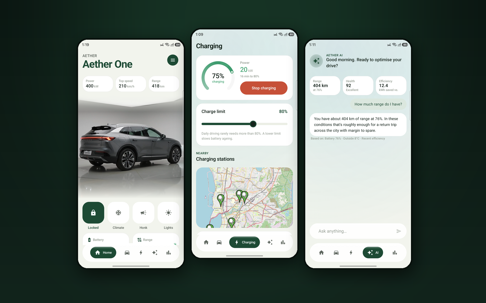
AETHER EV is an intelligent companion for a software-defined electric vehicle — one surface replacing the five to seven apps a driver currently juggles. The interface is built and runs on device across five feature areas, with a live Filament 3D vehicle, real OpenStreetMap charging data, and an assistant that shows the evidence behind every answer. It runs against a mock backend — a physics-based simulator stands in for vehicle telemetry while the real integration remains unfinished.
RoleProduct Strategy & Architecture
Timeline2026
CategoryAutomotive / IoT
TypeAndroid · Kotlin · 25 Modules
AETHER EV interface
25
Gradle Modules
5
Feature Areas
9
Screens Shipped
1
Offline-First Core

The problem
A modern EV is a software platform, but the experience around it is five to seven apps that were never designed to talk to each other.
The approach
Collapse them into one surface, make it work with no signal, and require every AI claim to carry the telemetry it came from.
The outcome
A working Android interface — live 3D vehicle, real charging maps, and an assistant that shows its evidence under every answer.
25
Gradle modules
5
Feature areas
9
Screens shipped
75%
Coverage floor

01 — The Problem

The vehicles got smarter.
The apps did not.

A modern EV is a software platform on wheels, but the experience around it is still assembled from fragments — one app for the car, another for public charging, a third for the home wallbox, a fourth for navigation, a fifth for the energy tariff. The intelligence exists. It is scattered across vendors who have no reason to talk to each other.

01
App fragmentation
Five to seven apps to operate one vehicle. Each holds part of the picture and none holds the whole.
02
Range anxiety persists
Not because batteries are small, but because the information needed to trust the number is spread across systems.
03
Charging is a guessing game
Availability, speed, cost and reliability live in different apps and are frequently wrong.
04
AI without accountability
Predictions are presented as magic. When one is wrong the driver has no way to judge whether to trust the next.

05 — Solution Exploration

Three decisions about
what to build first.

Each of these chose long-term structural integrity over a faster demo — a trade that is only defensible if you are equally honest about what therefore is not finished.

Decision 01
Features first or architecture first?
Problem
A vision this broad can be demoed quickly with a monolith and mock data.
Option A
Build the screens first; refactor into modules once the shape is proven.
Option B
Establish 25 modules, conventions and the data strategy before features. (Chosen)
Chosen
Architecture-first, accepting that most feature modules remain contracts.
The product's promise is trustworthy intelligence under poor connectivity. That is a structural property — retrofitting it onto a network-first monolith means rewriting everything the demo proved.
Decision 02
Network-first or offline-first?
Problem
Vehicle telemetry is inherently remote, which pulls toward a network-first client.
Option A
Fetch on demand and cache opportunistically — the conventional approach.
Option B
Local store as source of truth; the network is an enhancement. (Chosen)
Chosen
Offline-first, so the interface is fully usable with no connection at all.
The moments a driver most needs the app — an underground car park, a rural charger — are precisely the moments with no signal. An app that spins there has failed at its actual job.
Decision 03
How much should the AI explain itself?
Problem
Showing model inputs adds visual weight to every prediction.
Option A
Present predictions cleanly; keep the reasoning out of the way.
Option B
Bind every claim to the telemetry it came from, by contract. (Chosen)
Chosen
Provenance carried alongside every prediction, enforced in the domain model.
A confidently wrong estimate with no visible reasoning destroys trust in every future one. Showing the inputs lets a driver calibrate rather than simply believe or dismiss.

06 — Final Solution

What the app actually does.

Five capabilities carry the product, and all five render on device against the mock backend. Each exists to collapse something a driver currently does in a separate app, or to make the intelligence behind a number checkable.

🏗
25-module architecture
Type-safe project accessors, nine convention plugins, and a feature module that builds in four lines.
Problem
A monolith makes eleven feature areas impossible to develop or test independently.
Approach
Gradle convention plugins encoding the standards once, applied everywhere.
User Benefit
Faster, more predictable builds and clearer ownership boundaries.
Business Benefit
New feature teams onboard without relitigating build configuration.
📡
Offline-first data layer
A local store as source of truth, with the network treated as an enhancement rather than a requirement.
Problem
The app is needed most exactly where connectivity is worst.
Approach
Repository contracts that never surface a loading state as the primary experience.
User Benefit
The interface stays usable in car parks, tunnels and rural charge points.
Business Benefit
Removes the most common cause of abandonment for connected-vehicle apps.
🧠
Accountable AI contracts
Every prediction carries the telemetry it was derived from, enforced by the domain model.
Problem
Unexplained predictions cannot be calibrated, so one error poisons all of them.
Approach
Provenance modelled as part of the type, not appended at the presentation layer.
User Benefit
Drivers learn when to trust the estimate instead of guessing.
Business Benefit
Turns the intelligence claim into something defensible rather than marketing.
🚗
Filament 3D vehicle viewer
A real-time rendered vehicle model with a physics-based simulator driving its state.
Problem
Static illustrations cannot express live vehicle status convincingly.
Approach
Google's Filament renderer wired to the simulated telemetry stream.
User Benefit
The car's state is legible at a glance rather than read from a table.
Business Benefit
The visual signature that differentiates the product in a crowded category.
🎨
Complete design system
Tokens, components and motion specified before feature work began.
Problem
Eleven feature modules built in parallel diverge without a system already in place.
Approach
The design system module completed as a dependency, not a deliverable.
User Benefit
Consistency across the platform by construction rather than review.
Business Benefit
Feature teams ship faster because the visual decisions are already made.

07 — Design System & Scalability

Light, because
cars are bright.

Automotive UI defaults to dark, which looks impressive in a showroom and reflects the cabin ceiling in daylight. AETHER inverts it: a light pistachio canvas with deep forest green, so the screen stays readable through a windscreen at noon. Saturated green marks live states and terracotta is reserved for stop actions.

Palette
Canvas#F2F4ED
Forest#1D4A34
Bright#4FA97B
Terracotta#C65038
Ink#16241C
Typography
Outfit
Display — headings, the vehicle name and hero figures
Inter
Body, labels and all telemetry readouts
Colour as state, not decoration
Bright green marks live and changed states; terracotta appears only on destructive actions such as Stop charging. Because neither is ever decorative, their presence always carries information.
Convention plugins
Nine Gradle convention plugins encode the module standards once. A new feature module declares four lines and inherits testing, linting, Compose configuration and coverage floors.
Quality gates in the build
Spotless, Detekt tuned for Compose, and Kover with a 75% coverage floor run as part of the build rather than as a review checklist.

08 — Outcomes & Impact

The interface is real.
The car is not.

Every screen in the walkthrough is a device capture from a Galaxy S25 Ultra — the 3D model rotates under a real renderer and the charging map is live map data rather than an image. What sits behind it is mocked: a physics-based simulator produces the telemetry, and the network layer that would talk to an actual vehicle is still parked in a pending source set. This is a designed and built front end, not a connected product.

25
Gradle Modules
Type-safe accessors and nine convention plugins.
75%
Coverage Floor
Enforced by Kover in the build, not requested in review.
5
Feature Areas Built
Home, Vehicle, Charging, AI and Insights — all rendering on device against mock data.
9
Screens Captured
Real device captures from the mock build, including the AI answer that carries its own evidence.

09 — Key Learnings

What This Project Taught Me

Learning 01
Some promises are structural
Trustworthy intelligence under poor connectivity is not a feature you add — it is a property of the data layer. Choosing architecture first was the only way that promise could survive contact with a real drive.
Learning 02
Provenance is a design element
Treating the telemetry behind a prediction as part of the type, rather than optional UI garnish, meant the interface literally cannot display a claim it cannot substantiate.
Learning 03
Offline-first changes the UX, not just the data
Once the local store is the source of truth, loading states stop being the default screen. That single decision removed an entire category of frustrating moments from the design.
Learning 04
The category default is not the right answer
Every competitor ships a dark automotive UI because it photographs well. Designing for a sunlit cabin rather than a showroom pointed the opposite way, and the light canvas is now the thing that makes AETHER recognisable at a glance.

Reflection

"The decision I keep coming back to is the AI one. It would have been easy to print a range number and let people trust it or not. Instead every answer carries the line it was derived from — battery, outside temperature, recent efficiency. It adds visual weight to the least glamorous part of the screen, and it is the difference between an assistant a driver calibrates and one they eventually stop reading. A confidently wrong estimate with no visible reasoning does not just lose that moment; it loses every future one."
— Rupesh Chavan, Lead Product Designer
"Going light was the least obvious call. Every EV app on the market is dark, and dark demos beautifully. But the screen is read through a windscreen at midday, propped on a dashboard, with the cabin ceiling reflecting straight back at you. Once I framed it as a legibility problem rather than a style one, the pistachio canvas stopped feeling like a risk and started feeling like the only defensible answer."
On making the least glamorous part of the screen the most important

Explore the Project

See the whole thing

Every screen below is a capture from the running build on a physical device — step through with the arrow keys, or click any screen to open it full size.

View All 9 Screens All Projects Vera Mobile App