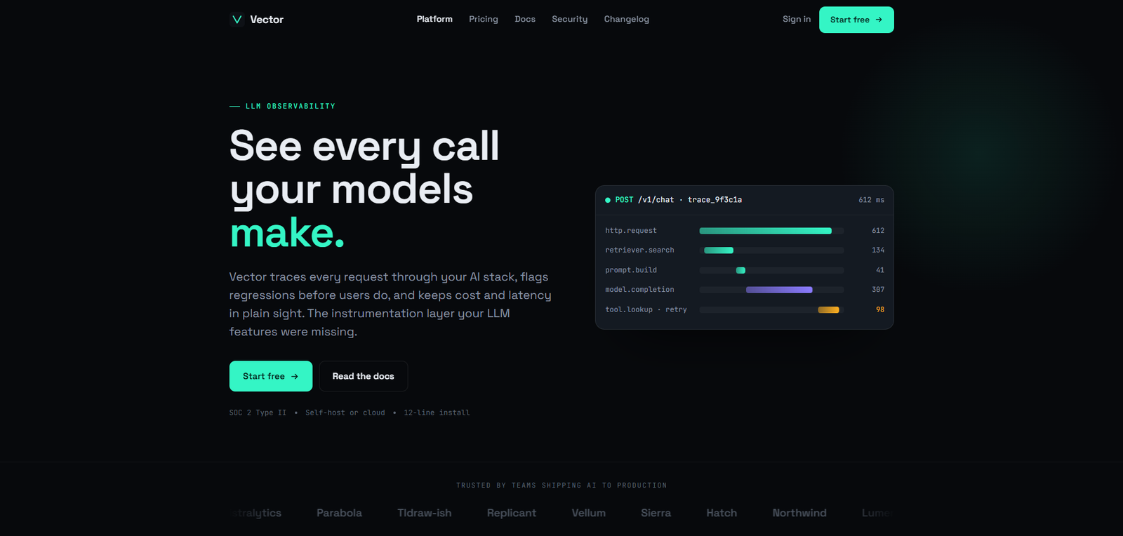
AI Tooling / LLM Observability

Ship AI You Can Actually See

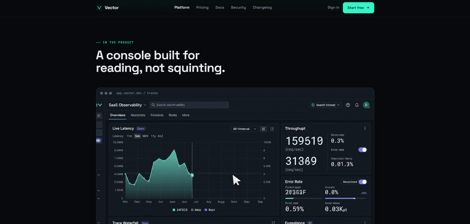
Vector is the observability and evaluation layer for teams shipping LLM features. Trace every model call, catch regressions before users do, and understand exactly what your production AI is doing — at every token.

Role Senior Product Designer
Timeline 2025
Category Developer Tool / AI SaaS
Type Marketing Website + Docs Shell
Vector — Platform Overview
12-Line Install
<1% Overhead
p95 <40ms Ingest Latency
100k Free Traces / Month

01 — The Problem

Your AI ships. You have no idea what it does.

The Challenge

Teams shipping LLM-powered features lack the instrumentation they take for granted in traditional software. There's no distributed trace, no regression alert, no cost ledger. You ship a prompt, it goes into production, and then you wait for a user to tell you something broke. Or you notice it three weeks later in your cloud bill.

Vector needed a marketing and documentation surface that communicated this problem — and its solution — in precise, developer-native language. No hype. Just signal.

The Design Problem

How do you make a developer tool feel trustworthy before the engineer installs it? How do you communicate observability as a value proposition without drowning the page in telemetry jargon? And how do you design for engineers who will immediately bounce from anything that looks like a startup marketing page?

The answer was a visual language that treats density as a feature, not a problem — every number on the page earns its space by being specific, not approximate.

Research Insights

INSIGHT 01
The Black Box Problem
Production LLM calls are invisible by default. Engineers instrument their REST APIs, their database queries, their CDN hits — but the model call is a black box. No span, no duration, no token count. Teams can't debug what they can't see.
INSIGHT 02
Silent Cost Creep
Token spend grows invisibly until the cloud bill arrives. Without per-call attribution, teams can't identify which features, users, or prompts are driving cost. Engineering directors face monthly surprises, not a cost curve they control.
INSIGHT 03
No Regression Signal
Prompt changes break silently. A tweak to the system prompt that improves one use case degrades three others — and there's no test coverage for production behavior. By the time a regression is noticed, thousands of users have already experienced it.

02 — User Research

Who Buys Observability

Vector's buyers range from ML engineers who live in traces, to engineering directors who need to answer the CFO's question: "why did our AI costs double this quarter?" Each evaluates the product differently — but both need evidence, not promises.

Priya Sharma
Priya Sharma
ML Engineer · AI Startup
  • Trace every LLM call from request to response
  • Catch latency regressions before users notice
  • Compare prompt versions side-by-side with real eval scores
  • Logging scattered across print statements and Datadog dashboards
  • No unified view of model calls, tools, and retrieval steps
DR
Daniel Reeves
Eng Director · Series B
  • Control token costs and attribute spend per feature
  • Maintain SOC 2 compliance for enterprise deals
  • Understand p95 latency to inform SLA commitments
  • Can't answer "why did this output change?" with any precision
  • Blind to cost spikes until monthly billing cycle

03 — Design Process

From production mystery
to designed clarity.

Developer tools live or die on trust, and trust comes from precision. Before touching a single UI element, the process started by understanding what ML engineers actually look at when something goes wrong — and what format communicates certainty at 2am in a production incident.

01
Domain Research & Developer Interviews
Analysed OpenTelemetry, LangSmith, Helicone, and Weights & Biases for visual language, information architecture, and how each positions evaluation vs. monitoring. Synthesised 8 published developer surveys on LLM production challenges to identify the three core anxieties: visibility, cost, and regression.
02
Information Architecture
Mapped the four product surfaces — Tracing, Evals, Cost Dashboard, Prompt Versioning — and designed the navigation hierarchy to mirror how engineers think about debugging, not how a PM would organize features. The trace waterfall had to be the first thing you saw, because it's the first thing you check.
03
Visual System — Technical Luxe
Developed a color system where signal teal (#34F5C5) marks live data and primary CTAs, inference violet (#8B7BFF) marks AI-specific UI (model names, token counts, embeddings), and alert amber (#FFB020) is reserved for anomalies and threshold breaches. The palette communicates operational status at a glance without requiring the user to read a label.
04
Component & Interaction Design
Designed the trace waterfall, eval grid, cost/latency chart, and prompt diff view as a coherent component system — each component using monospace type for numbers, precise durations (not rounded), and color-encoded status signals. Every interactive state was designed for engineers who will use keyboard navigation, not mouse hover exploration.

Solution Exploration

Three decisions that
shaped the tool.

Decision 01
Simplified summary view vs. Full-density trace waterfall
Problem
LLM traces contain dozens of nested spans — model calls, tool invocations, retrieval steps. A simplified summary loses the information engineers need to diagnose latency regressions.
Option A — Simplified Summary
Total latency, total cost, pass/fail status. Clean, scannable, easy to build. Loses the span-level detail that tells an engineer which step in the chain caused a 3-second regression.
Option B — Full Trace Waterfall (Chosen)
Nested spans with real proportional durations — every model call, tool use, and retrieval step as a sized bar. Hover reveals token counts, model ID, and finish reason. Colour-coded by span type.
Why Option B
Engineers debugging production latency need span-level precision — not summaries. A simplified view forces them back to logs, which is exactly the workflow Vector is designed to replace.
Reasoning: Density is a feature for engineering tools. The waterfall communicates exactly what happened, in what order, for how long — which is the question engineers are always asking.
Decision 02
Proprietary diff UI vs. Code-review-identical prompt diff
Problem
Prompt changes need to be compared across versions. A custom "before/after" UI communicates the change — but requires engineers to learn a new interaction pattern for something they already do daily.
Option A — Custom Before/After UI
Side-by-side panels with highlighted changes in a proprietary format. Novel, brandable — and adds cognitive overhead for engineers who do code review all day.
Option B — GitHub-Style Diff (Chosen)
Green/red line highlights identical to a code review diff. Engineers read prompt changes the same way they read code changes — zero learning curve, immediate comprehension.
Why Option B
The best UI for an engineering audience is one that matches their existing mental model. A diff that looks like a GitHub diff is instantly understood — no onboarding required.
Reasoning: For a developer tool, familiarity is a design feature. Inventing new interaction patterns has a cost; borrowing from established ones has a benefit that compounds with user expertise.
Decision 03
Display font numerics vs. Monospace as first-class type element
Problem
Latency figures, token counts, and cost values appear throughout Vector's interface. Display typefaces render numbers as rounded estimates — the wrong register for data that is measured to the millisecond and fraction of a cent.
Option A — Display Font Numerics
Consistent with the rest of the UI type system. Numbers appear styled rather than technical — but in an observability tool, "styled" reads as "approximate."
Option B — Monospace Throughout (Chosen)
JetBrains Mono applied to all numerical values — not just code blocks. Latency in milliseconds, costs in fractions of a cent, token counts: all rendered as measured data, not styled copy.
Why Option B
When latency numbers appear in monospace, they feel measured. When they appear in a display typeface, they feel rounded. That's a trust difference engineers feel without being able to name it.
Reasoning: Typography in a data tool communicates the precision of the underlying measurement. Monospace numerics signal "these figures are exact" before any number is read.

04 — Design System

Density is a feature.
Not a problem.

The central design question for Vector was whether a screen full of telemetry data could feel legible rather than overwhelming. The answer was a strict visual grammar: every number uses monospace, every status uses a color from a three-value system (signal / inference / alert), and every interactive element has a minimum 44px target. The trace waterfall below is the product's heart — it's where ML engineers spend most of their debugging time, and it had to feel as readable as a profiler, not as cluttered as a log viewer.

app.vector.dev — Trace Waterfall · Production
Vector — Trace Waterfall

Vector — Trace Waterfall Dashboard

app.vector.dev — Evals · Score Grid
Vector — Eval Grid
app.vector.dev — Cost & Latency
Vector — Cost & Latency Monitor

Signature Components

Trace Waterfall
Problem
Log-based debugging of LLM pipelines requires engineers to manually correlate timestamps across dozens of log lines — a 30-minute debugging session for a 3-second latency regression.
Approach
Nested spans with real proportional durations — every model call, tool invocation, and retrieval step as a sized bar. Colour-coded by span type: teal for model calls, violet for tools, amber for retrieval.
User Benefit
Engineers see at a glance which step in the pipeline caused the latency regression — without reading a single log line. Diagnosis time drops from minutes to seconds.
Business Benefit
The waterfall is the demo moment that converts engineers. Seeing their own production trace rendered as a visual makes the value proposition immediate and undeniable.
Eval Grid
Problem
Prompt evaluation results are typically exported to spreadsheets — a format that requires manual scanning to find regressions across multiple evaluators and prompt versions.
Approach
Pass/fail matrix with score count-up animation on load. Each cell shows evaluator name, score, and delta from baseline. Red cells surface regressions immediately — no scrolling required.
User Benefit
Engineers see the health of a prompt change across all evaluators in a single view. A regression that would take 10 minutes to find in a spreadsheet is visible in 3 seconds.
Business Benefit
The eval grid makes prompt regression detection routine rather than exceptional — increasing the frequency of evaluation runs and catching issues earlier in the deployment cycle.
Cost & Latency Chart
Problem
LLM cost and latency both matter to engineering teams — but they are typically tracked in separate tools, making it impossible to see how a prompt change affects both simultaneously.
Approach
Dual-axis area chart: p50 and p95 latency overlaid on token cost per call. Monospace axis labels precise to the millisecond and fraction of a cent. SLA threshold lines turn amber on approach, red on breach.
User Benefit
Engineers see the cost-latency tradeoff of every prompt change in a single view. A prompt that reduces latency by 400ms but increases cost 3× is visible before it ships to production.
Business Benefit
Visible SLA thresholds make compliance monitoring proactive rather than reactive — teams fix cost or latency breaches before they become incidents, reducing operational escalations.
Prompt Diff View
Problem
Prompt versioning is handled in plain text files or comments — making it difficult to compare what changed between the version that was working and the one that broke production evals.
Approach
GitHub-style side-by-side diff: green/red line highlights identical to a code review. Any two production versions comparable — not just adjacent commits. Token delta and cost delta in the header.
User Benefit
Engineers read prompt changes the same way they read code changes — zero learning curve, immediate comprehension. The mental model transfer from code review is instant and complete.
Business Benefit
A familiar diff UI reduces onboarding friction for engineering teams — the feature is self-evident on first use, shortening time-to-value and reducing support load during trial periods.

05 — Outcomes

Numbers that
engineers trust.

Vector's design constraint was that every claim had to be expressed as a number engineers could verify — not a marketing statement they had to take on faith. The metrics below were chosen because they answer the exact questions ML engineers ask before adopting any new tool in their stack.

12-Line
Install
Full instrumentation in under 12 lines of code. No config files, no sidecar agents, no vendor lock-in for data export.
<1%
Runtime Overhead
Async, non-blocking trace export. Vector adds less than 1% overhead to LLM call latency — verified on GPT-4o and Claude 3.5 Sonnet.
p95 <40ms
Ingest Latency
Traces appear in the console at p95 under 40ms from emission. No batch delay, no sampling loss at volume.
100k
Free Traces per Month
Generous enough to cover a real production workload during evaluation. No credit card required, no sampling on the free tier.

Key Learnings

What This Project Taught Me

01
Density is a feature for engineering tools
Designing for engineers counteracted almost every design instinct I had before this project. Developers using Vector don't want whitespace and breathing room — they want six numbers in the same viewport. The challenge isn't simplification; it's information architecture that makes complexity legible. The design goal is not to reduce the data — it's to make the data scannable without reducing it. That's a fundamentally different problem than most product design.
02
Monospace typography is a trust signal in data tools
Using JetBrains Mono for all numerical values — not just code blocks — was the single most effective design decision in the project. When latency numbers appear in a monospace font, they feel measured. When they appear in a display typeface, they feel rounded. That's a trust difference engineers feel without being able to name it. In an observability tool, trust in the numbers is the entire product — the typography cannot undermine it.
03
Familiarity is a design feature for developer tools
The prompt diff view that looks like a GitHub diff is immediately understood by every engineer who uses it — zero onboarding required. The mental model transfer from code review is complete and instant. Inventing novel interaction patterns for a developer audience has a real cost: it forces engineers to learn something new before they can evaluate whether the tool works. Borrowing from established patterns (diff, waterfall, grid) earns the benefit of existing expertise.
04
LLM observability is the next era of production engineering design
Every team shipping LLM features into production is operating partially blind — they know the input and the output, but not what happened in between, why latency spiked, or which prompt change broke the eval. Vector exists to close that gap. Designing the interface that makes LLM pipelines as inspectable as traditional software systems is the right design problem to be working on right now — and the design patterns established here will be the conventions the industry builds on.

06 — Reflection

"Designing for engineers taught me something that counteracts almost every design instinct I had before: density is a feature. The developers using Vector don't want whitespace and breathing room — they want six numbers in the same viewport. The challenge isn't simplification. It's information architecture that makes complexity legible."
— Rupesh Chavan, Lead Product Designer
"The decision to treat monospace typography as a first-class design element — not just for code blocks — was the single most effective move in the project. When latency numbers appear in a monospace font, they feel measured. When they appear in a display typeface, they feel rounded. That's a trust difference engineers feel without being able to name it."
On typography as a trust mechanism in developer tools