Luxury Travel / Membership Platform
Stay somewhere that remembers you.
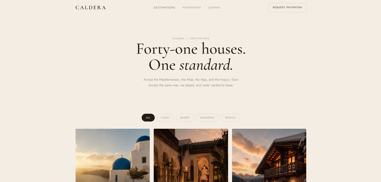
Where every house
already knows your name

Caldera is an invitation-only collection of private villas and houses, each staffed by a resident team and paired with a personal travel director — so every detail of your stay is known before you arrive, and remembered long after you leave.

Role Senior Product Designer
Timeline 2025
Category Luxury Travel / Hospitality
Type Marketing Website + Membership Platform
Caldera — The Club
41 Properties
3 Membership Tiers
18 Countries
1 Personal Travel Director

01 — The Problem

Luxury travel lost its memory.

The Challenge

The ultra-high-net-worth traveller has grown up. They no longer want points programmes, marble lobbies, and staff trained in scripted politeness. They want to stay somewhere that feels as considered as their own home — but not their own home. The challenge was building a brand and digital platform that felt like a trusted introduction rather than a booking transaction.

Caldera needed to feel like a letter from a well-connected friend, not a rate comparison widget.

The Design Problem

How do you communicate curation without listing credentials? How do you make an application process feel like an honour rather than a barrier? And how do you present 41 extraordinary properties without reducing them to tiles on a grid?

Every design decision was tested against one question: does this feel like the beginning of a long acquaintance, or the start of a transaction?

Research Insights

INSIGHT 01
Hotels Forgot How to Remember
Every hotel stay resets to zero. Preferences recorded on one visit vanish before the next. The staff who knew you retire. The new GM restarts the relationship from scratch. Affluent travellers have accepted this amnesia as inevitable — Caldera's proposition is that it isn't.
INSIGHT 02
Booking Sites Commoditised the Experience
Ultra-fast booking killed the feeling of curation. When every luxury villa can be reserved in four clicks, no property feels genuinely rare. The Caldera platform needed to slow the process deliberately — not to obstruct, but to restore the weight that a truly considered stay deserves.
INSIGHT 03
The Market Lacks a Trusted Curator
There is no brand that occupies the space between Airbnb Luxe and a private members club. The former is transactional; the latter, social. Caldera could own the space where exceptional houses meet deep personal knowledge — without the club's exclusivity theatre.

02 — User Research

Who Caldera is for

Caldera members are well-travelled, quietly affluent, and tired of the labour that "effortless luxury" still requires of them. They are not looking for more options. They are looking for the right one, already chosen.

Isabelle Fontaine
Partner at PE Firm, 44
  • Effortless family stays where every detail has been considered in advance
  • Properties that feel genuinely curated, not generically luxurious
  • A travel director who already knows her children's dietary requirements
  • Researching the right villa takes 12 hours she doesn't have
  • Never certain whether "private" means truly private, or just expensive
Thomas Aldridge
Serial Founder, 39
  • Remote-work-friendly houses with reliable connectivity and quiet space
  • Properties in lesser-known locations with genuine cultural depth
  • Stays that feel like a local introduction, not a tourist itinerary
  • Hotel loyalty programmes feel transactional and impersonal
  • Nobody anticipates needs — he must articulate every preference from scratch

03 — Design Process

From brief to
editorial calm.

Luxury design is largely an exercise in restraint. The hardest part is not adding — it is knowing what to remove. Each phase below was guided by one question: does this create warmth, or only the appearance of it?

01
Brand Discovery & Competitive Analysis
Mapped the space between Airbnb Luxe, Soho House, Mr & Mrs Smith, and traditional villa brokers. Identified tone of voice gaps: no brand spoke with the quiet confidence of an old family connection. Caldera's voice was defined as warm, literary, and understated — the opposite of a deals site.
02
Editorial Architecture & Storytelling
Structured the site around stories rather than listings. Each property opens with a portrait — the house in light, the garden at dusk, the kitchen the morning after arrival. Information architecture was designed to slow the visitor down rather than funnel them toward a booking button. Conversion follows trust; trust follows story.
03
Visual Identity & Photography Direction
Established a terracotta-and-gilt palette drawn from Mediterranean stone, golden hour light, and age-worn linen. Photography art direction emphasised intimate scale — a fig on a table, a half-read novel, the shadow of a vine at noon. The grain texture throughout the site recalls film photography: deliberate imperfection as a luxury signal.
04
Membership UX & Application Flow
Designed the membership application as a conversation rather than a form. Progressive disclosure reveals each question only after the previous is answered. The copy uses the language of a gracious host — not "submit your details" but "tell us a little about how you travel." The application process itself communicates the Caldera experience before the first stay.

Solution Exploration

Three decisions that
defined the platform.

Decision 01
Photography hero vs. Cinematic video with film grain
Problem
Luxury travel photography is ubiquitous — every competitor uses the same category of image: perfect pool, golden hour, aspirational lifestyle. Photography no longer differentiates at the hero level.
Option A — Hero Photography
A full-bleed hero photograph of a Caldera property. Beautiful, expected, immediately scannable — and indistinguishable from every other luxury travel platform at first glance.
Option B — Cinematic Video + Film Grain (Chosen)
Autoplay golden-hour video with a film grain overlay. No sound, no controls. A single perfect moment at one property — the edit is the message. Time is given to the visitor, not extracted from them.
Why Option B
Motion at this pace is the visual register of considered luxury — not the rapid scroll of a feed. The film grain closes the gap between screen and memory, between looking and being there.
Reasoning: Photography shows a property. Cinematic video communicates the experience of being at a property. For a platform selling belonging, not booking, the distinction is everything.
Decision 02
Feature-list membership tiers vs. Tier hierarchy through editorial restraint
Problem
Membership tier pages default to feature comparison matrices — a format that commoditises the offering and signals "choose the right plan" rather than "join the right club."
Option A — Feature Comparison Matrix
Three tiers with bullet-pointed capability lists: properties available, nights per year, concierge access. Transparent, comparable, and completely wrong for the register Caldera occupies.
Option B — Editorial Hierarchy (Chosen)
Three tiers presented with deliberate visual hierarchy and no feature bullet lists. The highest tier described in a single sentence. Restraint communicates confidence — the less you need to say, the more you can charge.
Why Option B
Feature lists invite comparison shopping. Caldera's membership is not comparable to other products — it is a relationship. The tier page communicates quality of experience, not quantity of benefits.
Reasoning: The format of a tier presentation signals the nature of the offer. A matrix says "service." Editorial hierarchy says "membership." They are not interchangeable.
Decision 03
Standard booking form vs. Application as first experience of the travel director
Problem
The application form is the first direct interaction between Caldera and a prospective member. A standard form — name, email, preferences — signals that the relationship begins with data collection, not with care.
Option A — Standard Data-Capture Form
Multi-field form collecting contact information, travel preferences, and party size. Efficient, expected — and entirely inconsistent with a platform whose core proposition is the personalised travel director relationship.
Option B — Single-Question Progressive Disclosure (Chosen)
One question at a time, warm microcopy at each step, a final screen that reads as a personal acknowledgement from a travel director. The form is the first experience of what membership will feel like.
Why Option B
The application is not a form — it is an introduction. Every design decision in it should communicate: you are already being cared for. This is not a sign-up flow. This is the beginning of a relationship.
Reasoning: The form is the product at its most vulnerable. The member has decided to apply — the form's job is to confirm that the decision was right, not to process data.

04 — Design System

A platform that looks
like the places it holds.

The visual language was built from the properties themselves — terracotta rendered walls, gilt midday light, the blue-green of a shaded pool. Typography leans on Cormorant Garamond's warm italics for warmth and Jost's light weight for restraint. The result is a screen that feels more like a well-designed magazine spread than a booking interface.

caldera.co — The Club
Caldera — Home Page

Caldera — Home Page

Caldera — Destinations
Caldera — Membership
caldera.co — Apply
Caldera — Application

Caldera — Application Experience

Signature Design Elements

I
Cinematic Hero
Problem
Luxury travel photography is category-generic — every competitor uses the same golden-hour hero image. Static photography no longer differentiates at the hero level; it signals "one of many" rather than "unlike any other."
Approach
Autoplay golden-hour video with film grain overlay. No sound, no controls. A single perfect moment at one property — the edit is the message. Time is given to the visitor, not extracted from them.
User Benefit
Prospective members experience the feel of being at a Caldera property before reading a single word. The emotional register — unhurried, considered, warm — is established before any claim is made.
Business Benefit
A cinematic hero is instantly distinct from the photography-only category. The motion and grain create a visual memory that persists beyond the session — supporting the word-of-mouth acquisition Caldera depends on.
II
Destination Carousel
Problem
Travel platforms default to search-and-filter grid interfaces — the format of maximum choice. For a curated collection of 41 properties, a search grid signals commodity abundance rather than editorial scarcity.
Approach
Swipeable carousel at the pace of considered browsing — not rapid swiping. Each card: property name, one image, a country. Nothing else. Detail is reserved for the house page, where it earns its place.
User Benefit
Members browse at the pace the collection deserves. Each property is encountered as its own moment — not as one item in a grid of competing options. The carousel enforces the curation that defines the club.
Business Benefit
A carousel at considered pace signals editorial confidence. Caldera does not need to show all 41 properties at once — the restraint communicates that each property was chosen deliberately, and that the collection is not for everyone.
III
Membership Tiers
Problem
Membership tier pages default to feature comparison matrices — a format that commoditises the offering and invites price-comparison thinking rather than belonging-consideration thinking.
Approach
Three tiers with deliberate visual hierarchy and no feature bullet lists. The distinction communicated through quality of experience, not quantity of benefits. The highest tier described in a single sentence.
User Benefit
Prospective members evaluate membership as a relationship decision, not a features decision. The tier page communicates what kind of member you will become — not what you will receive.
Business Benefit
Restraint at the tier level signals confidence. The less Caldera needs to explain, the more it can charge. A single-sentence description of the highest tier communicates that its value is self-evident to the right person.
IV
Application Form
Problem
Standard membership forms signal data collection — the relationship begins with fields to complete. For a platform whose core proposition is the personalised travel director relationship, a form is the wrong first impression.
Approach
Single-question progressive disclosure with warm microcopy at each step. Final screen reads as a personal acknowledgement from a travel director. The form is the first experience of what membership will feel like.
User Benefit
Applicants feel cared for from the first interaction — not processed. The form confirms that the decision to apply was right, rather than testing patience with fields and dropdowns.
Business Benefit
An application that feels like the product it leads to converts more deliberately than a standard form — because the form itself is a demonstration of the care that defines the membership.

05 — Outcomes

A platform that earns
its silence.

Caldera was designed to speak quietly and be remembered. The metrics below are not conversion numbers — they are the shape of a collection that doesn't need to shout.

41
Properties in the Collection
Each one personally known, not algorithmically ranked. The number is deliberately finite.
3
Membership Tiers
Designed with clear hierarchy and no feature parity. Simplicity at this level signals confidence.
18
Countries
From a Majorcan farmhouse to a Kenyan lodge. Geographic breadth with editorial depth at every location.
0
Generic Stays
Every property has a resident team, a story, and a travel director who knows it. None are interchangeable.

Key Learnings

What This Project Taught Me

01
Restraint is not minimalism — it is a form of generosity
Luxury design taught me that every element that doesn't add warmth should be removed — because its presence costs the visitor something: attention, trust, time. Restraint is not about having less to say. It is about respecting the visitor enough to say only what earns its place. The hardest conversations in this project were about why we were removing things, not adding them — and why the removal made the product more, not less.
02
The format of a presentation signals the nature of the offer
A feature comparison matrix says "service." Editorial hierarchy says "membership." These are not interchangeable formats — they signal completely different relationships between the product and the buyer. Caldera's membership tier page communicates what kind of member you will become, not what you will receive. The insight: the structure of information is itself a message. Choosing the wrong format undermines the content regardless of how well the content is written.
03
The application form is the product at its most vulnerable
The moment a prospective member decides to apply is the moment they are most open to doubt. The form's job is not to collect data — it is to confirm that the decision to apply was right. Every design decision in the Caldera application (single-question disclosure, warm microcopy, personal final screen) was chosen to communicate: you are already being cared for. A form that feels like the product it leads to converts more deliberately than a form that merely processes information.
04
Editorial calm is harder to build than visual complexity
Adding visual elements is easy. Removing them when they are "useful sometimes" requires conviction and a clear sense of the register you are protecting. Caldera's visual language — Cormorant Garamond italic, terracotta against near-black, the unhurried carousel — was the product of many decisions to not add things that would have been defensible. Building confidence through editorial calm, rather than through feature demonstration, is the most demanding brief in product design.

06 — Reflection

"Luxury design taught me that restraint is not minimalism — it is a form of generosity. Every element that doesn't add warmth should be removed, because its presence costs the visitor something: attention, trust, time. The challenge with Caldera was building confidence through editorial calm rather than feature lists. The hardest conversation was explaining why we were removing things, not adding them."
— Rupesh Chavan, Lead Product Designer
"The application form was the most argued-over piece of the project. Every stakeholder instinct said: capture more data. Every design instinct said: ask less, listen more. The version that launched asks five questions. It converts better than the version that asked fourteen. The lesson is not about forms. It is about what trust feels like when it's been designed properly."
On friction as a luxury signal in the membership UX